Green Dog Trumpet and other stories

CREATOR/S: Ian Miller

YEAR: 1978

PLACE: Brighton / Paris

PUBLISHER: Dragon’s Dream

ORIGINAL PRICE: Not known

PRINT RUN: Not known

WHERE CAN I READ IT FOR MYSELF? Billy Ireland Cartoon Library, Ohio State University

IMG_6938 IMG_6939

Figs. 1 and 2. Cover and spine of Green Dog Trumpet and other stories © 1978 Ian Miller

Ian Miller may need a little introduction but his art shouldn’t: anyone familiar with the Fighting Fantasy series, or the cover art for various SF / fantasy / horror books (including several Lovecraft volumes from the 1970s, see here), or the graphic novels The City (written by James Herbert) or The Luck in the Head (written by M. John Harrison) will have seen his work. Green Dog Trumpet and other stories (1978) appears fairly early in Miller’s career and represents an intriguing permutation of the trade paperback collection of short comics. It is also doing things with panels and layout I haven’t seen before; not in this way, at least.

The biography at the start of the book tells us that Miller was born in London on 11 November 1946 and that he studied at Northwich College and later at St. Martin’s College of Art in London. His website also states that he studied there, thus he joins several British comics creators who came through St. Martin’s (see Sabin for an account of some of the others). Miller was plugged into the fashionable transatlantic currents of 1970s fantasy illustration and animation; he designed backgrounds for Wizards (1977), the feature film directed by Ralph Bakshi (Bakshi also directed 1972’s Fritz the Cat). Green Dog Trumpet and other stories was published by Dragon’s Dream, the publishing imprint run by Roger Dean (responsible for some cracking Yes album covers). Dragon’s Dream also published two books of comics by French creator Phillipe Druillet, Lone Sloane / Delirius (probably released March 1978) and Yragael / Urm (I’ve yet to establish the year of publication to my satisfaction) (see fig. 3). Dragon’s Dream’s books include collections of commercial fantasy art linked by a single artist, or themed around specific collectives of artists (such as The Studio).

IMG_6937

Fig. 3. Covers of Lone Sloane / Delirius and Yragael / Urm. Lone Sloane © 1972 Philippe Druillet/Dargaud Editeur, Delirius © 1973 Philippe Druillet/Dargaud Editeur, Yragael © 1974 Philippe Druillet/Dargaud Editeur, Urm © 1975 Philippe Druillet/Dargaud Editeur,

The wordless comics of Green Dog, loaded with spectacle and incredibly detailed art, fits into Dragon’s Dream’s other publications. There are five stories (see fig. 4), the longest of which, “The Triwag Chronicles,” is 23 pages long (including title page). These are enigmatic stories, fusing SF, fantastical and post-apocalyptic visual tropes (retrofitted technology, monumental apparatuses, fortified settlements and aerial battles); there is a discernible temporal progression with each panel transition, although the causality behind the actions of agents (‘why did they do that?’) is essentially unexplained.

IMG_6940

Fig. 4. Page [7] of Green Dog Trumpet and other stories © 1978 Ian Miller

The edifices, war machines and mobile contraptions in the book do not seem to have been assembled to follow the laws of physics, rather they operate in a surreal tradition of infernal imagery: think Hieronymus Bosch and Max Ernst. The book’s biography outlines Miller’s background in “art history” and his identification “with the whole North European Expressionist tradition; from Brueghel to James Ensor, from Grünewald to George Grosz.” The artist Miller admires most is Albrecht Dürer. The word repeated several times in the epitexts in Green Dog is “Gothic,” and Miller’s style is certainly highly adorned, made up of medieval bawdiness and gargoylesque figures.

IMG_6944

IMG_6945

IMG_6946

Figs. 5-7. Pages [24-29] of Green Dog Trumpet and other stories © 1978 Ian Miller

As well as his grounding in the worlds of fine art and art history Miller was the subject of exhibitions in 1973 and 1974 (both in London: the Greenwich Theatre Gallery and the Jordan Gallery). This is a key context for understanding Green Dog: surely the exhibitionist sensibility of the book – mimicking the experience of perusing an art gallery – is intentional. Miller has structured his panels as if one is walking past a long sequence of differently sized paintings (see the sequence of pages in fig. 5-7). In the title story, for instance, frames do not fill out the whole space of every page. One or two panels are positioned on each page and each panel has a double border, reproducing the effect of a painting framed and with an inlay. The composition of the images reflects this choice of staging since the panels show tableau akin to portraiture or landscapes, one after the other (there is one panel transition that could be described as a shift from one moment to another immediately after, namely, when the green dog trumpet emits a blizzard of canines; see fig. 8-9). Another two stories follow this vein, whereas “The Pequod Saga” and “The Triwag Chronicles” have multiple panels inside each inlay and ‘frame.’

IMG_6941 IMG_6942

Fig. 8-9. Page [30-33] of Green Dog Trumpet and other stories © 1978 Ian Miller

For each story all the space on the pages is filled out with a single, uniform colour depending on the story. The colours on each page are shown next to the relevant story on the Contents page (fig. 4). This reminds me of the colour-coding used for the floor plans that guide visitors around museums, not least art museums (e.g. Boston’s MFA and New York’s Metropolitan Museum of Art). But why do this with a book of five separate comics where each one starts with a title page?

Bear with my suppositions for a while: let’s say that the title pages for each chapter anticipate that some readers will go through the book from start to finish, turning each page in sequence. The colour-coded pages, on the other hand, are aimed at a different kind of reader, one who plunges into the book at random. This reader has glanced at the Contents page and is glad of the orientation provided by the colour key. For such a reader, the book offers five sets of images to be surveyed: one might enter these sets at different points, admiring the images on display before departing to find another point of re-entry. You can make your way to the end of each story, one after the other and all the way through, or sample as much (or as little) of each section as you want.

Of course a reader of any comic can skip ahead, circle back or read the same page over and over. Green Dog seems to go further, expecting that some spectators will see the chapters, not as integral narratives, but as images available for contemplation. The aesthetic I am delineating here constructs the book as an art museum and each story as a separate wing (after all, a ‘story’ can be a narrative or a floor in a building). Green Dog came from a decade when the book of comics for adult readers was not as common as it is now: why not look to the institutions of the art world to provide a meaningful framework to gather short comics together? Further inquiry into the doubleness of Green Dog – its bookishness, its museum-ness – would be fascinating.

All of this makes the book sound very po-faced and sober but the last story is punchy, energetic, bawdy, brightly coloured and playful. You can get an idea of its contents from the title. What’s it called? “Trolley Dog Shag.”

August 2015


Bibliography

Sabin, Roger. “Some ‘Contemptible’ British Students.” The Education of a Comics Artist: Visual Narrative in Cartoons, Graphic Novels, and Beyond. Ed. Michael Dooley and Steven Heller. New York: Allworth Press, 2005. 214-20. Print.

Slattery, James. “Biography.” Green Dog Trumpet and Other Stories. Brighton/Paris: Dragon’s Dream, 1978. 10-11. Print.

The Best of Archie

IMG_6599

IMG_6600

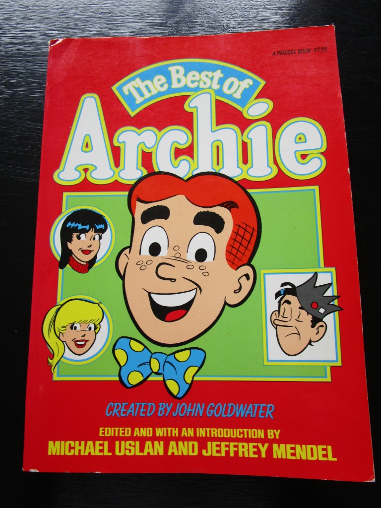
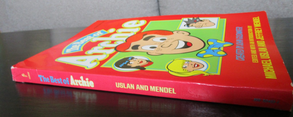
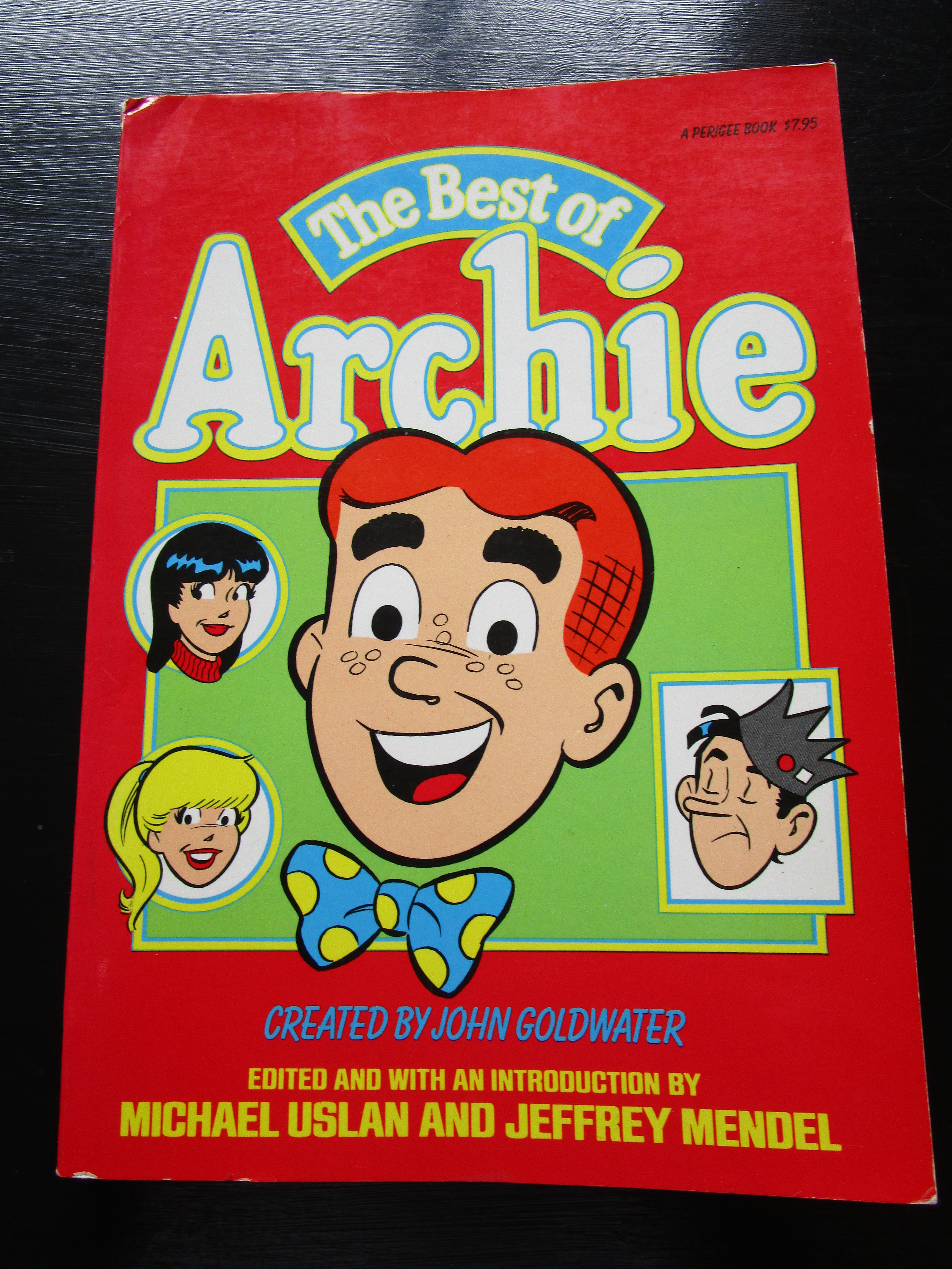
Figs. 1 and 2. Cover and spine of The Best of Archie © 1980 Archie Comics Publications, Inc.

2010s Nostalgia for 1970s Nostalgia for the 1950s

In 1970s America the 1950s were in vogue. This could be seen in the reruns on TV, the lyrics of Don McLean’s song “American Pie” (1971) and films such as American Graffiti (1973) (actually set in early 1960s). From the 1950s and earlier, the nostalgia movement plundered the twentieth century for styles that could be brought back and sold to consumers. Film and fashions alike reflected this obsession with the commodities that constituted America’s national past (Carroll 71, 297).

The teenage comic character Archie Andrews first appeared in 1941. His fictional world – Riverdale High School, Pop Tate’s Choklit Shoppe, the dating and the trips to the beach – is of a piece with that mid-twentieth-century culture the United States hankered for so powerfully in the 1970s. As the introduction to the 1980 book collection The Best of Archie puts it, “At first glance, it appears that the strip had remained virtually static since the early days. The same characters are at the same malt shop, in the same jalopy, on the same beach, and in the same school doing the same things they were doing during World War II.” (Uslan and Mendel 9-10)

IMG_6609

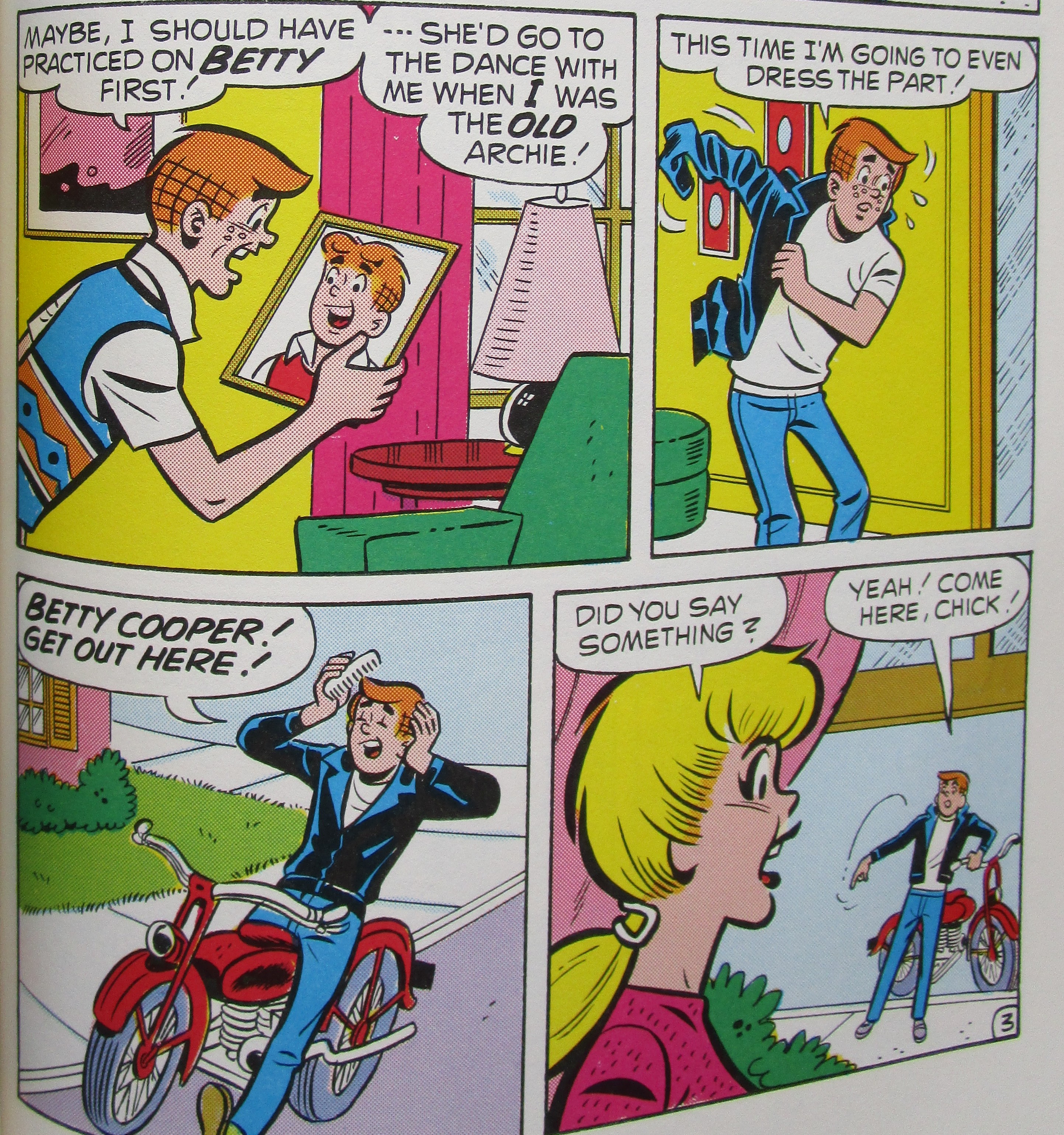
Fig. 3. Page 185 of The Best of Archie © 1980 Archie Comics Publications, Inc.

The early 1970s Archie story “A Fool for Cool,” reprinted in The Best of Archie, plays with 1950s nostalgia in what builds up into a feedback loop of allusion. The plot is simple: a television show, clearly a version of Happy Days,[1] has made a star of the character “Funzee” – a bequiffed, leather-jacket-wearing, motorbike-riding lothario. Archie is advised that if he wants “to get anywhere with girls” (183) he needs to adopt the ways of Funzee and just tell the girls in his life they’re going to the dance with him. So Archie has his hair cut like Fonzie, sorry, “Funzee,” and tries to be forceful with Veronica. She tells him to leave. Archie throws on Funzee’s white t-shirt and leather jacket and turns up outside Betty’s house to tell her she’s coming with him (fig. 3). Betty’s parents collapse with laughter; Betty refuses and suggests Archie has been watching too much TV. Later, the three teenagers sit in the Choklit Shoppe eating sundaes, and Veronica and Betty explain to Archie that “just because we dig a character on TV doesn’t mean we’d dig him in real life!” (186) It’s Archie and not Funzee they want – but when a friend rushes in to announce “the guy who plays Funzee on TV is making an in-person appearance at the supermarket” (187) Betty and Veronica knock their table over in their rush to see him. They run off, calling Funzee’s name, as Archie lies dazed on the floor covered in ice cream (fig. 4).

IMG_6611

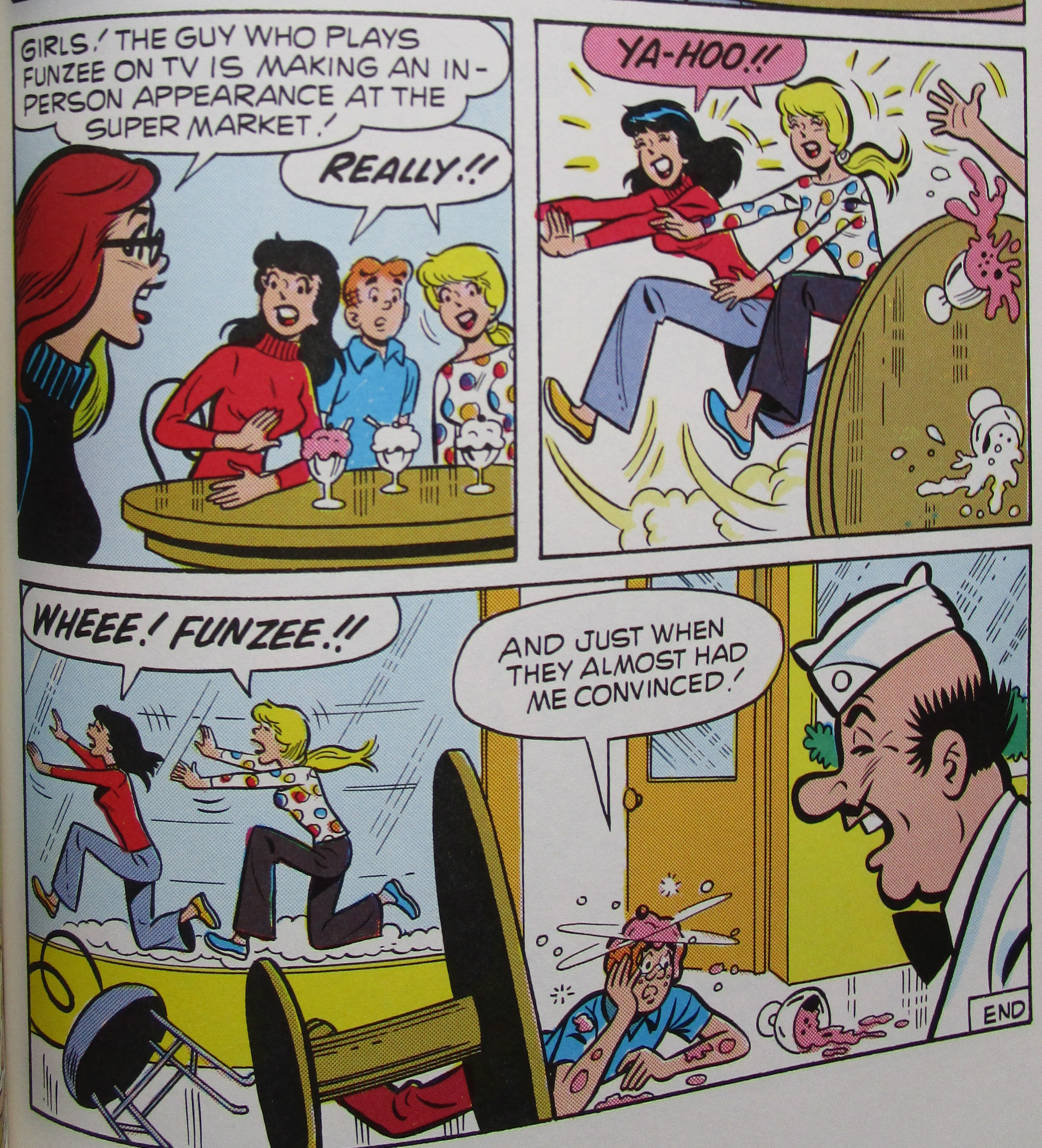
Fig. 4. Page 187 of The Best of Archie © 1980 Archie Comics Publications, Inc.

For much of this comic we might think it is a morality tale on the seductions of popular culture, a particularly self-reflexive reminder that the image-world of the 1950s found in 1970s mass media is a set of representations for which no actual referents exist. These can be enjoyed when they appear in their allotted exhibition space (“we dig a character on TV”) but we should be highly suspicious if they are taken to have some sort of weight in our lives. Given that the debut of Happy Days “coincided almost exactly with the collapse of Archie comics’ sales” (Beaty, Archie 6) we could read this critique as a defence reflex. Archie comics are protecting their territory from the new interloper.

But wait… is “A Fool for Cool” implying that readers should be just as suspicious about the Archie comics and the Riverdale they show us? One could read this as the comic interrogating itself, proposing that what is being depicted is not so much the 1950s themselves but the 1950s that America wished it had experienced between the 1940s and 1960s: peaceful, fun, affluent, full of adventure and with times of fruitful maturation ahead.

The joke, of course, is that Veronica and Betty may well care for Archie himself and not Funzee but as soon as the actor turns up in the vicinity they run off to see him. Perhaps this is part of the story’s critique: we knowingly indulge in the nostalgia boom, fully aware that the 1950s didn’t look like it does in Happy Days but wilfully suspending our disbelief. Veronica and Betty have mastered this process, and in some senses are the nostalgia boom’s ideal consumers, not Archie: because Archie believes that the 1950s lives he emulates can be inhabited and exert social leverage in the world, he can be snapped out of that belief too. The two women know that Funzee is not real and that his forceful attitude towards females is risible, but they crave the pleasure of seeing him in the flesh, a different type of investment in the aura of presence. And because it is seemingly more knowing, it is shaken less easily. If I was out to try my readers’ patience, I’d elaborate on this possibility: “A Fool for Cool” dramatizes a clash of consumption practices in the middle of the twentieth century. Archie is persuaded to become a modern consumer who invests in the characters of serial narratives and feels a personal stake in their existence (there’s something of Jared Gardner’s Projections here); Betty and Veronica are postmodernist consumers whose cynical distance in no way mitigates the impassioned pleasure they take from characters whose verisimilitude they deride.

The final image has Archie prone and confused (perhaps he’s been reading my blog) and Pop Tate looks on, silently laughing. The final twist in the tale? The Choklit Shoppe was, according to the introduction in The Best of Archie, “the soul and inspiration of ‘Arnold’s’ on the TV show ‘Happy Days’” (Uslan and Mendel 9) and Beaty thinks Arnold’s is “essentially” a direct copy of the Choklit Shoppe (Archie 184). I’m trying to work out who the joke is on: the character Archie, for sure. Also the Archie comics themselves, trumped by a televisual successor? Does Pop Tate’s final presence remind readers that the original is the best, the authentic, the one and only, or has his – and Archie’s – laughter been stolen away by the usurper Happy Days?


The Pureheart Returns

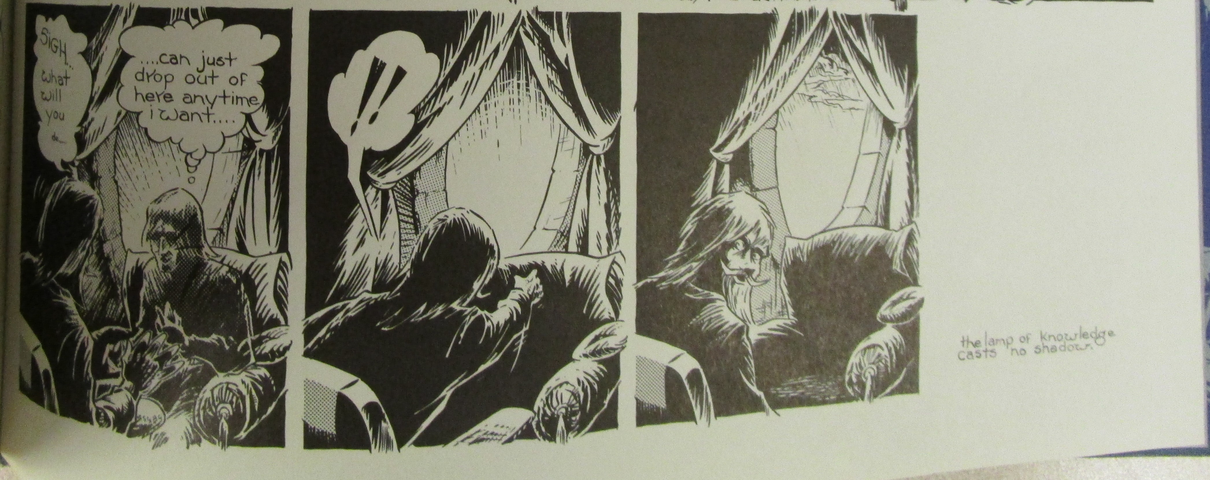
The Best of Archie, which reprints all of its comics in full colour, tries to capture the variety and major permutations of the Archie franchise. There are historical fantasies, gangster daydreams, SF adventures, stories where Dilton and Chuck are the protagonists, or Betty and Veronica, or Jughead, or Little Archie. It reprinted the origins of Pureheart the Powerful, Archie’s superhero alter ego, a story which originally appeared in Life with Archie #46 (Feb. 1966). In this story the red-headed teenager learns how to transform into a super-powered crime-fighter by calling upon “the power of the pure heart!” (71)

IMG_6613

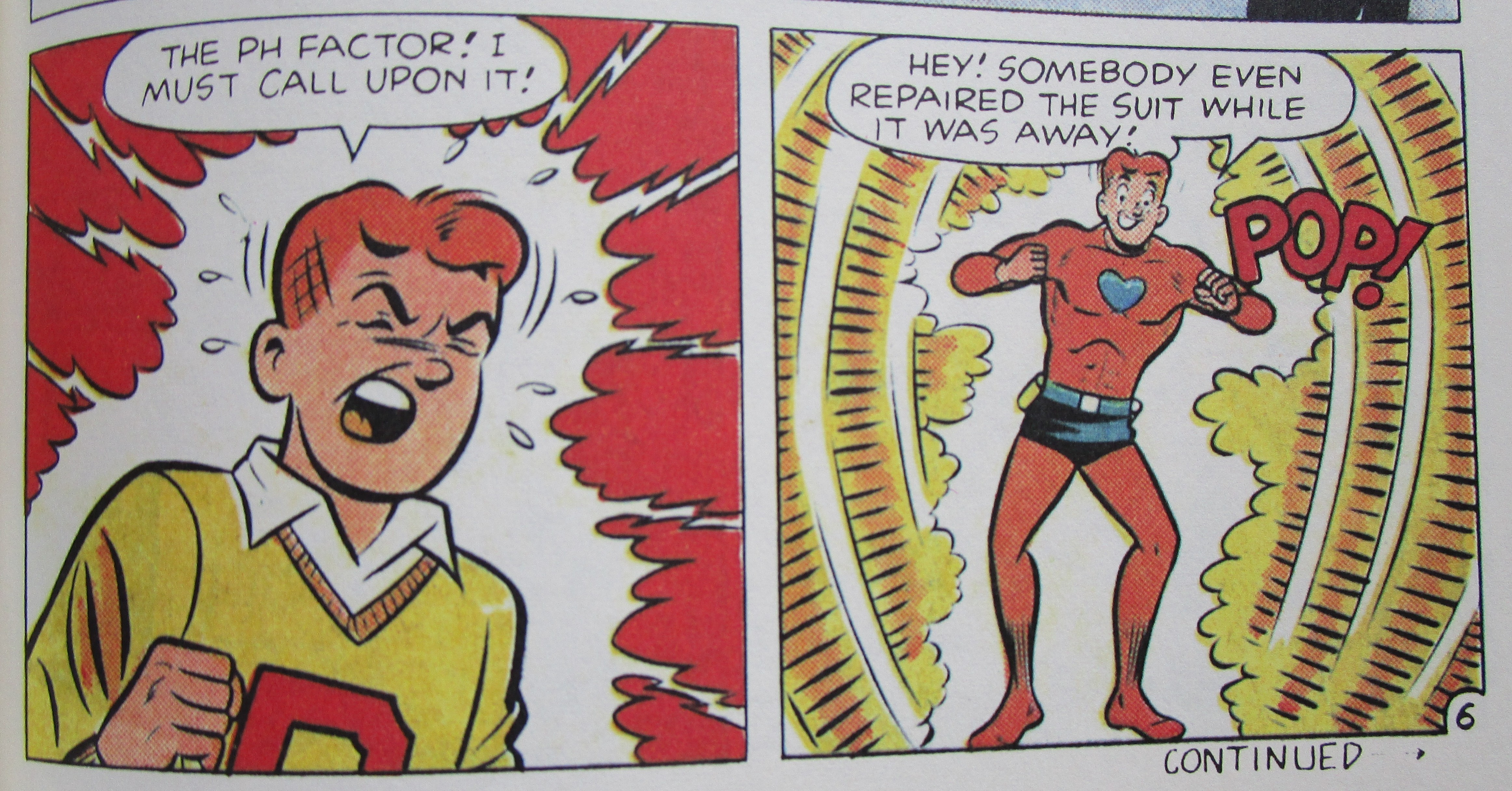
Fig. 5. Page 75 of The Best of Archie © 1980 Archie Comics Publications, Inc.

In a swipe against generic conventions, Archie’s suit inexplicably repairs itself between his stints as Pureheart. The suit repairing itself is not so unusual, but superheroes don’t usually draw attention to this illogical (but highly convenient) commonplace in the genre (fig. 5).


Why Buy Old Comic Books When You Can Buy Books of Old Comics

Jules Feiffer started it. When a newspaper cartoonist like Feiffer edits a lavish book of mid-twentieth-century superhero comics for the respected Dial Press, the hacks raise one eyebrow. When it includes an articulate introductory essay drawing on Feiffer’s experience as a pro, the hacks sit up. And when that book coincides with a hubbub of media attention about hip superheroes and comics on campus, further stoked by the popularity of the Adam West Batman TV series… no wonder Feiffer’s The Great Comic Book Heroes (1965) caught the imagination of comics fans in the mid-1960s.

It wasn’t until the next decade that comics companies and trade publishers really joined forces to reprint the comics of eras past. These book collections often had some stories from the 1970s but made a virtue of presenting the best of comic book history back to the late 1930s. The Best of Archie contains comics from the 1940s, 1950s, 1960s, 1970s and 1980s.

Where the books reprinting Marvel comics are concerned, check out Robert G. Weiner’s Marvel Graphic Novels and Related Publications: An Annotated Guide to Comics, Prose Novels, Children’s Books, Articles, Criticism and Reference Works, 1965-2008 (2008). I won’t list every title in Weiner’s bibliography, but the Marvel reprint activity includes:

  • The Marvel Collector’s Album series that Lancet Books brought out (1966-67).
  • The so-called “Origins books” published under Simon and Schuster’s young adult imprint Fireside Books (1974-79).
  • The Pocket Paperbacks series that began in 1977 and ran into the 1980s.
  • Grosset & Dunlap’s Ace Tempo paperbacks, which often reprinted fairly recent comics series (e.g. Battlestar Galactica, Conan the Barbarian) linked to properties popularised by other media. These seem to start in 1978.

I don’t know that anyone has compiled a similar bibliography for DC’s books, but where the 1970s is concerned it would need to include:

  • Three book collections of DC comics printed by Fireside Books: America at War: The Best of DC War Comics (1979), Heart Throbs: The Best of DC Romance Comics (1979), and Mysteries in Space: The Best of DC Science-Fiction Comics (1980).
  • Grosset & Dunlap’s Ace Tempo paperbacks of DC superheroes. I have five: Superman, The World’s Finest, The Justice League of America, Wonder Woman, Superboy and the Legion of Superheroes (all published 1977-78).
  • Secret Origins of the DC Super Heroes (1976), published by Harmony (a division of Crown Books).
  • From 1972, the Paperback Library’s two-volume Green Lantern starring Green Arrow.
  • Also from 1972 a book of Wonder Woman comics published by Holt, Rinehart and Winston.
  • Two substantial (380+ pages) collections by Bonanza Books from 1971: Superman: From the 30’s to the 70’s and Batman: From the 30’s to the 70’s (rogue apostrophes in the original titles).

The hardback collection of Wonder Woman comics published by Holt, Rinehart & Winston was a collaboration between Holt and Ms. Magazine. Gloria Steinem wrote the introduction and the prefaces to many sections, explaining Wonder Woman as a feminist icon. Sacks suggests there was a corporate, as well as ideological, synergy between America’s most prominent feminist magazine and the DC superhero. Ms. began in July 1972 and was bankrolled and published by DC’s corporate owner (85).

It was not only big trade publishers repackaging stories from old comic books. Robert K. Wiener’s Archival Press brought out three books at the end of the 1970s: Miss Fury (1979) by Tarpe Mills, in which crime-fighter Miss Black Fury defends the US from a spy ring, the SF adventures of Spacehawk (1978) by Basil Wolverton, and the horror / SF short stories that Berni Wrightson wrote and drew between 1968 and 1971 collected in Back for More (1978).

Remember this is hardly a conclusive summary, and I’m not even talking about the reprint collections of newspaper strips.


Archie-cana

The 1970s book collections enabled later generations to familiarise themselves with the history of the medium. This preservation of texts was justified on the grounds that here is a window onto the nation’s cultural soul, a common enough defence for the study of American comics (Beaty, Art 29). Carmine Infantino’s short introduction to Secret Origins of the DC Super Heroes asserted that America’s superhero comics were an unappreciated vernacular form, akin to woven blankets or blown glass: “The craftsmen who created the stories in this volume were worried about feeding those voracious presses, not about how posterity might judge their work.” And as “with jazz and American films, the Europeans – particularly the French – recognized cultural value in what most natives dismissed as so much fish-wrapping, the comics. They […] have given a cachet of respectability to a vital part of our folk art” (11). Let others decide the cultural worth of the comics in the stale air of posterity: the craftsmen that hewed these texts were too busy rolling their sleeves up and earning an honest living to do so themselves. In Infantino’s telling the early comics creators were grappling with the locomotive energy of a bustling cultural industry and maintaining the vivacity of America’s popular culture. Infantino’s choice of words implies these comics deserve reprinting because they provide an “insight into national character” (Beaty, Art 29), in this case American dynamism and graft.

The related rationale is that these comics are primary sources for historical study. Michael Uslan’s edited collection America at War included “some of the ads that appeared with the war stories. […] They’re there just to remind you of what some folks were trying to sell you back then.” (4) This volume also included a “DC War Comics Bibliography” (243-45) and an “Index to DC’s 1950s Frontier War Comics” (247) so eager researchers can track down the entire DC war comic output at marts, conventions and comic shops.

Both impulses are apparent in The Best of Archie. As the introduction explains, the cast of characters reproduced in the collection have become “part of Americana.” Archie himself has taken “his place in American folklore” and his “roots are all-American” (Uslan and Mendel 7-13). The two-page “The Archie Archives,” a brief listing of the runs of comics featuring Archie, is provided to assist readers who want to track down the entire history of the character. And it is clear that the selection of comics has been made with an eye on the Archie comics as a barometer of changing American values, from transient fads (CB radios and video tapes) to more profound social issues and morals (communes, racial prejudice and the women’s movement). In fact these comics seem very carefully chosen to express, in the words of Archie co-publisher John Goldwater, how the Archie comics “have to be relevant to the year in which we’re publishing or we’ll start losing our readership” (qtd. in Uslan and Mendel 10). “Don’t Quote Me” (1980), a story in which Mr. Weatherbee gets “hooked on the preaching of […] a phoney prophet who preaches simple living from the back seat of a limousine” (152-54), seems to have been included to prove that the comics are hip to the self-awareness movement (which was really a 1970s phenomenon, but you get the idea).


The Pureheart Triumphant

The Best of Archie was edited by Michael Uslan and Jeffrey Mendel. In the 1970s Uslan wrote some Batman stories for DC and by the time The Best of Archie was published he co-owned the movie rights to the character of Batman. Uslan would go on to be an executive producer on all the Batman films from Batman (1989) onwards.


Archie for Sale

The Best of Archie was sold for $7.95 (in paperback) and $14.95 (in hardback). These prices were consistent with other reprint books: the Marvel Fireside Books, which had the same page dimensions and were also in colour, ranged from $3.95-$7.95 (paperback) and $10.95-$14.95 (hardback) (these prices are taken from the Pacific Comics Catalogue for Aug.-Oct. 1980). In January 1977 Clay Geerdes reported that the Secret Origins of the Super DC Heroes paperback was retailing for $6.95. The Wonder Woman hardcover retailed at $12.95.


This Blogpost Is Just a Cheap Rip-Off of Bart Beaty’s Twelve-Cent Archie, Isn’t It?

Imitation is the sincerest form of parody. No, wait, parody is the lowest form of wit; irony is the second cousin of flattery. Or, as Mr. Weatherbee puts it, “Time is the salad dressing of life.” (151)

July 2015


Endnotes

[1] Do I have to explain what Happy Days was? Yeesh. OK, it was a nostalgic early 1970s sitcom set in the 1950s and revolving around the lives of a group of teenagers. The milieu bears some similarity to the world of Riverdale, and red-headed star of the show Ron Howard, who played the character Richie Cunningham, bore some resemblance to Archie Andrews. I mean, ‘Richie’ is virtually ‘Archie’…

Bibliography

Beaty, Bart. Comics Versus Art. Toronto: U of Toronto P, 2012. Print.

—. Twelve-Cent Archie. New Brunswick, NJ: Rutgers UP, 2015. Print.

Carroll, Peter N. It Seemed Like Nothing Happened: America in the 1970s. New Brunswick; Rutgers UP, 1990. Print.

Gardner, Jared. Projections: Comics and the History of Twenty-First-Century Storytelling. Stanford: Stanford UP, 2012. Print.

Geerdes, Clay. Comix World 64 (15 Jan. 1977). Print.

Infantino, Carmine. Introduction. Secret Origins of the DC Super Heroes. Ed. Dennis [sic] O’Neil. New York: Harmony, 1976. 11. Print.

O’Neil, Dennis, ed. Secret Origins of the DC Super Heroes. New York: Harmony, 1976. Print.

Pacific Comics Catalogue #12 (Aug.-Oct. 1980). Bound within The Comics Journal 59 (Oct. 1980). Alexander Street Press Underground and Independent Comics. Web. 18 Dec. 2014.

Sacks, Jason. American Comic Book Chronicles: The 1970s, 1970-1979. Raleigh, NC: TwoMorrows, 2014. Print.

Uslan, Michael, ed. America at War: The Best of DC War Comics. New York: Simon and Schuster, 1979. Print.

Uslan, Michael, and Jeffrey Mendel, eds. The Best of Archie. New York: Perigee, 1980.7-13. Print.

Weiner, Robert G. Marvel Graphic Novels and Related Publications: An Annotated Guide to Comics, Prose Novels, Children’s Books, Articles, Criticism and Reference Works, 1965-2008. Jefferson, NC: McFarland, 2008. Print.

Beyond Time and Again

CREATOR/S: George Metzger

YEAR: 1976

PLACE: Huntington Beach, CA

PUBLISHER: Kyle & Wheary

ORIGINAL PRICE: $10.95

PRINT RUN: TBC

WHERE CAN I READ IT FOR MYSELF? Columbia University Butler Library

 MET1

Fig. 1. Cover of Beyond Time and Again © 1976 George Metzger

What a beautiful book Metzger’s Beyond Time and Again (1976) is! A 9½ x 7½ blue hardback, in landscape format, with lavish endpapers (see fig. 2). Based on the information in Clay Geerdes’s newsletter Comix World (Sept. 1976) I believe Metzger’s book was originally published with a “color wraparound dust-jacket” (alas, this wasn’t present when I consulted a copy). Its printing was timed for the 1976 San Diego Comics Convention, and copies were rushed there within hours of coming out of the bindery. “Between advance sales and wholesale purchases […] at the convention we had our money back that first day,” one of the publishers, Richard Kyle, later reported in a letter to the magazine Comic Book Artist, but “we’d published the book solely because we believed in it” (13).

MET2

Fig. 2. Endpapers of Beyond Time and Again © 1976 George Metzger

 The book’s arrival had been anticipated since November 1973: the back cover of that month’s Wonderworld advertised the publication of Metzger’s book, “America’s first graphic novel.” Many of Wonderworld’s readers would have known that the term ‘graphic novel’ was one of Kyle’s, coined in 1964 (along with ‘graphic story’) to denote an intelligent and sophisticated use of the comics medium. Kyle is a key figure in the development of an adult audience for comics. In addition to his contributions to the APA Capa-alpha and Bill Spicer’s Fantasy Illustrated / Graphic Story Magazine, Kyle’s magazine Wonderworld (which began life as Graphic Story World) acted as a forum for comics scholarship and as a catalogue of sorts for the Graphic Story Bookshop which Kyle ran with Fred Patten in Long Beach, CA.(i) In Wonderworld’s first editorial in August 1973 Kyle wrote that this magazine “will help shape” the “destiny” of the graphic story as “the most significant artform of the last quarter of our century” (2).

MET3

Fig. 3. Title page of Beyond Time and Again © 1976 George Metzger

Metzger was highly praised in fan circles during the 1960s and 1970s. The imaginative comics he drew for Fantasy Illustrated / Graphic Story Magazine displayed an impressive command of the mechanics of comics storytelling. In retrospect, they appear to be a harbinger of the experiments of the underground (Schelly 131). A hardcover book containing a long comics narrative by Metzger? No wonder Geerdes called it “George Metzger’s long awaited graphic novel” (the September 1976 newsletter of Comix World).

I know it is hardly ground-breaking to read the protagonist of a narrative as a stand-in for the creator, but the hero of Beyond Time and Again Seth of Comstock (that name itself is full of allusions) is in an analogous position to Metzger. At the start of the book, in a future Earth, the restless Seth sets out on a quest to discover whether the spells of the Ancients still exist. Seth is a magician, left “these few ancient spells and runes” by his “late father,” and he is described as “seeking the Arts of the Past to escape the future…” [10].

Metzger seems to be dramatizing his own position as an innovative comics creator, using the practices of the past but seeking to expand his repertoire of technique. The names of those runes and spells he seeks – “the Rune of Everchange, the incantation of the Slow Hour” – invoke the notion of panel transitions (the sequential art at the heart of one definition of comics) and manipulating time so it appears to slow down. Seth goes questing in order to “inquire” whether the Ancients’ spells “are left in the world today” and Metzger too uses the space of the book as an exploration of formal techniques [10]. When Seth walks through a time distortion spell without problem, another wizard wonders if he has found a man with “some latent ability to move thru time” [24] – surely the very thing Metzger was trying to do with his comic, manipulate space to give the impression of temporal change. As well as panel transitions, Metzger uses De Luca Effects to show Seth moving between the future and the present (see fig. 4). One striking sequence is a silent lovemaking scene [34-35] that I won’t reproduce here, but I wonder whether it’s the sort of thing Metzger had in mind when he described being influenced by “japanese comics for awhile which are very visual, very film-like, & I took to doing more visual stuff, letting the story be told by visual action & dialogue” (qtd. in Geerdes’s Comix World newsletter #30 in 1975).

MET4

Fig. 4. Page [45] of Beyond Time and Again © 1976 George Metzger

I find it difficult to believe my interpretation is reading too much into the text; Seth’s return to the ‘present’ is described as “dropping back into the past sequences of the continuum…” [45]. Again and again, there seems to be congruence between Metzger the creator and Seth the character, both learning how to master the rules of time in comics.

MET5

Fig. 5. Page [42] of Beyond Time and Again © 1976 George Metzger

In the far, far future to which Seth journeys, only women are still alive, and he becomes the father of all humankind to come, seeding life right before the explosion of the Sun that ends the existence of the Earth (see fig. 5). This could potentially be an act of high hubris given the terms of my reading, a metaphorical prediction that the race of comics writers and artists who follow in Metzger’s wake will bear his evolutionary trace. But at the very end of the book, with Lolcraft trying to persuade Seth to share his knowledge, Panchandara tells the magician he must “seek it within your own mind. it [sic] is there!” [49] What we have in Beyond Time and Again is Metzger’s experiment, but other creators must conduct their own, not recreate this one. The book ends in a state of irresolution. Seth disappears at the narrative’s enigmatic conclusion, and Lolcraft, turning back to look over his shoulder, shares a moment of incomprehension with the reader (see fig. 6). What next for the characters… what next for comics?

MET6

Fig. 6. Page [49] of Beyond Time and Again © 1976 George Metzger

June 2015


Endnotes

(i) A detailed account of the life of the Graphic Story Bookshop will appear in my future book on the novelization of comics.


Bibliography

Beyond Time and Again. Advertisement. Wonderworld: The Graphic Story World 3.2 (Nov.

1973): back cover. Print.

Geerdes, Clay. Comix World 30 (1975). Print.

—. Comix World 56 (15 Sept. 1976). Print.

Kyle, Richard. Letter to the Editor. Comic Book Artist 8 (May 2000): 13. Print.

—. “Wonderworld.” Wonderworld: The Graphic Story World 3.1 (Aug. 1973): 2. Print.

Schelly, Bill. The Golden Age of Comic Fandom. Rev. ed. Seattle: Hamster Press, 1999. Print.


Captain Kremmen and the Krells

CREATOR/S: Original concept by Kenny Everett, written by Chris Browne, designed and drawn by Roger Wade Walker, lettering by Chris Welch

YEAR: 1977

PLACE: London

PUBLISHER: Corgi Books

ORIGINAL PRICE: £1.50

PRINT RUN: Not known

WHERE CAN I READ IT FOR MYSELF? The British Library

KC2    KC1

Fig. 1 and 2. Cover and spine of Captain Kremmen and the Krells © 1977 Everex Marketing Company

For my generation, memories of the comedian and broadcaster Kenny Everett start with his appearance at a rally for the Young Conservatives in 1983, and his giant-foam-gloved exhortation “Let’s bomb Russia!” Everett (1944-1995) specialised in a fast-paced, wacky, risqué brand of comedy. As his notorious joke in 1983 indicates, his humour frequently pushed the boundaries of taste. Everett’s antics were reported with horror in the national press, but this did not stop him rising to fame in the 1960s and enjoying a highly successful broadcasting career on radio and television up to the mid-1990s. Hogg and Sellers’s 2013 biography of Everett starts with the “Let’s bomb Russia!” exclamation; this scene is held back until the second page of Andrew Marshall’s foreword to the Everett book by David and Caroline Stafford (also published in 2013). Both biographies resist the idea of Everett as a good Conservative party supporter, emphasising his iconoclasm and his willingness to outrage good taste across the political spectrum. Everett was happy to make the Conservative Prime Minister Margaret Thatcher the butt of his controversial jokes too; apparently Everett could not stand Thatcher, even if he did lean to the right politically (Hogg and Sellers 9, 284: Stafford and Stafford 197-201).

I haven’t done with politics completely, but for the time being let’s turn to the 1977 book Captain Kremmen and the Krells, based on one of Everett’s comic creations. Over a 62-page sequential art narrative we follow the titular character from boyhood to Kremmen’s first mission in charge of the intergalactic vessel Troll 1. The majority of the book depicts the hero’s adventure to save the city of Liverpool from destruction by the Krells, and even after defeating these alien invaders our hero has a further quest to fulfil, regaining command of Troll 1 following an attempted coup. What makes Captain Kremmen and the Krells especially worth one’s attention is that, as I write this in 2015, it appears to be an early example of the British underground graphic novel. This may seem an unusual suggestion since Captain Kremmen and the Krells was issued as a 10¾” x 8” paperback by trade publisher Corgi Books, an imprint of Transworld Publishers, but consideration of the book’s history and the text itself will hopefully bear out my contention.

According to DJ Dave Cash the Captain Kremmen character came to life in the summer of 1965 when he and Everett co-hosted a show on pirate radio.[i] Cash recounts that Kremmen appeared on The Kenny & Cash Show for about three months, but perhaps only for a few seconds at a time. Kremmen became a substantial part of Everett’s radio shows in 1976, when Everett used the space-travelling hero as the main character in a regular science fiction-comedy serial. This serial, full of puns and innuendo, appeared in Everett’s broadcasts for the London-based station Capital Radio.[ii] Everett made recurring use of flamboyant comic characters and the Captain Kremmen serial was a pastiche of the science fiction texts of the comedian’s youth. The aliens named in the title of Captain Kremmen and the Krells allude to the Krell from the 1956 American film Forbidden Planet. Everett had been a devotee of Saturday morning cinema serials (his favourite was Flash Gordon) and The Adventures of Dan Dare radio show, based on the strip from the British Eagle comic (Hogg and Sellers 21, 24). When Everett appeared on BBC Radio 4’s Desert Island Discs, a programme on which public figures choose items for a sojourn on a desert island, he selected an Eagle annual as the book he would like to take with him (Stafford and Stafford 154).

Kremmen proved highly popular with fans in the second half of the 1970s, spawning a torrent of merchandise: an LP record of episodes, watches, T-shirts, patches, badges, key rings, dolls and a Captain Kremmen single. The character starred in a comic strip in a London newspaper and a series of cartoons were created by Manchester-based animators Cosgrove Hall for the Kenny Everett Video Show. This was Everett’s live music and comedy sketch show, which first appeared on Britain’s television screens in 1978 (Hogg and Sellers 233-38; Stafford and Stafford 167). Kremmen: The Movie was released in July 1980 but due to financial constraints it was only 25 minutes long and was exhibited as the B-feature to the Village People’s film Can’t Stop the Music (Hogg and Sellers 240-43; Stafford and Stafford 178-79).

The franchise had a transatlantic reach, even if Everett made very little money from all this merchandising activity: the Captain Kremmen radio serial was syndicated in the USA (Hogg and Sellers 235, 243) and Captain Kremmen and the Krells was advertised in the December 1977 issue of The Comics Journal. The advert’s explanation of the character’s provenance suggests that the British dealer did not take it for granted that readers would be familiar with him: “Captain Kremmen’s adventures are related by Kenny Everett every Saturday on Capital Radio, but, thought Corgi, why should London be the only town to suffer[?]” (Campbell 50). It seems appropriate that this character partly inspired by American science fiction should journey across the Atlantic, although the everyday details of 1970s Britain keep peeping out from behind Captain Kremmen and the Krells’s futuristic setting. The rubbish bins have “KEEP TROLL ONE TIDY” on them, mimicking the Keep Britain Tidy slogan of the period, and the Krells intend to destroy Liverpool on their way to a holiday in Blackpool, a seaside resort in north-west England. After the aliens have been successfully defeated, Kremmen’s starship flies into the London Astroport, “where only the Customs men are allowed to go on strike,” a reference to the industrial action taken by British Air Traffic Control Assistants in 1977.[iii]

So the immediate context for Captain Kremmen and the Krells’s publication is the strong commercial prospect for tie-in material related to Everett’s radio and television shows. The comedian’s name sits across the book’s title on the front cover and on the title page – the credits for the book’s actual creators are tucked away in the indicia. Yet, in translating Everett’s radio character into comics form, the creators of Captain Kremmen and the Krells produced a text with striking similarities to the underground comix movement, both in the UK and the USA. The book’s letterer Chris Welch was one of the better-known underground creators in Britain at the time, and I discussed his Introduction to Chile: A Cartoon History (1976) (a left-wing graphic history) in an earlier blogpost. The background of artist Roger Wade Walker was in illustration but he did occasional uncredited work for Fleetway’s aerial warfare comic Air Ace Picture Library in the early 1960s. Walker was included in the project because of his friendship with Everett; as the comedian’s neighbour the artist had spent time in Everett’s home studio and observed him recording the Kremmen serials. Walker, who shared Everett’s love for the Eagle, first depicted Kremmen in a visual style whose realism was akin to that comic’s Dan Dare strip. The artist recollects that the final, cartoonish version came about because Kremmen needed to resemble the character depicted in the animated shorts, and Cosgrove Hall could not produce an animated version of Walker’s Eagle-inspired pencils in time for broadcast on the Kenny Everett Video Show (Walker).

So, unlike Welch, the book’s artist did not emerge from the underground, but there are affinities between Walker’s art and the work of the comix creators. The design of the insect-like Troll 1 (see fig. 3 and 4), for instance, is visually distinctive, and its eschewal of aerodynamic slenderness reminds me of the spacecraft drawn by Vaughn Bodē, which also appeared unlikely candidates for defying gravity.

KC3      KC4

Fig. 3 and 4. Panels from Captain Kremmen and the Krells © 1977 Everex Marketing Company

Walker’s attempt to visualise Everett’s fast-changing and unpredictable comic imagination led to the artist depicting a universe of ontological instability that chimed with the rejection of diegetic coherence that one observes in the comix. Walker inserted into the comic “Quick change surreal background objects. Objects that come and go for no reason but produce a strange tense world, which was supposed to run as a counterpoint to Everett’s own mad imagery.” (Walker) Other instances of formal experimentation include self-reflective devices, with Captain Kremmen offering asides to the reader, at one point resting his arms on the bottom of a panel and addressing us directly about the Krells’ plan to destroy Liverpool (see fig. 5). The underground hardly had a monopoly on characters rupturing the pretence of a self-enclosed fictional world, but comix creators did make use of this form of address.

KC5

Fig. 5. Panel from Captain Kremmen and the Krells © 1977 Everex Marketing Company

Walker’s attempt to capture the surrealism and formal play of Everett is evident early on in Captain Kremmen and the Krells, when Kremmen rips off the leg of a school bully, and the leg subsequently drips blood into the panel below. A teacher looks on through a window frame supported on a set of wooden legs, part of a strange, outdoor office set up in the middle of a field for no perceivable reason. Shortly after, in a panel that conveys the social enforcement of homogeneity of thinking, a row of schoolboys huddled over their desks think in unison “I MUST NOT TALK IN CLASS” (see fig. 6). This critique of conformity of consciousness accords with many underground comix texts from the 1960s and 1970s. From rock opera to psychological treatise many texts intended to reach countercultural audiences reflected this core position: the key institutions through which children in Western capitalist democracies are socialised are highly suspect because those institutions operate a system of reward and punishment that disciplines subjects into following lines of thought and behaviour that support the reproduction of an insidious socio-economic system and deter the possibility of alternative ways of living. KC6

Fig. 6. Panel from Captain Kremmen and the Krells © 1977 Everex Marketing Company

There is one more way in which Captain Kremmen and the Krells evokes the underground comix, and that is the flaunting of offensive material, notably in terms of ethnic caricature. The book is riddled with stereotypes of German, Jewish, Scottish, Chinese and black characters. As with similar stereotypes used elsewhere in the underground (Robert Crumb’s depictions of African Americans being the most discussed), these images confront the reader with a mode of representation that exaggerates the physical attributes of (usually disempowered) ethnic groups in order to encode them with derogatory mental and moral characteristics. How we read the racial politics of such representations in the underground comix remains a subject of debate; commentators are undecided as to whether they are a progressive / satirical encounter with a repressed history of racism, or whether they constitute the casual recycling of unacceptable imagery.[iv] At this point I am reminded of the comment made by Everett’s biographers that the comedian never stopped to think about jokes such as “Let’s bomb Russia”; he was trying to make people laugh, without regard for the political meaning of those words, at that rally, at that particular point in history. Everett appears to have had little to do with Captain Kremmen and the Krells, but we could make the same point about the presence of offensive stereotypes in the book: getting a controversial laugh superseded reflection on what those stereotypes might mean and what their consequences might be.

Having the reached the subject of politics and provocative humour, we have returned to where we began. Artist Roger Wade Walker’s inventive reworking of storytelling conventions makes Captain Kremmen and the Krells a fascinating document in comics history. It was not Walker’s intention to mimic the underground but his innovations are akin to those found in the comix, and in the 1970s few British creators were experimenting in such a way in a long-length narrative.

May 2015


Endnotes

[i] The name of Captain Kremmen came from Superfun, a library of comedy “drop-ins” (very short audio recordings used on radio shows) produced by Mel Blanc, the voice actor, and his son Noel. The drop-ins from the Superfun library included mock adverts for products manufactured by the Kremmens company (Hogg and Sellers 230-33; Stafford and Stafford 154-55).

[ii] Everett made the two-minute episodes in his home studio, although exactly when he stopped doing so is unclear. When he left Capital in August 1980 he was no longer making episodes to air on his own show, although he appears to have continued recording episodes for the radio station (Hogg and Sellers 230-33; Stafford and Stafford 154-55).

[iii] It is difficult to work out who this joke is on: is this the grim humour of left-wing pessimism that recognises the UK’s political slide to the right, foreseeing a future in which draconian government makes it impossible for certain workers to go on strike? Or are we laughing at the Air Traffic Control Assistants for engaging in a futile industrial action, an atavistic political gesture whose backward nature is underlined by its impossibility in a technologically superior future? Or does neither apply?

[iv] Leonard Rifas wonders whether the stereotypical representations in the underground comix might raise awareness and “accomplish an anti-racist purpose” by helping “us better recognize this undercurrent in popular culture as a sickness” and leading one “to identify and reject such stereotypes.” In this way the stereotypical images in the comix may “cause less harm than more normal negative images, which make their insults beneath the level of conscious awareness.” William H. Foster, III’s survey of “The Image of Blacks (African Americans) In Underground Comix” sees the overwhelming use of these racist stereotypes as “satirical” (17) although novelist and scholar Charles Johnson criticises Crumb’s depictions of black people for not being “provocative in any positive way” (13).

Bibliography

Campbell, Colin. “Biytoo Books.” The Comics Journal 37 (Dec. 1977): 50-51. Alexander Street Press Underground and Independent Comics. Web. 30 Sept. 2014.

Foster, William H., III. “The Image of Blacks (African Americans) In Underground Comix: New Liberal Agenda or Same Racist Stereotypes?” Looking for a Face Like Mine: The History of African Americans in Comics. Waterbury, CT: Fine Tooth Press, 2005. 12-17. Print.

Hogg, James, and Robert Sellers. Hello, Darlings! The Authorized Biography of Kenny Everett. London: Bantam, 2013. Print.

Johnson, Charles. Foreword. Black Images in the Comics: A Visual History. By Frederik Strömberg. Seattle: Fantagraphics, 2003. 6-19. Print.

Rifas, Leonard. “Racial Imagery, Racism, Individualism, and Underground Comix.” ImageTexT: Interdisciplinary Comics Studies 1.1 (2004). Dept of English, University of Florida. Web. 29 Apr 2015.

Stafford, David, and Caroline Stafford. Cupid Stunts: The Life and Radio Times of Kenny Everett. London: Omnibus, 2013. Print.

Walker, Roger Wade. Email to the Author. 19 Nov. 2014.

Introduction to Chile: A Cartoon History

CREATOR/S: Collectively written under the general direction of Larry Wright and A. Mago; art by Chris Welch

YEAR: 1976

PLACE: London

PUBLISHER: Bolivar Publications

ORIGINAL PRICE: £1.00

PRINT RUN: Not known

WHERE CAN I READ IT FOR MYSELF? The British Library

    DSC02738

Cover of Introduction to Chile © 1976 Chris Welch and Bolivar Publications

I’m going to suggest – tentatively and acknowledging many exceptions – three dominant trends in the book publication of underground comix:

  • First, collections based on popular underground creators (primarily Robert Crumb, Gilbert Shelton, Richard Corben and Vaughn Bodē).
  • Second, anthologies usually tied to specific companies (e.g. The Best of the Rip Off Press [Vol. 1, 1973]), periodical series (e.g. The Best of Bijou Funnies [1975]) or specific titles and themes together (The Best of Wimmen’s Comix and Other Comix by Women [1979]).
  • Third, educational comix. Sheridan Anderson’s Baron Von Mabel’s Backpacking (1980), for instance, was a pocket-sized book published by Rip Off Press reprinting Anderson’s syndicated strips of backpacking tips. Left-wing histories were prevalent too, and can be divided into subgenres including:
    • Revisionist docudrama, such as Comanche Moon (1979) and Los Tejanos (1982) by Jack ‘Jaxon’ Jackson and Give Me Liberty: A Revised History of the American Revolution (1976) by Gilbert Shelton and Ted Richards, with Gary Hallgren and Willy Murphy
    • Documentary history, such as Larry Gonick’s The Cartoon History of the Universe, Book One (1980)

The book publication of educational comix is not that surprising, since this was a robust aspect of underground periodical publishing in the 1970s. Periodical comix provided information about reproductive rights (Abortion Eve [1973]), nuclear power (All-Atomic Comics [1976]) and consumerism (Consumer Comix [1975]), as well as histories of anarchism and revolution (Anarchy Comics [1978-87]). Readers interested in finding out more about educational underground comix should check out Leonard Rifas, who has written on the history of educational comics and their use; see his entry on this subject in Booker’s Encyclopedia of Comic Books and Graphic Novels (2010). Furthermore, Rifas was the founder of EduComics in 1976, which published educational comic books, including some of the examples mentioned above.

As with the comix movement more generally, the educational genre was frequently allied to left-wing politics, feminism and other progressive causes. The Mexican creator Eduardo del Rio or ‘Rius,’ perhaps best known for his Marxism for Beginners (first English translation 1976), was a major influence on educational comix, specifically on the work of Larry Gonick (Rifas 166; Petersen 224). Starting in the 1960s Rius “perfected a super-quick style of cartooning (using sketchy drawings and pasted-in found illustrations) which enabled him to research, write, and draw a weekly comic book almost single-handedly.” (Rifas 166) In 1969 Rius created Cuba para principantes (Cuba for Beginners), commemorating the tenth anniversary of the Cuban revolution and its achievements. This historical narrative, composed out of photocopies, caricatures and maps, proved popular on American college campuses in a translated version. Significantly, Cuba for Beginners inserted the revolution into the history of belligerence directed towards Cuba by the USA (Petersen 223). I don’t know whether Chris Welch had read Cuba for Beginners but his 95-page comics narrative Introduction to Chile: A Cartoon History certainly seems to come out of the same left-wing practice of collage and appropriation of images.

Welch was fairly well known in British underground comix circles, contributing to the seminal The Trials of Nasty Tales (1973) alongside creators such as Dave Gibbons. Welch was also the artist on Ogoth and Ugly Boot (1973), written by Chris Rowley and Mick Farren, a 31-page comics narrative (referred to as “a full-length novel” [Burns 9] in 1978). Introduction to Chile details the long history of foreign interference in Chile, moving from the Spanish conquest to nineteenth-century British involvement and finally to the twentieth century and the USA’s substantial influence on the country. The USA offered support to the junta that seized power from President Salvador Allende in 1973. Allende was democratically elected in 1970 and his Popular Unity coalition began a series of reforms to improve the country’s economy, industrial productivity, women’s rights, literacy, access to healthcare and housing. Allende’s socialist experiment was a source of fear and resentment for some members of Chilean society, as well as for the US government. This led to the leaders of Chile’s military declaring martial law and bombing the presidential palace with Allende inside; although the circumstances are unclear, Allende died on 11 Sept. 1973. Chile fell under the rule of General Augusto Pinochet and a period of intense political repression – and economic freefall – began.

This is the immediate context for Welch’s history, an account of Chile’s last five hundred years that extensively covers the country’s immediate past and present. Welch’s cartooning is smart, succinct and powerful: in an image encapsulating how junta rule has ravaged the economy, with industrial production falling 35% in two years, a tank outline has been inserted into a line graph representing plunging productivity (fig. 1). To conjure up the murderousness of the regime and their inability to manage the economy, Welch pictures the junta’s failed, C.I.A.-influenced economic plan (“administered by the ‘Chicago Boys’”) as a gangster who thinks you can shoot down inflation (fig. 2).

DSC02739   DSC02741

Fig. 1 and 2. Pages [72-73] of Introduction to Chile © 1976 Chris Welch and Bolivar Publications

Throughout the book Welch uses two characters painting slogans on a wall as a way of vocalising the hopes and opinions of Chile’s working class. Their clothes change in different historical periods, but these characters – types, really – endure as a symbol of the resilience of the Chilean people. After the junta takes power they are forced to carve their messages because paint has become too expensive (fig. 3).

DSC02742

Fig. 3. Pages [71] of Introduction to Chile © 1976 Chris Welch and Bolivar Publications

As with the comics of Rius, and fitting a much longer tradition of appropriating found images for radical purposes that includes the interwar German artist John Heartfield, Welch borrows and adapts photographs, logos and paintings, re-contextualising them to tell Chile’s story. The overwhelming foreign control of the Chilean economy in the 1950s is conjured up in a blizzard of corporate brand names dominating a panel with two Chilean men drinking at a bar (fig. 4). As their speech balloons suggest, this twentieth-century foreign investment has brought the same kind of riches that British investment did, i.e. profit that passes out of the country and into the pockets of overseas investors (the book offers an array of statistics to back up this claim).

DSC02744

Fig. 4. Pages [26] of Introduction to Chile © 1976 Chris Welch and Bolivar Publications

Some images have been reframed but not altered otherwise. They do not need manipulation, since they represent the horrifying evidence of how Chilean society was being remade to ensure maximum allegiance to Pinochet’s new regime, which was reaching into the leisure pursuits of children. Welch includes an advert for children’s outfits that shows a boy dressed in a military uniform wielding a gun (fig. 5), and a panel from March 1974’s Disney Landia, where sinister vultures named Hegel and Marx prey on much cuter animals (fig. 6) (Dorfman and Mattelart clearly not the only leftists ringing alarm bells about the Disney franchise’s adventures in South America).

DSC02745   DSC02746

Fig. 5 and 6. Pages [70], [75] of Introduction to Chile © 1976 Chris Welch and Bolivar Publications

Introduction to Chile ends on a hopeful note, logging the many acts of solidarity committed by British activists mobilising against what was happening in Chile. Chilean refugees were welcomed and supported into UK communities; boycotts of Chilean goods put pressure on the junta; workers at Rolls-Royce factories prevented engines leaving Britain for Chilean Air Force planes. With the phrase “One Enemy… One Struggle” Welch links the South American Wars of Independence (fig. 7) to the 1970s struggle against multinationals, “intelligence agencies, financial bodies, companies, governments and others whose aim is to extract ever greater profits at the expense of the people and keep the system going.” [97] (fig. 8)

DSC02748  DSC02747

Fig. 7 and 8. Pages [13], [97] of Introduction to Chile © 1976 Chris Welch and Bolivar Publications

As that last example indicates, on one level Introduction to Chile is a history in which Chile’s contemporary state is a direct result of the accretion of wealth and power in the hands of a select few. The story’s power comes from this gradual build-up and the reader’s ability to make connections between oppression at different moments in the narrative: American involvement now (i.e. the mid-1970s) stems from that country’s business interests superseding the financial and cultural influence that Britain commanded during the nineteenth century. While the two men painting slogans on Chile’s walls are not so much characters as avatars of proletarian sentiment, it is significant that the opening page of Introduction to Chile frames the following historical narrative as a story told in a British pub (marked as such by the pint glasses and dartboard) by one man to another. As one of them says, what the Chilean people want – a peaceful, legal, constitutional transition to socialism – is “just what we want” [3] too. The symmetry of two left-wing male friends – one pair in Britain, the other Chile – contributing to the story’s telling is a structural expression of the British-Chilean solidarity with which the book ends.

But if the book is looking to manoeuvre allegiance to the socialist cause in Chile through narrative, it is a narrative told through jarring, provocative imagery. Welch is pursuing a difficult task, trying to maintain continuity while arresting one’s attention with striking visuals. I would suggest the artist succeeds in keeping the propulsion of the historical narrative and the atemporal power of the panels in balance, helped by the use of recurring characters and panel compositions (such as the two men in Chile painting the wall or in the bar).

Where toggling between the narrative and the spectacle is concerned, Pinochet and his forces may have a political stranglehold on Chile, but the cover of Introduction to Chile implies that the dictator lacks the visual and verbal literacy to understand what’s happening in the comic. It is almost as if, through sequential art, the left may outfox and undermine the junta’s authority.

April 2015

Bibliography

Burns, Mal. Comix Index: The Directory of Alternative British Graphic Magazines: 1966-1977. London: Media & Graphic Eye Enterprises, 1978. Print.

Dorfman, Ariel, and Armand Mattelart. How to Read Donald Duck: Imperialist Ideology in the Disney Comic. New York: International General, 1975. Print.

Petersen, Robert S. Comics, Manga, and Graphic Novels: A History of Graphic Narratives. Santa Barbara, CA: Praeger-ABC-CLIO, LLC, 2011. Print.

Rifas, Leonard. “Educational Comics.” Encyclopedia of Comic Books and Graphic Novels. Ed. M. Keith Booker. Vol 1. Santa Barbara, CA: Greenwood-ABC-CLIO, LLC, 2010. 160-69. Print.

Six Months In (and some graphs)

Something different this month: rather than analyse a single text I’m going to reflect on the progress I’ve made on the project since it officially started back in August 2014 (although I’ve been beavering away at it for many years now).


Archival Visits

Since 2011 I’ve visited the following archives/libraries. In an idiosyncratic fashion I’ll say a bit about what I looked at, what you might want to look at, and to make me seem sophisticated, there are some food and drink recommendations for each city (also: I’m in Boston next if anyone wants to suggest where to eat?).


  • The University of Texas, Austin (USA)

UT at Austin holds the Jack ‘Jaxon’ Jackson papers: you’ll find a lot of letters (those written to other comix creators and publishers, and a lot of correspondence with historians) and some sketchbooks (containing historical research and layouts for some of his comix).

WHERE TO EAT/DRINK? Manuel’s (a medium-length walk from UT), Vino Vino (a long walk from UT)


  • Columbia University, New York City (USA)

Great collection of comics and graphic novels. Columbia has a copy of George Metzger’s Beyond Time and Again from 1976, which is difficult to find elsewhere.

WHERE TO EAT/DRINK? Zabar’s (not very near Columbia though)


  • New York Public Library, New York City (USA)

Fan publications including Fanfare and The Comic Reader, the latter on microfilm.

WHERE TO EAT/DRINK? Duke’s, The Ginger Man (within walking distance)


  • The Library of Congress, Washington DC (USA)

A massive collection: in the Madison Building you’ll find comics-related stuff spread across the Prints & Photographs Reading Room (where I consulted the Jules Feiffer holdings), the Manuscript Room, the Newspaper & Current Periodical Reading Room, and you can read various early graphic novels in the Main Reading Room in the Jefferson Building (e.g. the four visual novels that Martin Vaughn-James produced in the early-to-mid 1970s).

WHERE TO EAT/DRINK? Eatonville, El Rinconcito Café (neither is near the LoC)


  • The Billy Ireland Comics Library & Museum at Ohio State University, Columbus (USA)

Another one where it’s difficult to know where to begin. Apart from the reams of comics and obvious sources like the Will Eisner papers there are many other gems: the recorded interviews in the Arn Saba/ Katherine Collins Papers are a pleasure to listen to, for example. Scholars of fandom will be interested to see the runs of Rocket’s Blast Comicollector and The Buyer’s Guide to Comic Fandom, and if (like me) you want to consult the Fantagraphics issues of The Nostalgia Journal / The Comics Journal that aren’t available on the Alexander Street database for underground and alternative comics, this is the place. And there are permanent and temporary exhibitions upstairs in the galleries.

WHERE TO EAT/DRINK? Northstar Café, North High Brewing, Seventh Son Brewing Company, Barley’s Brewing Company, Blue Danube (all walking distance but some much closer than others)


  • Michigan State University, East Lansing (USA)

And one more big archive that holds so many great resources you won’t believe your eyes. What I consider to be the crown jewel in MSU’s holdings is the Eclipse archive, boxes and boxes of art, advertisements, flyers, letters, contracts, all relating to the comics publisher Eclipse Enterprises (later Eclipse Comics). If there are any prospective PhD students thinking about writing a thesis on the comics industry from the late 1970s to the mid-1990s I would visit MSU, since Eclipse gives you a lot of different angles to work with: the creators’ rights movement, the importance of revisionist superheroes for the independent companies, the publication of manga in the 1980s, the use of British creators… if I had a time machine I’d travel back in time and give my 22-year-old self a plane ticket to East Lansing (and some strong advice about dress sense).

WHERE TO EAT? Finley’s (this is in Lansing, MI so not very near MSU)


  • Penguin Group Archive, University of Bristol, Bristol (UK)

I consulted materials relating to Raymond Briggs’s books of comics and found some interesting bits and pieces but no scripts / drafts / original art. I got the sense that if you work on illustrated children’s books you’ll find a lot in this archive; also, if you want to do research into the political economy of British book publishing during the 1970s and early 1980s (and the relationship with the US book trade), this would be your destination of choice. Be aware that you need to plan your visit well in advance (you need written permission from Penguin before you can make an appointment to visit) and when I visited in spring 2014 it wasn’t possible to have your laptop permanently plugged in while you consulted the Penguin materials.

WHERE TO EAT/DRINK? The Barley Mow (nowhere near the University of Bristol but quite near Bristol Temple Meads train station)


  • The National Art Library at the V&A Museum, London (UK)

The National Art Library wins the prize for the most beautiful reading room I’ve ever visited: high ceilings and book-lined walls and the windows provide views of the V&A’s courtyard. As well as the comics collections it also offers a selection of fan periodicals but not necessarily complete runs. I’ve used the Rakoff Collection (primarily US comic books) and the Andy Roberts Memorial Collection, and I plan to return to the latter for a future project on 1990s British minicomics and the small press (which gives you an idea of what’s in it).

WHERE TO EAT/DRINK? Gordon’s (not near the V&A but easy to get to from there: Gordon’s is just outside Embankment tube station, which is a short tube journey from South Kensington [the stop for the V&A] on Circle and District)


  • The British Library, London (UK)

I suppose one expects the BL to have impressive holdings of British graphic novels and comics – which it does – but it also has a terrific collection of American underground comix. These do not always show up by title when searching the catalogue, but if there’s something specific you want to see, put in a request to consult Cup.806.g.1 and write in the ‘Notes’ section of the request the title of the comix you require. If you’re super-keen to know whether a title is in Cup.806.g.1 before you travel to the BL, you can email me and I’ll look at my notes.

WHERE TO EAT/DRINK? King of Falafel, Hare and Tortoise, Chutney’s (all within walking distance and King of Falafel is close enough to go for lunch while you’re working at the BL)


Progress Report

One of the triggers for the project was the gaps I encountered when trying to find out about the history of the graphic novel. I wanted to know – and still want to know – whether Eisner really did popularise the term ‘graphic novel.’ After looking very briefly at copies of FOOM and Mediascene at the National Art Library in 2012 it was obvious that the term was in the air before 1978. And more importantly, I started to realise that if we want to write the history of the novelisation of comics in the 1970s, we’ll have to shake off the fixation with graphic novels alone. Since then I’ve been trawling through fan publications (to date I’ve managed to read extensive runs of Graphic Story World / Wonderworld, Graphic Story Magazine / Fanfare, The Nostalgia Journal / The Comics Journal, Comixscene / Mediascene / Prevue, The Comic Reader, Comix World, Rocket’s Blast Comicollector, The Buyer’s Guide to Comic Fandom and the APA Capa-alpha) and recording when the word ‘novel’ was used to describe a sequential art narrative. I’m closer, now, to answering another question I started with: when creators, publishers and fans talked about comics novels from the mid-1960s up to the end of 1980, what kind of novels were they talking about? Composite novels? Historical romances? Naturalism? How did the use of the word ‘novel’ change over time?

The most difficult task I’ve set myself is to track how comics in book form (particularly, but not only, products explicitly marked as ‘novels’) were produced, distributed and read in the 1970s. The aforementioned fan publications have been extremely valuable in building up the reception history, supplemented by other sources (e.g. letters written to comics creators). Where production and distribution are concerned I’ve been consulting published histories of the comics industry and the book trade, but the finely granulated information I’m pursuing has also sent me to corporate records at the above institutions and the private documents held by publishers active in the 1970s. Some extraordinarily kind and helpful businesses and archives have allowed me to make reasonable progress collecting sales information; right now I have solid figures for around a dozen books of comics from the 1970s (and uncorroborated data for many more).

Which brings me to…


Two Graphs and some comments on Will Eisner

To celebrate Will Eisner week let me share a cumulative sales graph for A Contract with God (1978) from December 1978 to January 1980:

 EISNER GRAPH 1

SOURCE: WEE Box 21 Folder 10, Will Eisner Collection, Billy Ireland Cartoon Library & Museum, Ohio State University, Columbus, OH

I arrived at these figures by deducting what I take to be the number of returns from the number of initial sales, giving 6059 total sales of A Contract with God by January 1980. This data comes from the Will Eisner papers at the Billy Ireland Comics Library & Museum (WEE Box 21 Folder 10), which also contains sales information on Eisner’s other products from the period. Here is A Contract with God compared to Eisner’s 1978 sports calendars (he drew one about tennis and one about golfing):

EISNER GRAPH 2

SOURCE: WEE Box 21 Folder 10, Will Eisner Collection, Billy Ireland Cartoon Library & Museum, Ohio State University, Columbus, OH

This data comes out of my recent explorations into the reception of A Contract with God. In keynote and visiting lectures I have playfully referred to ‘the Eisner Distortion’ affecting many histories of the graphic novel. The effect of the Eisner Distortion is to pull the 1970s out of shape so that A Contract with God dominates the stage as the first graphic novel. More often these days, it is not identified as the first graphic novel, but cited as the most important early graphic novel – or the one that popularised the term – or the one that changed people’s perceptions of what could be done with complete, long-length comics narratives. I’ve asserted that kind of thing myself in the past. I do think the preoccupation with Contract is slowly changing: Baetens and Frey’s The Graphic Novel: An Introduction (2015), for example, gives an account of the 1970s that resists the tug of the Eisner Distortion’s gravitational force. But I have yet to find a study that assembles evidence from the period to evaluate what kind of importance and influence it is appropriate to attribute to Contract. So I decided to see what I could do myself, which has led to me returning to the 1970s and trying to reconstruct the excitement and uncertainty of the time, when different texts were vying for attention and when graphic novel culture was going through a process of definition that had yet to be settled, when an array of radical possibilities for comics-as-novels was in the air (and being hotly debated within the comics art world).

Looking at communications between fans, as well as reviews in fanzines, the response to Contract was mixed: one group of fans intensely loved it, a smaller group of fans protested that the book’s boosters were wildly over-estimating its importance and innovation, and a lot of readers liked it without any great passion. This latter group didn’t think Contract deserved to be singled out (and some preferred what Eisner had done on The Spirit) but they could appreciate it was part of a general moment of excitement in comics when the long-length sequential art narrative for adult readers was looking like a viable format.

I’m going to try not to use the term ‘the Eisner Distortion’ in future, since what I called the Eisner Distortion is more accurately ‘the Contract with God Distortion.’ One reason why I want to challenge the assumed primacy of Contract is because it obscures and minimises Eisner’s wider contribution to the 1970s graphic novel. Life on Another Planet, serialised in Kitchen Sink’s The Spirit magazine between 1978 and 1980, is far more interesting to my mind, a long and evolving story that addressed a slew of national debates – some of which came to prominence while the narrative was unfolding. My desire to put Life on Another Planet on an equal footing with Contract reflects Eisner’s contemporary evaluation of his serialised graphic novel, his feeling that after Contract he would do something longer and more ambitious and, well, more like a novel.

When I finally get all of this research down on paper Eisner will still loom large as a major figure in the development of the 1970s graphic novel. But he won’t be the only one, and he won’t be represented by A Contract with God alone. If you’ll permit a little more playfulness: serialisation of Life on Another Planet began in issue 19 of The Spirit magazine, cover-dated October 1978, the same month that Contract was officially published. Given that comics traditionally hit the stores before the month shown on the cover, should we call Life on Another Planet Eisner’s first graphic novel?

March 2015


Sword’s Edge

CREATOR/S: Sanho Kim with Michael Juliar

YEAR: 1973

PLACE: Southfield, MI

PUBLISHER: Iron Horse Publishing Co.

ORIGINAL PRICE: $1.50

PRINT RUN: Not known

WHERE CAN I READ IT FOR MYSELF? Michigan State University or Ohio State University or Library of Congress

SE cover    SE spine

Cover of Sword’s Edge © 1973 Iron Horse Publishing Company, Inc.

It’s a short one this month – the length of this blog, that is, not the text (although at 7½” x 5½” it does have smaller page dimensions than most other books of comics from the 1970s). I am discussing Sanho Kim’s “Montage Book” Sword’s Edge, Part One: The Sword and the Maiden, published in 1973 by the Iron Horse Publishing Company. I don’t believe this press published any other long-form, book-format comics, and neither do I know of any further instalments of the Sword’s Edge saga. Please let me know if I’m wrong! On a similar note I have yet to find much information about this text (e.g. how it came to be published, how it was distributed, the size of the print run or how many copies were sold) and I’d love to have some answers to those questions.

What do I know about Sword’s Edge? According to Lambiek Comiclopedia Kim was born in 1939 in Korea, where he began a career as a comics creator in a variety of genres. He started working for several US comics publishers in the 1960s, and the Grand Comics Database shows him working for Warren, Marvel and others, doing the bulk of his duties on Charlton’s comics: his time on the Cheyenne Kid (beginning in May 1969) stands out. He continued to pencil and ink, and occasionally script, across a spectrum of genres: SF, westerns, war and horror. Sword’s Edge made a tiny splash within fandom – Gil Kane’s paperback Blackmark (1971) was a prized trophy and recurrent point of reference but Sword’s Edge gets barely a mention in the APA mailings, newsletters and fanzines I have consulted. One exception: The Comic Reader noted the publication of Sword’s Edge in its January-February 1974 issue, identifying Kim as an artist at Charlton. It added that this was “the first in a series of sword-fighting adventure-romance stories told in comic book style but in paperback format. The book […] is a departure from the normal American comic fare.” (“Et Al” 2)

On the grounds of content I’m not sure the book is that different “from the normal American comic fare.” The narrative begins with the eighteen-year-old Hyunil Shin travelling to Seoul to compete in the National Swordsman Championships. During the journey Shin encounters bandits, a well-informed old man, an unlikely monk and the seductive maiden of the book’s subtitle. There is a degree of similarity between Sword’s Edge and the texts, including comics, that came out during the martial arts boom of the early 1970s; the television series Kung Fu, for instance, featured David Carradine as a wandering monk and martial artist and began in 1972.(i) But a deeper point of connection between Sword’s Edge and the comics of its era would be the vogue for sword-and-sorcery triggered by the success of Marvel’s Conan the Barbarian title, a series which began in 1970. Shin’s trek involves navigating a series of violent or sexual encounters, meeting characters who hide their true identities only for them to be dramatically revealed later in the narrative (I will try to keep spoilers to a minimum here). In terms of narrative structure and the representation of violence, sex and nudity, Sword’s Edge has much in common with the sword-and-sorcery comics of the 1970s, especially with the more adult, magazine-format sword-and-sorcery comics published later in the decade (a key distinction is that the milieu of Kim’s book is medieval Korea and not an invented fantasy world).

Something interesting is happening with the layouts in Sword’s Edge. With scenes of emotional intensity or dramatic importance Kim is less fixed on using the spatial succession of panels to imply the unfolding of events in the chronological sequence in which they take place. For example the lovemaking scene between Shin and the maiden on page 83 is constituted of nine panels showing bits of bodies and one panel containing an exterior shot of the house. The panels could be read, left-to-right and top-to-bottom, as a chronological sequence, but the kinds of prompts that would make this the obvious preferred reading aren’t available (only one panel contains dialogue and panel progression barely follows the logic of cause-and-effect) and once one starts playing about with possible reading options there are a few different ways to move around the page that are equally plausible. The reader is invited to spend time exploring the relations between the panels, thinking about how they fit together, which seems to be a deliberate ploy given that this is the most sexually explicit episode in the book (bashfulness prevents me elaborating this any further).

Another key scene is on page 64, when Kim saves the maiden from a snake (see fig. 1).

SE page 64 Fig. 1. Page 64 of Sword’s Edge © 1973 Iron Horse Publishing Company, Inc.

Broadly speaking the panels progress chronologically: I venture that many readers will move across the top three panels, left and down to the upper-middle panel of Shin flying towards the snake, down again to the maiden’s shocked face, down once more to the snake getting the “chop!” and then right to the snake being chopped again (give me a moment on that), and finishing with the panel showing Shin with sword in hand. There is some flexibility to making one’s way through the panels: we could read the panels at the top of the middle of the page – Shin’s legs running and Shin’s shoulder, head and wrist in motion – either way round. Taking Shin’s speech out of a speech balloon in the first panel is intriguing: I find the arrangement of the words has the effect of forcing me to pause momentarily over the “DON’T” before plunging down to read the “MOVE,” at the end of which the momentum of my train of sight carries me into the far-right panel with the snake. It all takes place very quickly but my viewing process is arrested by the first word, “DON’T,” and then flung rightwards to the end of the page because I follow the line established by “MOVE!” So. My impression is that those panels at the top of the middle of the page are occurring simultaneously, hence the flexibility in reading them. The panels with the snake being sliced in two seem to operate on the same principle: we are shown the same event in time from different angles. When we see the snake on the ground on page 65 it lies in two pieces, so while it is possible the second panel is Shin’s swiping his blade through the gap made in the already-severed snake the most likely explanation is that this is the same event being visualised in separate panels, or maybe that the second panel shows the displacement of air as Shin follows through with his arc. It’s as if that second panel is a kind of trophy, elongating the emotional apex of the preceding panel by repeating the image. Further, the speed-lines of Shin’s blade, which are roughly aligned at the moment they sever their respective frames, seem to cut each panel in two. This is more obvious in the second panel and it emphasizes Shin’s martial abilities in besting the snake.

SE contents Fig. 2. Contents page of Sword’s Edge © 1973 Iron Horse Publishing Company, Inc.

Sword’s Edge claims, on its front cover, to be the first example of a “montage book.” Looking at its peritexts (paratexts which are part of the same volume [Genette 4-5]) Sword’s Edge is like many graphic novels of the 1970s:

  • the story is divided into chapters (see fig. 2)
  • the high quality of the reproduction, binding and paper is emphasized, and with that, the explicit instruction that this is a comic to keep on a bookshelf rather than discard as ephemera
  • Sword’s Edge has an introduction from the person responsible for the bulk of the creative tasks
  • that introduction extols Sword’s Edge for being unlike other comics and for demonstrating what the potential of the medium could be
  • that introduction insists that the creator, after years of working for editors in the US industry, is finally able to pursue a project representing their personal vision

Several graphic novels alluded to the cinema as their source of inspiration and Kim’s notion of montage starts with film too. The reader is given a dictionary-style definition of montage: putting together or assembling. More specifically it means “the cutting and editing of a motion picture.” A montage is “a cinematic sequence of images and sounds which create an idea or feeling in the audience not present in any one image or sound alone.” [9] This is elaborated further in the following pages, which explain the kinds of influences fused together in the book, and the central importance of a harmonious relationship between the entire creative team working towards the same goal. There is an appealing simplicity to calling Sword’s Edge a montage book: it is a book that contains a sequence of images and words and their combination produces certain ideas or feelings in the reader, ideas or feelings that would not emerge from an image or a word on their own. I wonder what Comics Studies would look like if the 1970s had ended with montage book as the preferred term for what we now call graphic novels?

When I think of montage, I think of Sergei Eisenstein. Eisenstein, one of the most important theorists and practitioners of montage in the cinema, saw editing as a contrapuntal process: images might clash with each other, or the sound and image are brought together in jarring tension. Eisenstein is not mentioned by Kim, and observations such as “the artist and the writer must be in harmony” [12] would suggest that contrapuntal use of montage is not what he has in mind for Sword’s Edge, but there are some calculated juxtapositions going on in the text. Take page 33, for example (see fig. 3); by this point in the narrative Hyunil Shin has defeated two bandits in combat (they were trying to steal his last ball of rice). An old man approaches Shin and narrates the skirmish that he saw taking place, and the old man attempts to build a rapport with Shin by describing the swordfight as a particularly robust lesson in etiquette around the dining table.

SE page 33 Fig. 3. Page 33 of Sword’s Edge © 1973 Iron Horse Publishing Company, Inc.

The incongruity of the old man’s words with the violence of the fighting is witty, but they also serve the purpose of steering the reader to understand what is being shown. In the third panel of the bottom row, for example, it might not be clear that Shin is swinging his sword without the comment that the young warrior was showing the bandit “how to hold it…”

Sword’s Edge was still working within the logic of serial publication: the story ends on a cliff-hanger but no further books in the series appear to have been released. The format and the content were somewhat at odds with each other; the violence, nudity and sexual content put the text in the embryonic adult comics market, despite the peritextual comment “a book for men and women of all ages” [10], but the material text did not resemble a prose novel that an adult might buy. If anything the format evokes books of cartoons or reprints of newspaper strips. This montage book made effective use of strategically ambiguous panel progression and jarring juxtapositions between word and image, but the mismatch between the images and physical format were less well judged, and has perhaps contributed to Sword’s Edge’s obscurity.

Endnotes

i) In the 1970s the films of Bruce Lee quickly gained international popularity and the trend made its way into American comics, including Charlton’s Kung Fu series Yang (the cover date of #1 is November 1973) and various titles at Marvel, with the character Shang-Chi making his first appearance before the end of 1973. In the years after Sword’s Edge was published Sanho Kim contributed to some of the Kung Fu comics, namely Charlton’s House of Yang and Marvel’s The Deadly Hands of Kung Fu.

Bibliography

“Et Al.” The Comic Reader 103 (Jan.-Feb. 1974): 2. Print.

Genette, Gérard. Paratexts: Thresholds of Interpretation. Trans. Jane E. Lewin. Cambridge: Cambridge UP, 1997. Print.

“Kim San-ho.” Lambiek Comiclopedia. Amsterdam, Lambiek. 8 Aug. 2012. Web. 21 Jan. 2015.

Hear the Sound of My Feet Walking.. Drown the Sound of My Voice Talking..

CREATOR/S: Dan O’Neill

YEAR: 1969; revised edition 1973; second printing of revised edition 1975 *

PLACE: San Francisco

PUBLISHER: Glide Publications

ORIGINAL PRICE: $3.95; $4.95 for 1975 printing.

PRINT RUN: Not known

WHERE CAN I READ IT FOR MYSELF? Library of Congress; Michigan State University

IMG_4459  IMG_4465


(c) 1969 Chronicle Publishing Co.


Dan O’Neill’s book Hear the Sound of my Feet Walking.. Drown the Sound of my Voice Talking.. (1969; rev. ed. 1973) brought together his comic strip Odd Bodkins in one large book (132 pages including covers, 12” by 9”); Odd Bodkins was first published in the San Francisco Chronicle and then syndicated in other newspapers. O’Neill is probably best remembered in American comics history for being part of the Air Pirates collective, a group of underground creators who were successfully sued by Disney for depicting the corporation’s copyrighted characters in lewd, drug-taking scenarios. There are twinklings of the Air Pirates controversy in Hear the Sound – a figure looking very much like Mickey Mouse cries “Dirty commie Jewish monolithic hippy anarchist!” [125-26] and tries to shoot one of the main characters with a machine gun – but I’m interested in how the book can be read as an extended meditation on the counterculture at the end of the 1960s.

IMG_4462

Fig. 1. Hear the Sound of my Feet Walking.. Drown the Sound of my Voice Talking.. (c) 1969 Chronicle Publishing Co. Page [45].

Hear the Sound does some interesting things with the newspaper strips that it reprints; O’Neill takes full advantage of the book’s impressive page dimensions, making use of negative space (see fig. 1), large panels and full-page spreads. To appreciate how these strips have been reworked it is instructive to consult O’Neill’s following reprint collection, The Collective Unconscience of Odd Bodkins (1973). The latter volume stacks the horizontal rows of comics four to a page, a conventional arrangement for newspaper strip reprints and one that retains the original interrelationship between panels (in terms of size and space) that readers would have experienced discovering them in a newspaper (see fig. 2 and 3). O’Neill writes in his prefatory comments that in organising the strips in Collective Unconscience he chose to “put them into place by tone, not the actual dates” [9]; this reinforces further the sense that these comics have been deracinated from their original context of publication. So: the title, layout and selection of material frame Collective Unconscience as a reprint collection – a “Collective” [9] – but one is invited to read the comics in Hear the Sound rather differently, as a continuous sequential art narrative (albeit an unusual narrative divided into chapters). Tantalisingly the back cover of Collective Unconscience retrospectively proclaimed that its precursor, Hear the Sound, was a “metaphysical cartoon novel.”

IMG_4460   IMG_4461

Fig. 2 and 3. Cover and interior pages from The Collective Unconscience of Odd Bodkins (c) 1973 Chronicle Publishing Co.

As well as being different from Collective Unconscience, O’Neill’s 1969 reprint collection was unlike other early softcover collections of underground comix, such as R. Crumb’s Head Comix (1968) or the multi-authored paperbacks Wonder Wart-Hog, Captain Crud, & Other Super Stuff (1967) and Swift Comics (1971; also known as Swift Premium Comics). Hear the Sound stands out because it offered readers a book-length sequential art narrative populated by recurring characters. Successive chapters clearly follow on from one another: for example, the concluding relationship between characters at the end of chapter 4 is relationship with which chapter 5 begins (see fig. 4). Continuity of space, time and character, however, do not guarantee that Hear the Sound is a narrative; better yet, we might say it has the vestige of a narrative, but not one that moves a great deal. Characters do interact in time, and on a local level their actions trigger reactions that usher some supporting characters out and others in, but at a global level the text is essentially atemporal. Todorov’s seminal formulation of the “minimal complete plot,” the movement from an original “equilibrium” through an “imbalance” to a “different” equilibrium, is not easily mapped on to Hear the Sound (75). There are undeniably disruptions that detain Fred and Hugh from their strolling and philosophizing, but these are always temporary. Comics scholar Jared Gardner discusses Art Spiegelman’s “Little Harold Sunshine” (1967) as an example of an “acid-trip narrative” told “in a serial-strip format”; Spiegelman’s strip, in which “Harold’s adventures take him precisely nowhere,” bears strong comparison to Hear the Sound (Gardner 123).

IMG_4463

Fig. 4. Hear the Sound of my Feet Walking.. Drown the Sound of my Voice Talking.. (c) 1969 Chronicle Publishing Co. Pages [40-41].

At the conclusion of the book, the two main characters (Fred Bird and Hugh) are as they were at the start, which is the same state they exist in at various intervals throughout: they are walking along a road musing on philosophical conundrums. Hear the Sound is made up of somewhat self-contained episodes, with titles used to signify a new stage of the story, although after the first chapter the end of each episode clearly segues into the one that follows. The order of events is irrelevant: it would make no difference if the discussions took place at different times (since they lead nowhere), or if characters entered the narrative earlier or later (since the essential relationship between the main characters and their environment does not change). The book’s penultimate page feints a denouement, a nugget of wisdom, as Hugh tells Fred he has “learned one thing.” [127] We turn over to the last page, anticipating a revelation, and we get a full-page spread, using the maximum possible area to fix one’s attention on this concluding tableau and the promise of enlightenment. Hugh’s observation is trite and contains no insight: “Life can be a picnic.. ..only if you accept the ants..” [128] In fact, the observation seems nothing more than the cue for a visual gag, two giant ants drinking tea (I assume) on the grass as Fred and Hugh stroll in the middle distance (see fig. 5). Like the gag in the final panel of a newspaper strip, eliciting laughter before the strip continues the following day, the end of Hear the Sound is where the comic ceases but not where it concludes.

IMG_4468

Fig. 5. Hear the Sound of my Feet Walking.. Drown the Sound of my Voice Talking.. (c) 1969 Chronicle Publishing Co. Page [128].

The “lack of any coherent sequence” or “restitution” in the plot of Hear the Sound chimes in my head with the notion of the “chaos narrative” (97) as described by the medical humanities scholar Arthur W. Frank in his 1995 book The Wounded Storyteller. Frank provides a typology of self-narrations of illness and one of his categories, chaos narrative, refers to stories that do not have an upward trajectory ending with health and restoration. The chaos narrative is “an anti-narrative of time without sequence”; the first example Frank gives is a story with “no narrative sequence, only an incessant present with no memorable past and no future worth anticipating.” (98-99) Hear the Sound is not, of course, a first-person narration of illness or physical impairment, but it bears out the essential character of Frank’s chaos narrative, that events are occurring but nothing is changing on a structural level that would give us faith that the future will look different from the past.

Some of those interruptions shed light on the historical context of 1969, the year in which Hear the Sound was published. Earlier in the decade student-led anti-war activism and the support given by young protestors to the African-American Civil Rights movement had fostered an acute consciousness of intergenerational antagonism in American society. As the 1960s dwindled to an end it seemed more obvious every day that the forces of the American government would respond to anti-war protests with violent repression, two notorious examples being the repression of the march on the Pentagon in 1967 and at the Democratic Party’s convention in Chicago in 1968 (Marwick 545, 668-69). By 1969 the main political organisation of the youth movement, the Students for a Democratic Society (SDS), was fragmenting: some ex-SDS members called for a Leninist vanguard party to spearhead an American revolution, whereas others formed the Weathermen (later the Weather Underground), a secret organisation that waged war against the US government. The Weathermen’s activities included bombing symbolic targets (Heale 146; Marwick 746-51). One of the minor characters in Hear the Sound embodies the countercultural move towards forcing political change by acts of violence, a scruffy-haired man with a moustache who frenetically sets off machine guns and cannon fire into the landscape (he is firing at no discernible targets) as he proclaims “you can’t have change without violence!!” [72] (see fig. 6). This character turns out a stream of statements that drip with the ambience of the counterculture; when this character snarls “People who love you load you with chains.. one upon the other.. until the chains grow so heavy you aren’t there anymore..” [78] he could be paraphrasing the work of R. D. Laing. Laing, a Scottish psychiatrist who pioneered highly unorthodox therapeutic methods in the 1960s, enjoyed enormous popularity in America as an intellectual leader of the counterculture (Staub 64; see also Burston). He would go on to write more radical texts, but in 1960 Laing published The Divided Self, a book identifying family life as a smothering, pathological environment in which authentic selfhood is thwarted and one’s being is jeopardised. Another of the moustachioed revolutionary’s sayings – “The jester is the only one who knows the end of the joke” [82] – could almost be a line from Bob Dylan’s “Subterranean Homesick Blues,” the song from which the Weathermen took their name.

IMG_4464

Fig. 6. Hear the Sound of my Feet Walking.. Drown the Sound of my Voice Talking.. (c) 1969 Chronicle Publishing Co. Page [72].

At the end of the Second World War the so-called ‘baby boom’ occurred in America, a demographic explosion that stemmed from servicemen and women returning to civilian life and starting the families they had deferred while the conflict was ongoing. The counterculture was closely associated with this bulging youthful population and their angst is audible when the revolutionary in Hear the Sound laments “the instability of my war baby generation” [88].** Fred and Hugh also seem to represent the generation coming of age in the 1960s, with comments flung at them such as “You kids have no respect for your elders” [14], and when Hugh calls out for God to show himself, a watching turtle complains “his whole generation is a bit loud” [9]. Hugh is the more philosophical of the two, but one feels they are both questing to find meaning in their lives, searching for a value structure which living by will make sense. To the older, more conservative characters in Hear the Sound (Lucille Marie Gartersnake and the cantankerous turtle in the opening scene) Hugh and Fred symbolise their entire disrespectful, noisily restless generation. To give further evidence of Fred and Hugh’s affinities with the counterculture, near the end of Hear the Sound they eat some magic cookies and access an intra-diegetic hallucinatory environment (by which I mean they disappear from their existing narrative space and reappear in a new space within their thought balloons) (see fig. 7). Some of the minor characters also point to a fractured relationship between the counterculture and the United States of America, such as Batwinged Hamburger Snatcher, whose quest is to wipe out all hamburgers because they represent America to the wider world [30-31]. During their meanderings Fred and Hugh encounter some personifications*** of the polarised political positions of the late 1960s, such as Carl Marks the commie turtle, and Sam the 100% American Dog, who dines with Richard and Pat Nixon.

IMG_4469

Fig. 7. Hear the Sound of my Feet Walking.. Drown the Sound of my Voice Talking.. (c) 1969 Chronicle Publishing Co. Page [120].

Frank’s chaos narrative is subject to “life’s fundamental contingency,” where subjects have lost their sense of agency (102-03). We can take this back to Hear the Sound to understand the construction of its narrative as an emblem of countercultural anxiety in the late 1960s. This is not so different from what Frank does with his theory; he postulates that the failure of chaos narratives to get a hearing with doctors, scientists and other medical professionals is due to modernity’s fixation on progress, an obsession with what can be fixed and improved (111-14). In the late 1960s the socially transformative potential of the youth movement was sliding into violence and the American state was also going to more extreme measures to counter the avowed threat of revolution. The very youth movement of the 1960s seemed to be deviating from Todorov’s “minimal complete plot,” which was meant to culminate in a revised equilibrium. No wonder, given this crisis of direction affecting the counterculture, that O’Neill’s “metaphysical cartoon novel” eschews a bold narrative; no wonder that Hear the Sound permits small imbalances in the plot only to return, time and again, to the stasis of Fred and/or Hugh’s perambulations. The book’s “frenzied but flat” (Frank 103) narrative speaks to the uncertainty about the countercultural project that had set in, certainly by 1969.

The ability of Fred and Hugh to endure the events of the book and make it through to the final page is worth one last comment. They have survived, and if no higher or nobler set of relations has been reached, then the equilibrium with which they began the book is nonetheless resumed. This is a pragmatic qualification to countercultural optimism, and not a source of despair. In Hear the Sound the representatives of the youth movement cannot overvault the existential questions and dramas of 1960s America, but despite the efforts of Sam the 100% American Dog and the murderous, dogmatic (sorry) nationalism he represents (Sam morphs into Adolf Hitler after eating a magic cookie), the emissaries of authoritarianism have not triumphed. The protagonists are free to keep walking and philosophizing, and they may find the answers to their metaphysical questions yet.


December 2014


Endnotes

* Information about the date and cost of the 1969 and 1973 editions is from Jay Kennedy’s The Official Underground and Newave Comix Price Guide.

** It is possible the revolutionary is referring to babies born during the conflict, although this group would only be slightly older than the boomers.

*** Well, ‘animalifications’…


Bibliography

Where sources lack pages numbers I have determined them by counting the front cover as [1] and numbering the following pages accordingly (including recto and verso sides, regardless of whether they had been printed on). Page numbers arrived at using this system are presented in square parentheses.


Burston, Daniel. The Wing of Madness: The Life and Work of R. D. Laing. Cambridge, MA: Harvard UP, 1996. Print.

Frank, Arthur W. The Wounded Storyteller: Body, Illness, and Ethics. Chicago: U of Chicago P, 1997. Print.

Gardner, Jared. Projections: Comics and the History of Twenty-First-Century Storytelling. Stanford: Stanford UP, 2012. Print.

Heale, M. J. The Sixties in America. Edinburgh: Edinburgh UP, 2001. Print.

Kennedy, Jay. The Official Underground and Newave Comix Price Guide. Cambridge, MA: Boatner Norton Press, 1982. Print.

Laing, R. D. The Divided Self: An Existential Study in Sanity and Madness. 1960. London: Penguin, 1990. Print.

Marwick, Arthur. The Sixties: Cultural Revolution in Britain, France, Italy, and the United States, c.1958-c.1974. Oxford: Oxford UP. 1998. Print.

Staub, Michael E. Madness is Civilization: When the Diagnosis Was Social, 1948-1980. Chicago: U of Chicago P, 2011. Print.

Todorov, Tzvetan. “Structural Analysis of Narrative.” Trans. Arnold Weinstein. NOVEL: A Forum on Fiction 3.1 (1969): 70-76. JSTOR. Web. 12 Dec. 2014.

The Projector

CREATOR/S: Martin Vaughn-James

YEAR: 1971 (October)

PLACE: Toronto

PUBLISHER: Coach House Press

ORIGINAL PRICE: Not known

PRINT RUN: 1,000 (Source: page 123)

WHERE CAN I READ IT FOR MYSELF? Library of Congress

The Projector (c) 1971 M. Vaughn-James. Page 7 (panel 1).

The above image can be found in Sean Rogers’s obituary for Martin Vaughn-James, along with more information about the artist’s life and work

The Projector starts with these words: “You are walking down this street again. Your suitcase is getting heavier. The thunder of the train passing overhead interrupts your thoughts” (5). The accompanying panels seem to take the viewer on a journey through suburban Canadian space: we enter a garden, confront an impressive, empty greenhouse, move closer to this building – and then a horse, with a wrapped and bound humanoid figure writhing on its back, smashes through it (see fig. 1). While this journey is being shown in the panels, the recitative addresses the reader as a commuter carrying an umbrella and suitcase (and scissors) down a street, although not, it would seem, the same street (there’s a railway bridge in this one).

Following this are two panels that each take up an entire page: on page 9, the horse has plunged off the top of a skyscraper, and the tethered figure is dragged down with it (to get an idea of what this looks like, see fig. 2); on the facing page, a suitcase tumbles downwards in front of a skyscraper. Then we switch to a city scene, Macpherson Avenue, apparently Macpherson Avenue in Toronto. Three pigs dressed in human garb sit around an outside table, arguing about whether they need an umbrella and menacing each other with scissors. They are silenced when the suitcase plunges out of the sky, crushing the umbrella. The suitcase springs open and a photograph of the wrapped figure on the horse is inside, which the pigs silently and simultaneously slice up with their scissors. With that, the untitled prologue ends, and the first “passage” of the book – “Fat on the Brain” – begins.

I have started, then, as The Projector starts: the pigs, the figure on the horse, the scissors, the elements introduced here recur throughout the book. Unfortunately I can’t show you many of them – I have only been able to consult The Projector in the Library of Congress, so no photographs or scans of the cover[i] (though isn’t the poster handsome?). I’m grateful for the hours I spent with it; it’s a compelling comic.

Projector 2

Fig. 2. A poster for the book currently on sale on abebooks

The Projector is written and drawn by Martin Vaughn-James, and it’s a long comics narrative (122 pages) published as a large hardcover (I would guess 8 1/2” x 11”). Most of it is black and white, with red ink used on the final pages. The poster suggests it was conceived of as a “Visual-Novel,” which isn’t apparent from the copy I consulted, but it makes sense: “A Visual-Novel” was the subtitle of Vaughn-James’s best-known work The Cage (1975). Awareness of Vaughn-James’s contribution to comics history is stirring: Coach House Books reissued The Cage last year with an introduction from Seth, and it seems to have caught the imagination of comics scholars, praised in blogs and analysed in journal articles. This is not surprising. The Cage has historical interest (there weren’t that many 181-page comic texts published in book form in the mid-1970s) and it’s an enigmatic text that demands sustained philosophical inquiry, eschewing as it does the obvious pegs of character and narrative on which readerly attention is typically hung.

I won’t say too much about The Cage: the book contains a series of panels (one panel per page, except the double-page spreads) which are devoid of human life. The locations shown include a cage in a desolate desert landscape, a Mayan-looking temple complex (visualised in ruins and in a state of seeming newness), a bedroom filling up with sand and a 1906 pumping station. These scenes are not utterly unconnected: the subject of a series of panels might turn up in a later panel within a portrait or seen through a window. While there are no people or animals in The Cage, some of the objects in the panels are animated in a way that seems to give them agency and character (e.g. a sheet knotted up and lashed to a bedspread is reminiscent of a crucifixion), and Vaughn-James’s finely detailed and impossible/fantastical images recall the surrealism of Magritte.

Projector 3Projector 4Projector 5

Fig. 3, 4 and 5. The Cage © 2013 The Estate of Martin Vaughn-James. Pages 20, 25 and 29.

Most panels are accompanied by captions outside the frame. The captions do not so much tell a story as relate a series of enigmatic verbal images, not always with any evident relation to the images in the panels, although some sort of correlation can regularly be discerned. For example, on pages 68-69 the cage is shown to have fallen into disrepair and the caption ironically reads: “The cage stood as before… immune to chaos and decay.”

The British-born Martin Vaughn-James (1943-2009) spent the last stage of his life in Brussels, where his reputation as a painter really took off (Spurgeon). Before that he lived in Canada (he moved to Toronto in 1968 [Rogers, “RIP“]), where his 1970-75 books of comics were published[ii] and Sean Rogers locates Vaughn-James in terms of the experimentation that was pulsing away in Canadian arts in the early 1970s:

Vaughn-James was part of a scattered national vanguard, a generation that reinvented the art forms in which they worked. […] [The Cage was published by] Toronto’s Coach House Press, then a hothouse for radical literature in Canada. […] [Vaughn-James] created comics like no one had seen before – and like few have seen since. […] Here were nearly 200 pages of words and images, bound into a spine and resembling nothing so much as a coffee-table art book.

Crucially, Vaughn-James would look for inspiration to Alain Robbe-Grillet, the chief theorist of the French New Novel, who championed an approach to fiction where mysteries reside less in stories than in the processes by which those stories unfurl. […] The Cage is a labyrinth we were never meant to find our way out of. As Vaughn-James wrote in the original jacket copy, “The very substance of the narrative today should be the destruction from within of the worn-out sign-language of our culture.” Our usual ways of understanding a story, or time, or space, have all been obstructed here, in order to shake us out of convention and habit, in “the hope that we might see differently.” Few books indeed – even of the kind without drawings – force us to see the world from quite so alien a vantage. (Rogers, “Cage”; italics not in original)

Vaughn-James produced four books of comics in the first half of the 1970s: Elephant (1970), The Projector (1971), The Park: A Mystery (1972) and The Cage. There is a clear trajectory from Elephant, the most crudely drawn, to The Cage; at each step the conventions of comics (e.g. speech balloons, multi-panel layouts on each page) were being gradually abandoned. The Elephant and The Park: A Mystery are both short-ish, small texts; by my count, the former is 76 pages of comics, B&W on white paper, 8” x 10” and the latter has 32 pages of comics printed on red paper 4” x 6½”.

The Projector is the most interesting of all Vaughn-James’s 1970s books of comics to me, precisely because it is sits somewhere between The Cage’s austere purity of form and the recognisable conventions of North American comics. The Projector does interesting things with those conventions; the sequences with speech balloons and funny animals are surreal carnivals of odd, unsettling actions. Even though we can read the panels in The Projector as successive moments taking place one after the other in time, discerning the logic to the characters’ actions is tricky. AND: the sections where panels follow one another in temporal sequence are not the only type of sequence in the book, they are interspersed with speech-less sections of single-panel pages and double-page spreads (e.g. 63-80) akin to The Park and The Cage. AND: this distinction I have just drawn, between the conventional comic narratives and the wordless tableau in the book, is a shaky one. It won’t hold up in court. There are wordless sequences with people performing actions that unfold in time, five panels to the page (95-96). The Projector is, in the best possible sense, a con-fusion, a profane mixture of Vaughn-James’s trademark enigmatic, silent, unpeopled panels, and the jabbering mischief of funny animals.

Rather than try to do too much with a pleasantly bewildering text, I’ll tease out one line of inquiry: my contention is Vaughn-James connects the arrangement of images in sequence to the selling and consumption of mass-produced commodities, and this commodity world of sequential images is figured as a trap or constraining system that the book’s bald-headed protagonist yearns to transcend. The Projector is about the dangers of being an unthinking consumer of sequential art and it teaches us to read out of sequence, to break with the meanings that successive images are force-feeding us.

The titular machine provides a structuring metaphor that runs throughout the text. There is a giant projector in the narrative, which appears to screen films, but the projector used on the cover of the book looks more like a magic slide projector. The idea of a device that throws images onto a recurring point of visual focus – which need not be the same physical space, per se – is not restricted to actual projecting machines. Other scenarios follow this model, such as billboards on the side of a freeway and the swiftly changing images that one sees through the window of a fast-moving train. This motif of projected images, one after another, seems to bring in a critique of (a) the passive absorption of successive images, which is critiqued because the spectator has abnegated responsibility for the production of meaning, and (b) the capitalist society that deploys a chain of images the better to turn its citizens into unthinking producers and consumers.

So much for the high-altitude generalisations; an example will help here. In one ‘episode’ a torrent of cars fills the freeway, the vehicles queuing to enter one end of a giant projector. At first the cars pass a succession of giant objects, cigarettes, naked women, aerosols, makeup, condiments, wine (27-28), and then out in the desert we see the same objects featured on a succession of billboards (29-30). The nature of the adverts comment on the crassness and grandiosity of mass consumer culture, its garishness, its bad taste, the way sex and nudity is used to sell objects. It’s telling that image follows image follows image, shepherding the travellers as they move in one solid block (the cars are packed so tightly they merge into each other, a molten stream of chrome [25-26]) towards a single destination. Symbolically speaking, advertising culture bombards us with a sequence of images that shape and homogenize our desires, so we all aim in the same direction.

The giant projector that the cars flood towards is complicit in this process. The projector SEEMS to show moving images with sound, but words appear (on the screen and as speech balloons emanating from the screen) the wrong way round. Here’s what I mean: the first word that is projected, “LIFE,” has the letters in the right order but each letter is reversed (56). It is followed by banal scenes in which key words are similarly treated: a car says “Yes, I’d say I was free… yes” (where the individual letters in “free” are reversed), a fridge says “Well yes, that’s what the law’s for… right?” (the letters in “law” are reversed), a man sitting on a sofa with his wife and child says “Uh-uh… I love my wife… I guess…” (the letters in “love” are reversed) and a man with a telephone for a head says “…well… I’d say I was a man…” (the letters in “man” are reversed). These images do not only sucker the spectator (one group of spectators is an audience of pigs, who laugh uproariously) but they actually invert the values that they profess to uphold: life, freedom, law, love and humanity.

Sitting amongst the audience of pigs is the protagonist of The Projector, a bald man wearing glasses who works as a number-crunching bureaucrat. The bald man inhabits a grotesque distortion of the late capitalist world (I’m not sure it is best to call the diegesis a ‘world’ but I’ll keep going now) and the newspaper he reads has adverts selling “personality shields” (so you can wipe out “making contact” with others), “NOFEEL ®” tablets to take all your feelings away so you can “be popular again,” and a “completely automated” device that will do your thinking for you, a “FATFILTER ® MIND.” (46) The routine of commuting and labour has deadened the senses of his peers; at one point he stands on a subway platform amongst a crowd of businessmen, and on the opposite platform a blind man shouts “You’re all on the wrong platform!!” “You’re waiting for the wrong train!!” “You’re in the wrong station!” The blind man is ignored – even as he is murdered by men with shotguns, even as his body is dragged away (36-37).

The bald man, however, stands outside this consumerist society. He sits in the audience of pigs as the giant projector generates images, but he slips further into his chair. He is worn down by the tyranny of the visual, and this whole page (60) is a formal demonstration of the bald man’s break with the regime of the projector and its enforcement of a linear chain of images. Page 59 is full-page spread of the bald man climbing down the rocky slope behind the projector, trying to get away. Then, on the first panel of page 60, we seem to have gone back in time, and the bald man is back in his seat surrounded by pigs. The second panel is the bald man climbing down the slope, the third and fourth are him in his seat again, the fifth is him reaching the bottom of the slope, the six is him slid down in his chair, his mouth open in a (noiseless?) howl of pain. Presumably the reader is meant to read the images of him slipping down in his chair as happening before he climbs down the slope to get away from the projector, even though those panels are intercut. In other words, the reader of The Projector is challenged to make sense of the panels by reconfiguring their sequence; we are being taught not to swallow down the panels as they are delivered to us, to reject the diet of mass consumer culture that decides what images we are to see and in which order.

We could read the book’s middle section, “Scythes in the Night,” as a long sequence in which the bald man runs away from the giant projector, only for it to catch up with him at the end. At the end of the final passage, “Springtime in the Overcoat Pit,” the bald man makes a final, and seemingly successful, attempt to break out of the prison of his society. The bald man loudly complains about his situation in his office, but his words could almost be an attack on the panels of the comic that contain his figure: “Damn this cube!!” “Everything is flat!!” and eventually he seems to be addressing the reader: “But in here are nothing but these regular rows of modest heaps” (109). The bald man gets in a train, and as it passes over a gorge he jumps out shouting “Yes!” (112). The next pages (115-120) show panels of three-dimensional geometric swirls. They start to show dark crimson buds, growing until by pages 119-20 no white space is visible on the page: the panels are full of black and red, a dense thicket of tubes, plant life, squirming two-dimensional geometric shapes…

My hunch is that the train is another symbol of being deadened by a succession of images passing in front of one, flickering and changing in the window as seen through a proscenium arch (see Lynne Kirby’s book on the relationship between rail transport and early cinema). In the narrative the train does not provide escape for the bald man out of the violently competitive world. When he is on the carriage he berates the hippies on board, who proclaim “We’re leaping off! We’re leaving it behind!!” by saying “But you’re still on board.” What is needed is a leap away from the tyranny of images in sequence, into a place where the reader is challenged by infranarrative panels that do not do all the work – and all the thinking – for the reader, but where the reader must exert imaginative effort across temporalities and geographies to find their own meaning in a succession of panels.

I have barely touched upon the complexity of The Projector but I’ve tried to whet your appetite; let us hope that the reissued The Cage is a success and the Vaughn-James renaissance will continue with a reprint volume of The Projector. I may be leaving the reader with more questions than answers, although that is in accord with the text: the contemporary mediascape floods us with the thoughts we are meant to think – the difficult task of the human subject is to find a space in which productive questions can be formulated.


November 2014 (written October 2014)


Endnotes

[i] A simple image of an old-fashioned projector, perhaps a magic lantern slide projector, is printed directly on the front cover of The Projector. I suspect it originally came with a dust-jacket, which I have not been able to consult.

[ii] It appears Vaughn-James was already spending a substantial amount of time in Europe in the early 1970s. At the back of The Cage we are told the book was started in Toronto Jan. 1972 and completed Feb.1974, with most of the work done in Paris 1972-73.


Bibliography

Kirby, Lynne. Parallel Tracks: The Railroad and Silent Cinema. Exeter: U of Exeter P, 1997. Print.

Rogers, Sean. “The Cage: The brilliant graphic novel is back in print and ready to challenge a new audience.” The Globe and Mail. Toronto, The Globe and Mail Inc. 10 Jan. 2014. Web. 23 Oct. 2014.

—. “Martin Vaughn-James, RIP.” The Walrus Blog. Toronto, The Walrus Foundation. 16 July 2009. Web. 29 Nov. 2014.

Spurgeon, Tom. “Martin Vaughn-James, 1943-2009.” The Comics Reporter. Silver City, NM, Tom Spurgeon. 8 July 2009. Web. 23 Oct. 2014.

Vaughn-James, Martin. The Cage. Coach House, Toronto, 1975. Print.

—. Elephant. Toronto: new press, 1970. Print.

—. The Park: A Mystery. Coach House, Toronto, 1972. Print.

The Jewel in the Skull

CREATOR/S: Adapted by James Cawthorn from the story by Michael Moorcock

YEAR: 1978

PLACE: Manchester

PUBLISHER: Savoy Books

ORIGINAL PRICE: £2.95 and $7.95

PRINT RUN: 10,000 (Source: Savoy Books)

WHERE CAN I READ IT FOR MYSELF? The British Library

JitS COVER (2)

The Jewel in the Skull © Michael Moorcock 1967, this adaptation © James Cawthorn 1979. Image used with permission.

British SF writer Michael Moorcock’s The Jewel in the Skull (1967), the first in The History of the Runestaff series, is set in a post-apocalyptic future where the breakdown of civilization has cleared the way for adventures in the fantasy mode: feudal social structures, giant bats and heroic quests against an evil empire. The hero of Jewel in the Skull is Dorian Hawkmoon, captured by the Dark Empire and forced to travel to the land of the Kamarg on a secret mission. Count Brass, Lord Guardian of the Kamarg, refuses to bend to the will of the Empire, so to ensure his compliance Hawkmoon is meant to kidnap Brass’s daughter. Hawkmoon rebels against his orders and helps Count Brass defeat the invading army that the Dark Empire sends to crush the Kamarg. The last part of the novel recounts Hawkmoon’s journey east into Persia and his quest to find the sorcerer Malagigi, who can supposedly remove the titular Black Jewel that was implanted into Hawkmoon’s head to ensure his obedience to the Dark Empire.

Despite the publishing information within Cawthorn’s book indicating that the first printing was in 1979, 10,000 copies of Jewel in the Skull were produced in 26 October 1978. That actual first edition was misprinted and thus pulped almost immediately, though some copies still survive. The second edition, then, that is labelled as the first edition was only published in April 1979. Aside from Moorcock’s strong general influence on the underground comix of the 1970s, another connection between Cawthorn’s Jewel in the Skull and the underground is Savoy’s choice of distributor, Big O Publishing. Big O had originally been the distribution arm of Oz, the countercultural magazine whose editors were tried for obscenity in Britain in 1971 (the magazine notoriously showed a pornographic depiction of children’s comic character Rupert the Bear) (Butterworth [21 Aug 2014]).

As is common in post-apocalyptic narratives, in Jewel in the Skull the names of places are eroded versions of the place names used in the present; one thinks of ‘Cambry’ (Canterbury) in Russell Hoban’s novel Riddley Walker (1980). In Moorcock’s novel the River Thames is now the River Tayme, London is Londra, America is Amarehk, and Great Britain is Granbretan – the home of the Dark Empire. This post-apocalyptic Dark Empire is “a cancer that will infect history and will set it on a course that will […] lead to the destruction of the entire human race” (116), a provocative rewriting of the British Empire not as a civilizing force but a terrible juggernaut driven by power-hungry and immoral bullies. This critique of imperialism and the edifices it erects is powerfully conveyed in the 1978 The Jewel in the Skull, a comics narrative of the story found in the 1967 novel. Scholars of adaptation studies lament the widespread proclivity towards judging adaptations on their faithfulness to the source text: “from newspaper reviews to longer essays in critical anthologies and journals, [discussion] of adaptation has been bedevilled by the fidelity issue” (McFarlane 8). In the case of The Jewel in the Skull, evaluating the comic’s “fidelity” to the 1967 novel is a particularly unhelpful critical position. It was created by artist James Cawthorn, who had a long-standing friendship with Moorcock since 1956; the two of them collaborated on various fanzines, stories and non-fiction books (see the interview with Cawthorn at the back of his version of Jewel in the Skull). For Savoy Books, Moorcock’s and Cawthorn’s versions are two different tellings of the same story, one that was collaboratively conceived (Butterworth [19 Aug 2014]).

So, I’ll say a little about the construction of certain incidents in each text, the effects they produce and the interpretations they afford… without trying to establish whether or not Cawthorn’s version is ‘faithful’ to Moorcock’s. Let me start with the scene when the Black Jewel is implanted in Hawkmoon’s forehead by the Granbretan scientist Baron Kalan. The Jewel is a surveillance device allowing the Dark Empire to see everything Hawkmoon sees on his mission to the Kamarg. Further, should Granbretan suspect that their secret agent is betraying them, the Jewel can be activated remotely and made to eat Hawkmoon’s brain. The machine that creates and embeds the Black Jewel “consisted almost entirely of delicate red, gold, and silver webs” which “caress” Hawkmoon’s skin, but to complete the implantation process Kalan tells him to move further into the red, gold and silver strands:

Hawkmoon obeyed the Baron, and the webs rustled and began to sing. His ears became confounded, the traceries of red, gold, and silver confused his eyes. The machine of the Black Jewel fondled him, seemed to enter him, become him and he it. He sighed, and his voice was the music of the webs; he moved and his limbs were tenuous strands.

There was pressure from within his skull, and he felt a sense of absolute warmth and softness suffuse his body. He drifted as if bodiless and lost the sense of passing time, but he knew that the machine was spinning something from its own substance, making something that became hard and dense and implanted itself in his forehead so that suddenly he seemed to possess a third eye and stared out at the world with a new kind of vision. Then gradually this faded and he was looking at Baron Kalan, who had removed his mask, the better to regard him.

Hawkmoon felt a sudden sharp pain in his head. (58-59; italics not in original)

In Moorcock’s novel, then, the embedding of the Black Jewel is a sexualized process. Caressed, “fondled,” and then entered by the machine, becoming one with the machine, the implantation is unsettling precisely because it imports the language of seduction and lovemaking into an act of invasion and coercion. The autonomy of his selfhood is transgressed and Hawkmoon’s voice is mingled with the noise made by the machine. His limbs become “tenuous strands,” the same word previously used to describe the device’s dangling tendrils, and the “tenuous” nature of his limbs suggests they might dissipate into the air. Just as the Dark Empire is co-opting his body, turning it into a weapon fired at the Kamarg, Hawksmoon feels his corporeal identity has been dispossessed: he “drifted as if bodiless.”

JitS Fig 1 (2)

Fig. 1. The Jewel in the Skull © Michael Moorcock 1967, this adaptation © James Cawthorn 1979. Image used with permission.

Cawthorn’s Jewel in the Skull is a shorter version than the prose novel, and the above narration is condensed into a single panel (see fig. 1). Given that many of Cawthorn’s panels are highly detailed, this one stands out for its expressionist elements (the near-indistinguishable image of Hawkmoon) and its unusual composition: we see the Black Jewel being constructed on the left by the strands of machine, but the strands are superimposed over Hawkmoon, on whose forehead the Jewel is constituted. In other words, the same event is shown simultaneously from two different angles in the same panel, a compositional move that suggests the machine’s transgression of selfhood – is the subject of this panel the Black Jewel or Hawkmoon? Perhaps this panel foreshadows the question that the Jewel’s implantation impels: if everything Hawkmoon sees is transmitted back to Londra, and if he consequently obeys the Dark Empire to avoid destruction, is his identity still integral and autonomous? The machine is remaking who he is and his selfhood is in flow, like the viscous lines used to depict his visage.

Cawthorn’s rendering of the Dark Empire is most impressive and telling in the full-page panels that imagine the monumental architecture of Londra. Immediately after the Jewel is implanted Hawkmoon is led to meet the King-Emperor in his palace: “He was conscious of the jewel in his skull but of little else. The passages widened until they covered the area of a good-sized street. Guards in the masks of the Order of the Mantis were thick along the walls. Mighty doors, a mass of jewels making mosaic patterns, towered ahead of them.” (60) Given that Hawkmoon’s attention is diverted to the jewel, Cawthorn could have depicted this scene in a similarly nightmarish style to that used above: the masked guards and the towering doors could all have the shimmering unreality that might befall someone’s perception as they rapidly attempt to process the embedding of a lethal surveillance device in their forehead. Instead, we have something simple and fascinating, a full-page panel dominated by one of those mighty doors whose surface glistens with a mosaic of jewels (see fig. 2).

JitS Fig 2

Fig. 2. The Jewel in the Skull © Michael Moorcock 1967, this adaptation © James Cawthorn 1979. Image used with permission.

In the background of his panel we see the bustle of people in the far distance carrying out the work of the imperial metropole. There could be a comparison between the figures and the door here: just as the multitude of small, easily missed courtiers and bureaucrats make up the machinery of the Dark Empire, so too does each tiny gem contribute to an enormous whole, and a beautiful, impressive aesthetic of order at that. Beneath the mosaic, at the bottom of the door, are the soldiers of the Order of the Mantis: their menace is conveyed by their sheer number, an unbreakable, inhuman barrier. They, too, are part of the mosaic of empire, and carapaced in their armour and insect masks the soldiers glitter like jewels. In the foreground, on their way to the King-Emperor’s throne room, Count Meliadus points the direction to Hawkmoon – and is Hawkmoon, about to undertake a covert mission to the Kamarg and marked by a jewel, any less a part of the imperial order than the guards? Is he going to do Granbretan’s bidding and obey the trajectory laid out to him by Count Meliadus? The richness of Cawthorn’s page comes from the fact that, by making the patterned door the central and unavoidable point of focus, all sorts of symbolic readings become viable – and the reader is invited to connect the visual elements together and relate them back to a critique of British imperialism (its expensive and overbearing architecture signifies vanity and pomposity; the imperial order coerces the human individual into its mechanisms, and diminishes his or her right to stand apart).

I particularly like the dog lying on the ground to the left of Meliadus and Hawkmoon. In Moorcock’s version, it is unclear when the audience with the King-Emperor takes place; in Cawthorn’s version, the long shadows would suggest late afternoon or evening. If you’ll pardon the phrasing, this tired dog is the most humanizing element on the whole page, and it speaks to the recalcitrant messiness of life that the imperial pageantry seems to have no space for. The King-Emperor casts Hawkmoon as “part [of] the destiny of the greatest race ever to emerge on this planet” and expects his “great loyalty” to the Dark Empire’s expansionist project. Granbretan’s “noble purpose” is world conquest, “by virtue of our omniscient intellect and omnipotent might” (62): like the members of the Order of the Mantis who stand “rigid” (60) in a position of salute in the throne room, Hawkmoon slots into the unyielding role allocated to him. In Moorcock’s telling, the audience with the King-Emperor is the start of an “irritation” in the hero’s mind, perhaps “a sign of Hawkmoon’s humanity returning” (62) and his rebellion against the Dark Empire’s control. The lying dog seems to operate along similar lines: it is the element that Granbretan cannot boss about, it is the canine who flops down at the end of day and upsets the planned symmetry and sterile order of the palace and the Dark Empire. There are shades of Pieter Bruegel the Elder here, and the dogs in the background of Bruegel’s painting Massacre of the Innocents (c.1565-67), who (in W. H. Auden’s words) “go on with their doggy life” in some “untidy spot” (29) during Herod’s murder of infants from the New Testament; for Bruegel’s canines, an event which human history will register as epochal is of secondary concern to the here and now, to the warp and weft of everyday prosaic existence. In Jewel in the Skull the sleeping dog who catches the eye right before Hawkmoon’s (and the reader’s) first meeting with the King-Emperor confounds the tidy grandiosity of the moment; Hawkmoon’s subsequent rebellion will spoil the King-Emperor’s self-important claims to posterity too, throwing off his supposed role as an agent of the Dark Empire.

These enormous panels make Cawthorn’s The Jewel in the Skull worth one’s careful attention. Whether in battle scenes or imperial architecture, Cawthorn’s use of panels filling up whole pages (and double-page spreads) is a direct engagement with the scale of Granbretan’s claims, and, as the story unfolds, the limits of its imperial reach. Given the United Kingdom’s straitened economic condition in the 1970s and the rapid disaggregation of the British Empire after 1945, these images are in accord with the historical context of the book’s production. Cawthorn’s The Jewel in the Skull necessarily excludes some of the dialogue and actions in Moorcock’s version of the story, but the scale of the panels and the level of detail within them allow an intricate and thoughtful reflection on imperialism in ways that were unavailable in the earlier prose novel.


September 2014


Bibliography

Auden, W. H. “Musée des Beaux Arts.” 1938. Poems. Ed. John Fuller. London: Faber, 2005. 29. Print.

Butterworth, Michael. “Re: Inquiry about The Jewel in the Skull.” Message to the Author. 19 Aug. 2014. E-mail.

—. “Re: Inquiry about The Jewel in the Skull.” Message to the Author. 21 Aug. 2014. E-mail.

Cawthorn, James. Interview by David Britton. The Jewel in the Skull. Adapted by James Cawthorn. Story by Michael Moorcock. 1978. Manchester: Savoy, 1979. N. pag. Print.

Hoban, Russell. Riddley Walker. 1980. Expanded ed. Bloomington: Indiana UP, 1998. Print.

McFarlane, Brian. Novel to Film: An Introduction to the Theory of Adaptation. Oxford: Clarendon Press, 1996. Print.

Moorcock, Michael. The Jewel in the Skull. 1967. Frogmore, Hertfordshire: Mayflower, 1974. Print.