Notice: Undefined index: reset in /var/www/html/wp-content/mu-plugins/cets_blog_defaults.php on line 733

Notice: register_sidebar was called incorrectly. No id was set in the arguments array for the "left_sidebar" sidebar. Defaulting to "sidebar-1". Manually set the id to "sidebar-1" to silence this notice and keep existing sidebar content. Please see Debugging in WordPress for more information. (This message was added in version 4.2.0.) in /var/www/html/wp-includes/functions.php on line 5665

Notice: register_sidebar was called incorrectly. No id was set in the arguments array for the "right_sidebar" sidebar. Defaulting to "sidebar-2". Manually set the id to "sidebar-2" to silence this notice and keep existing sidebar content. Please see Debugging in WordPress for more information. (This message was added in version 4.2.0.) in /var/www/html/wp-includes/functions.php on line 5665

Deprecated: define() was called with an argument that is deprecated since version 3.0.0! The constant VHOST is deprecated. Use the boolean constant SUBDOMAIN_INSTALL in wp-config.php to enable a subdomain configuration. Use is_subdomain_install() to check whether a subdomain configuration is enabled. in /var/www/html/wp-includes/functions.php on line 5497
1010 Media - Matthew Rusk

Google Mobile Update

On the 25th of April 2015 Google brought out one of the most significant algorithmic search updates since the famous Panda/Penguin updates. Responding to a major shift during the last four years in the way that people search on Google, the leading search engine introduced this update to place mobile friendly websites higher in mobile searches than “non-mobile friendly” websites. This makes sense as over 45% of website users are now surfing the internet via their smartphone devices.

So what does this mean for the internet, well potentially the change will have dramatic ramifications across the globe as, on the top level, many of the FTSE, Dow Jones and S&P 500 companies do not have “mobile-friendly” websites – this update could see them drop off into Google obscurity until they re-aline with Google requirements for all websites. On a small to medium size business level you will see companies that generate a large proportion of their clients, if not all their clients, from the internet potentially destroyed as leads dry up due to drops in the mobile search. So what is it specifically that Google is requiring websites to be?

Well, originally websites were created to be viewed on wide-screened desktop (and more recently laptop) devices – this gave them an appearance where a lot of information would be displayed from left to right, before a user would scroll down “below the fold” as Google puts it. Those of you who use your smartphone to view websites will know that a “non-optimised” website will present this same information again within the same format, giving a website that requires a serious amount of zooming before you can read the text. A mobile friendly website tends to push the same content into blocks that re-size perfectly for all mobile devices – avoiding a client to zoom in and increase they scroll down through the information. Moreover, they are drawn through the website with links that are tappable on a mobile device – rather than the minuscule links on a non-optimised website that gives the frustration that many of you will share of tying to click one link but getting a completely different page to the one desired due to the links being so closely placed together.

This change in the Google algorithm has had a profound effect on many businesses, all of whom have been scrambling to get their websites updated fast enough for the algorithm update (the time between the Google announcement of the update and the actual update was only eight weeks, which isn’t long if you need to completed redesign your website!). Thankfully, in my case though the website designs did need updating to make them mobile friendly they didn’t need completely new designs – instead we adapted what we had to comply with the new algorithm requirements.
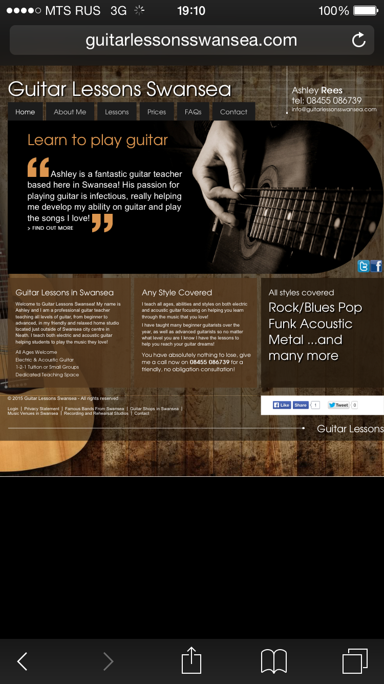
Guitar Lessons Swansea

Here you can see on the Guitar Lessons Swansea website how mobile users would see the websites prior to the mobile update – the text is almost unreadable due to the tiny size and the users ability to toggle through the website is much reduced due to the tiny links

Therefore over the last few weeks, with the help of 1010 Media, we set about updating the designs of all the websites to ensure that the music business’s websites would be complainant with the new Google algorithm. And I am please to reveal the finished article – something that we have tested extensively during April to ensure that it works seemlessly on all mobile devices, from iPads to Android smartphones (and I guess even smart-watches!).

Guitar Lessons Middlesbrough

The Guitar Lessons Middlesbrough website is an example of the post updated website, where the content has now be optimised for a mobile device enabling the user to scroll down (rather than zoom in) for information. You might note the menu bar at the top that enable users to easily access other pages of the website.

I am especially excited to watch the analytics of the websites to see how this improves enquiry numbers, or client engagement with the website from mobile devices now that they are being update. It will be a slow process for me to update all 120 websites, but over the next 60 days I am to do just that – and no matter where you are with your business I would advise you to do the same. You can view here the Google Page Speed Analysis program to determine if your website is suitably responsive to mobile devices – Google will also provide pointers on how to improve that page. I guess my question to you, as a student business who sells products online, is can you afford (i) to have up to 45% of your audience poorly catered for with a non-mobile friendly website and (ii) can you afford to drop off Google’s mobile searches? If the answer is no, then best get to updating soon! But don’t despair – as with all algorithms Google will constantly review your website promoting it again once it complies to its requirements, therefore, you can still reverse any negative changes you might face over the next few months.

On the business front thanks to the help of many University of Exeter students that are helping me write and create new websites I am pleased to announce that we have finished Piano Lessons Sheffield website this week. As a business we are keen to continue to expand to over 120 websites across the UK within the next 4 months. It is going to be a big challenge but I think we are certainly up to it! Alongside this I am keen to look to the recruitment side of the business to ensure that we are hiring new teachers as new websites are created. It is a big challenge to balance the time input into all areas of the business but overall I feel that we are going in the right direction.

Posted under 1010 Media, MGR Music

This post was written by
Deprecated: get_the_author_url is deprecated since version 2.8.0! Use get_the_author_meta('url') instead. in /var/www/html/wp-includes/functions.php on line 5213
Matthew Rusk on May 3, 2015
Tags: ,

Progress Update: Guitar Lessons London

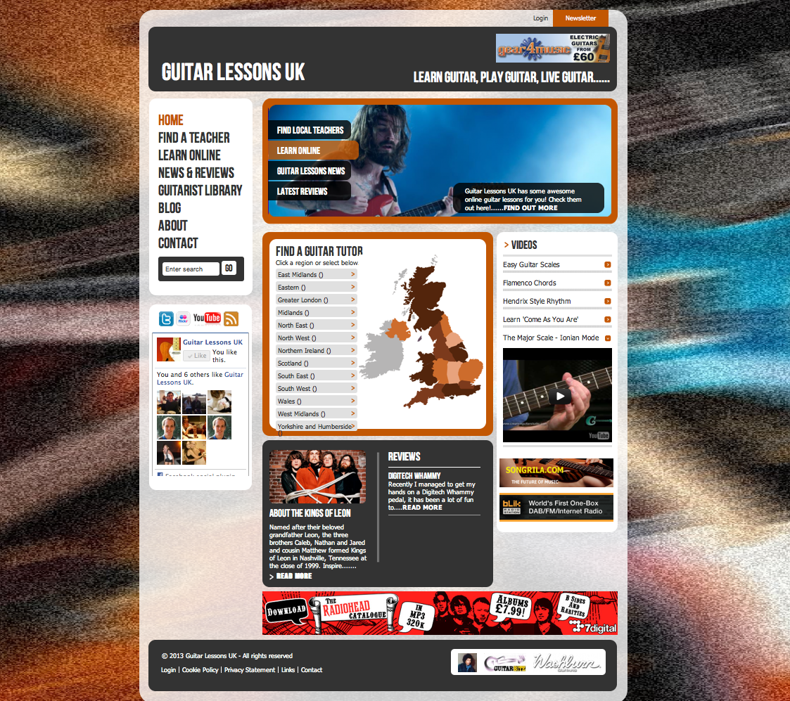
I thought exactly one year to the day when I launched Guitar Lessons London I thought I would write a short personal update on its development, a story of pivoting, entering the most competitive music tuition market in the UK and constant development to appeal to an audience that is like nowhere else in the UK. Originally rather than a Guitar Lessons London website the site was targeted at the entirety of the UK, under a “Guitar Lessons UK” branding with subpages for different teachers within locations – yet it quickly proved inefficient in generating the number of enquiries needed to support multiple guitar teachers across the nation.

Guitar Lessons London - originally launched under the a 'Guitar Lessons UK' branding

Guitar Lessons London – originally launched under the a ‘Guitar Lessons UK’ branding

Therefore, when the opportunity arose to move into the London guitar tuition market – a dream of mine since launching my music tuition business in first year of university – I pounce upon it, purchasing the www.guitarlessonslondon.com domain name and rebranding the website to “Guitar Lessons London”.

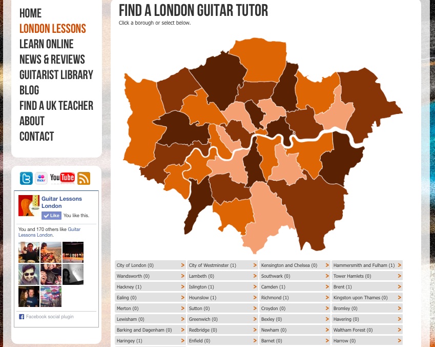
However, this quickly struck a problem as with a UK map potential students only had the very smallest of areas to click on to locate their teachers, so with the help of Andy from 1010 Media we decided to include a borough by borough map of London as the focus of the websites homepage. Whenever you design a website you have to be really clear about the customers journey through that website, once a potential client is on your website how are you going to get the from A (the first page they view) to B (a purchase, enquiry, content viewing, email subscription page depending on your aims for the website). For the music tuition websites the aim is to get them to enquiry via a contact form so having a clear customer journey for this new look Guitar Lessons London website was key: (i) landing page (ii) click on borough on map (iii) select teacher (iv) read about teacher (v) contact.

Guitar Lessons London - second design, with London borough map

Guitar Lessons London – second design, with London borough map

Yet, after this update was launched the truth was it simply didn’t work! How could this be? Well, the truth was this had disturbed a central theme that had helped the success of all of the other music tuition website; primarily that each website was designed for one teacher, creating a personalised experience for a potential student that didn’t give them more choices to make about which teacher they wanted. I found that providing potential students with a multitude of teachers actually decreased enquiry rates as a client simply wanted one teacher that looked professional, friendly and able to teach them the music that they wanted to learn. There was a second cold point that we quickly learned – that even 5 clicks from landing page to enquiry was too many to ask of the majority of web users who went through this thought process: (i) enter a website, does it look good? (ii) looks good, read a little info (iii) sounds good, I will enquire – making it a three step process. And a final third point was that by presenting a multitude of teachers the website gave the impression that it was a music agency rather than a personalised website ran by a great guitar teacher – a quick search for “Guitar Lessons London” on Google would show that my direct competitors all presented in the same manor: a music agency with teachers, rather than individual teachers running their own website. This meant that my website simply didn’t stand out from the rest – no wonder the enquiries were so low despite the best of intentions when we launched the second design update!

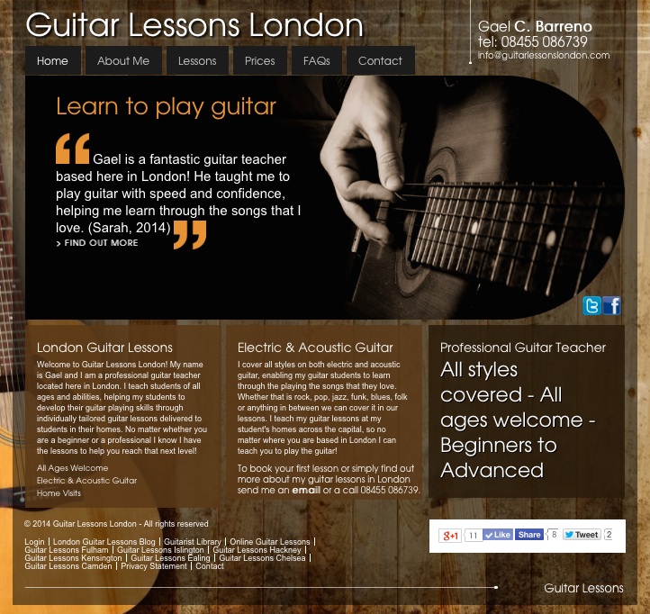
So despite all the hard work, as well in investment in this second design, in February 2014 I decided to develop a new model where the website replicated the normal locational website templates with a “lead teacher” who could deliver lessons to students within their own homes across London to see if I could increase enquiry numbers. Implementing this template would make the website much more personal, hopefully improving enquiry numbers through a model that had already been proven across the UK. Another huge time investment this third updated came into place and I quickly saw a rapid increase in the number of enquiries coming through the website – yet it was still way off what I would expect for the number of searches made per month in London for guitar lessons.

Guitar Lessons London - third design, personalised to a single 'lead teacher'

Guitar Lessons London – third design, personalised to a single ‘lead teacher’

Clue another step back and analysis of the analytics of the websites – turns out the Londoners spend even less time on the websites that in other cities across the UK, meaning basically even if they liked the website that they didn’t have the time/motivation/patients to get to the final “Contact Me” page. Ever heard of “London service” – turns out the same is true on the internet! (Why wouldn’t it be?!) So to combat this I decided to additionally put a contact form on every one of the pages that I want a client to work through when they land on the website, everything from the “About Me” page to the “Prices” page. This again dramatically increased the number of enquiries coming through the website – yet is it finished, certainly not! There is still plenty to develop on the website over the next year or so to help to increase the conversion numbers of the people entering the website to completing the target action desired by the webmaster. I have found that nothing ever stands still on the internet, it is an ever evolving field where a inconveniently placed link or one click too many will half the number of conversions you will make – but what am I complaining, I would do just the same on your website and so would you!

Connect with Matthew via LinkedIn or have a read of his personal blog, where this week he wrote the Ultimate Guide to Single Malt Scotch.

Posted under 1010 Media, Guitar Lessons London, MGR Music, Progress Update

This post was written by
Deprecated: get_the_author_url is deprecated since version 2.8.0! Use get_the_author_meta('url') instead. in /var/www/html/wp-includes/functions.php on line 5213
Matthew Rusk on April 17, 2014

Tags: , ,