 Caroline Nye is a social science researcher at the University of Exeter, having completed her PhD in rural sociology at the Centre for Rural Policy Research. She holds an MA (hons) in Social Anthropology from the University of Edinburgh, a diploma in International Development from London School of Economics (with a focus on environment) and has several years’ experience working on organic farms and in environmental education. She has also spent several years working further afield on international development projects and in industry in Asia, Africa and Latin America.
Caroline’s research expertise focuses on agricultural labour in the UK, examining the changes and challenges associated with farm labour in the transition to sustainable intensification. She is also currently working on a research project examining farmer motivations to participate in conservation-focused farmer clusters, as well as working on a project for Defra.
Academic poster presentations are an important method of sharing your research. But in an age where multiple stimuli are constantly competing for our attention, our brain usually decides within seconds if it wants to continue focussing on any one thing before shifting its attention elsewhere. Attracting a captive audience is, therefore, a challenge. Below are ten things to consider in designing a poster that will catch the reader’s eye. If somebody walks away having retained any information about your research, then your poster has had, yes it’s that magic word, IMPACT!
- Look upon it as an exciting opportunity. Here is a chance for you to exercise your creativity in a way you may not be able to during other phases of your academic career. Embrace your inner artist, leap outside of the box and brandish your metaphorical paintbrush with pride. Designing a poster should be a fun project which gets your research out there visually and assists you in defining the key points of your project.
- Know your audience. If designing a poster for a mixed audience, start by assuming that your audience knows nothing about either your subject or your discipline. Make it easy to understand and use language that won’t have your reader yawning three lines in. If your poster is for a specific event, a sheet stuffed full of technical jargon can still be overkill, so mix it up to ensure your reader is informed whilst being entertained at the same time.
- Before you even begin to add any text, play around with some images that might link your research to the rest of the world. Decide whether you want a backdrop image, images dropped between the text, or a combination. Make sure any pictures you use are relevant, interesting and fun. If a picture can tell your reader what your work is about as soon as they walk into a room, then you’re already winning.
- Don’t be afraid to go against the grain. Many students follow a set format which can often make posters look similar and difficult to remember. Innovative examples of poster design include the use of texture, colour or 3D materials (glasses included). One extraordinary design was completed entirely by hand. Be inspired and you will inspire others.
- What information do you want your reader to take away with them. What is NEW about your work and what message do you want to get across to your audience? This is your story. You can choose how you tell it.
- You cannot fit your entire thesis on to an A3 sheet. The ability to be concise is key here. Identify the principal goals of the thesis, your methods in brief, KEY findings and MAIN conclusions. This will ensure that your poster retains much needed space for visual aesthetics, making reading it a less daunting task for the innocent passer-by.
- Font is key! Don’t assume your reader has 20/20 vision. Try not to make the text any smaller than 24pt, and intersperse this with bigger titles and sub titles. It is fun to play around with font styles but many can be hard on the eye for a poster so plain styles can work better alongside good, strong images.
- Check sizing and margins before you print. These is nothing more frustrating than adding the final flourish to your masterpiece and then sending it to the printers and unrolling a mess. Text that pushes right up to the edges and poor quality images might reveal unpleasant surprises on print day.
- Print it before presentation day. Leaving the printing until the last minute is a common mistake for any student, be it your poster or your actual thesis! Try to print it at least a day early in case you see any glaring mistakes.
- Show up! Accompanying your poster with a smile and some enthusiasm will cast a happy, colourful light over your work as you both hang out there proudly. It is an opportunity to show passion for, and knowledge about, your subject on a friendly one-to-one basis. So enjoy!
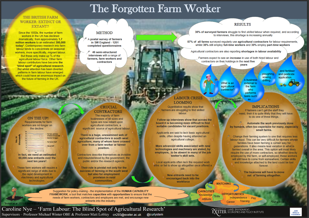
Written by: Caroline Nye
Twitter: @curlystem
If you wish to enter PGR showcase full details can be found on the PGR showcase webpage. Deadline to apply is: Sunday 22nd May.