CREATOR/S: Roy Thomas (writer), Barry Smith (artist), featuring the hero created by Robert E. Howard
YEAR: 1978
PLACE: New York
PUBLISHER: Tempo Star-Grosset & Dunlap (distributed by Ace Books)
ORIGINAL PRICE: $1.95
PRINT RUN: Not known
WHERE CAN I READ IT FOR MYSELF? Ohio State University
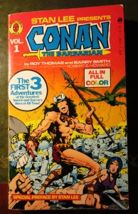
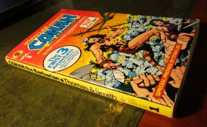
Fig. 1 and fig. 2. Cover and spine of The Complete Marvel Conan the Barbarian, volume 1 © 1978 Conan Properties, Inc.
Last month I talked about the importance of the Conan franchise for 1970s discussions about the metamorphosis of comics into novels, and I’m going to continue along the same vein here. In 1978 and 1979 Grosset & Dunlap issued six paperback volumes through their Tempo imprint entitled The Complete Marvel Conan the Barbarian. These books reprinted stories from Marvel’s comic Conan the Barbarian, starting with the early issues by the prized pairing of writer Roy Thomas and artist Barry Smith. Grosset & Dunlap also put out Marvel puzzle and activity books, Incredible Hulk paperbacks (reprinting newspaper strips featuring the green superhero), and a two-volume Battlestar Galactica adapted from the SF television show.
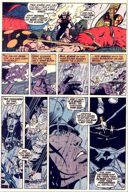
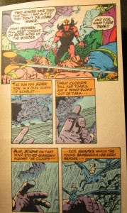
As Roy Thomas’s introduction conceded, “since the comics stories were designed visually for a different format than paperbacks, we’ve had to cut panels and copy to fit – an imperfect process, but one which was inevitable.” (4) Let me give an example of the editing process by comparing page 19 of issue 3 of Conan the Barbarian (fig. 3) with the same panels on pages 155-57 in the first Tempo volume (fig. 4). I’m not doing this to denigrate what has been lost on the cutting room floor. The panels in the paperback edition fall differently from those in the comic book but some of the book’s page layouts have intriguing effects unavailable in the original version.
Fig. 3. Page 19 of Conan the Barbarian #3 © 1971 Marvel Comics Group
Fig. 4. Pages 155-57 of The Complete Marvel Conan the Barbarian, volume 1 © 1978 Conan Properties, Inc.
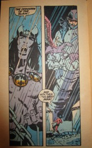
I won’t list every obvious change (e.g. the colouring). Just one or two obvious ones: the first panel no longer enjoys a whole row to itself at the top of the page. It has been cropped on either side so that the billowing tent flap on the right can no longer be seen. Because in the paperback volume Conan’s figure occupies a larger space relative to the other elements inside the frame, one might argue that the fallen warriors and the pointlessness of their struggle seems less poignant and less significant in the later version, less caught in a timeless moment as the canvas turns in the air. The purpose of this panel now seems to be more about bringing Conan quickly back into the narrative to pass judgment on the two dead kings before he sees the flying women of Borri, the Northern War-God, whisking off the souls of the fallen.
A second obvious point: in the original, the gutters dividing the four panels on the middle row don’t quite match the vertical gutters on the bottom row, but the shared colour scheme invites one to see (want?) those gutters all lined up. They almost do, but don’t.
I find this extremely irritating.
But I understand (I think) why it has been constructed this way: the panels on the middle and bottom rows don’t line up because the one focusing on Conan’s face is larger than the others. This slightly larger panel (the third panel on the bottom row) not only shows off the star of the comic’s title but, combined with the images of Borri’s hand on the middle tier, it almost looks as if Borri’s hand is Conan’s, raised to feel the coming rain and to send the women on their winged steeds. Well, Conan is a kind of Northern War-God.
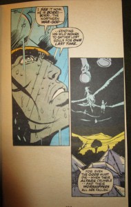
This reading the page as a gestalt isn’t possible with the paperback, since all the panels from the top and middle row are on p.156, and we have to turn the page to see the four panels from the bottom tier. Given that Conan and Borri occupy two adjacent panels blown up to larger size, the comparison still stands. Throughout this paperback volume the editing process creates a lot more negative space surrounding the panels than the comic book version, and when Conan says that Borri is “sending his wild women to gather lost souls for one last time” (157), rather than the speech balloon protruding into the next panel and leading on to Conan’s next comment, that “one last time” seems to dangle on the edge of nothingness. Time has been called on Borri the Northern War-God and he is passing into non-existence, into the nothingness that hovers around the panels. As the sequence appears in this paperback edit, the slight increase in time it takes to move from the penultimate panel to the last one adds a pause, a moment of contemplation about the void that awaits. And because now Conan’s speech balloon doesn’t intrude into the last panel, the sight of the winged steeds is able to be admired as a tableau, before the reader’s eyes descend to the last speech balloon. Given that the theme of Conan’s soliloquy is the death of gods, the crumbling of altars and the fall of worshippers, the edited version uses Conan’s speech balloon to poise the reader in the blankness over the last panel, so that the reader’s descent down the page seems to be more vertical and plunging than negotiating these panels in the comic book.
As this example suggests, the revised page layout of The Complete Marvel Conan the Barbarian loses some of the rhythms of the original – but the new arrangement of panels offers new, noteworthy spaces and beats.
More Conan to come!
October 2015
