Author Archives: Paul Gerald Williams

In this week of all weeks, it seems a good idea to post some thoughts on comics and the US Presidency, adapted from the talk I gave in November with Dr Sinéad Moynihan as part of the University of Exeter’s US Presidential Election lecture series. There isn’t anything to do with 1970s graphic novels though! Here we are:

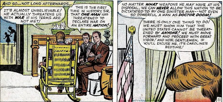
Presidents of the United States have been turning up in comics for decades. Sometimes they appear at the end of episodes in order to heap accolades on victorious heroes; on other occasions they add verisimilitude when supervillains threaten the world. Issue seventeen of The Fantastic Four from August 1963 shows a distinguished character in a rocking chair contemplating an ultimatum from the evil Doctor Doom, who has threatened that unless he is given a position in the President’s cabinet he will go to war against the United States (fig. 1).

FF and JFK

Fig. 1. Stan Lee (writer), Jack Kirby (art), and Dick Ayers (inking), “Defeated by Doctor Doom!” Fantastic Four 17 (Aug. 1963): 11, rpt. in Marvel Masterworks: The Fantastic Four, vol. 2 (Tunbridge Wells: Panini, 2007), 187. © 1963 Marvel Characters, Inc.

President John F. Kennedy is not named in this interlude – we don’t even see his face – but the hairline and the reference to JFK’s daughter Caroline make it clear who we’re seeing. Responding to the demands made by Doctor Doom, writer Stan Lee gives this character dialogue that would not be out of place in some of President Kennedy’s most famous speeches. When the JFK character says “No matter what weapons he may have at his disposal, we can never allow this nation to be dictated to by one sinister man” there are echoes of the promise made in Kennedy’s inaugural address that “every nation” must know that America will “pay any price, bear any burden, meet any hardship […] in order to assure the survival and the success of liberty.”[i]

Perhaps more interesting than the times when American presidents appear in comics is when fictional characters make a bid for the US Presidency. Bill Griffith’s character Zippy the Pinhead first ‘stood’ as a candidate in 1980, when T-shirts promoting Zippy’s candidacy became must-have items amongst his supporters.[ii] But the most notable campaign organised for a comics character has to be when Pogo the Possum stood for President in 1952. That was the year Dwight D. Eisenhower was elected to the White House, and his supporters wore badges proclaiming ‘I Like Ike,’ which the Pogo campaign mimicked with the slogan ‘I Go Pogo.’ Even though the cartoon possum lost, his creator, cartoonist Walt Kelly, was undaunted and another ‘I Go Pogo’ campaign took place in 1956.

Walt Kelly had worked as an animator for Walt Disney on films such as Dumbo, Pinocchio, and Cinderella, but he left the Disney Studios in 1941 and used his drawing talents to create ‘funny animal comics.’ In the first issue of Animal Comics (December 1942) Kelly drew a comic about the inhabitants of Okefenokee Swamp, a bayou in the American South. Many of these characters were anthropomorphic animals such as Pogo the Possum, Albert the Alligator, Howland Owl, and a turtle called Churchy LaFemme. Kelly eventually moved from comic books to newspapers, taking up a job with The New York Star in 1948 that involved drawing political cartoons and producing a daily newspaper strip in which Kelly re-used his characters from Okefenokee. By the mid-1950s the Pogo strip was a huge success and editors across America bought the rights to reprint it in their newspapers.[iii] Pogo had over 50 million regular readers and Kelly was earning over $150,000 a year.[iv]

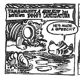
As Kerry D. Soper’s book We Go Pogo: Walt Kelly, Politics, and American Satire (2012) reminds us, Walt Kelly conceived of the ‘I Go Pogo’ election campaign as a neat way of raising the strip’s profile.[v] The campaign began in Pogo in February 1952 with the arrival of Tammananny the Tiger in the Okefenokee Swamp. This was an allusion to Tammany Hall, the political organisation based in New York associated with the symbol of the tiger. The Tammany Hall “machine” was synonymous with corruption, favouritism, and vote-rigging.[vi] When Tammananny cannot find a suitable candidate for the presidential race the animals of the swamp force Pogo to be the nominee against the honest possum’s wishes. To oversee his campaign a bear called P.T. Bridgeport enters the strip and becomes Pogo’s campaign director. As his name suggests, P.T. Bridgeport has more than a touch of P.T. Barnum about him. When P.T. Bridgeport speaks Kelly uses lettering in the style of a Big Top banner (see fig. 2) and the bear brings a touch of show business to the campaign trail.

Tamannany

Fig. 2. Walt Kelly, Pogo, 8 May 1952, rpt. in Pogo, vol. 2 (Seattle: Fantagraphics, 2012), 145. © 2012 Okefenokee Glee & Perloo Inc.

Between February and November 1952 the Pogo strip was filled with political satire about mechanical voters and back-room deals and throwing hats into the ring (literally). Kelly wove the election-year calendar into the strip’s daily episodes and the inhabitants of Okefenokee Swamp set off for Chicago during convention season (both the Republicans and Democrats held their conventions in Chicago in 1952).

While the ‘I Go Pogo’ campaign was taking place inside the newspaper strip, Kelly was touring the country, rousing support for his creation to be the next president. We Go Pogo describes these as a mixture of knowingly ridiculous stump speeches and serious lectures about art and politics; Kelly’s public appearances were usually held on university or college campuses.[vii] By the end of the 1952 campaign 150 colleges endorsed Pogo as their candidate. According to Soper the cartoonist took enormous care preparing for these public appearances. Kelly’s assistant studied college newspapers in advance of the visits and made a list of the issues that interested the students Kelly was going to address. Campus newspapers and student governments were sent packs of material to help promote Pogo’s bid for the presidency including mock news releases about the campaign’s progress. The cartoonist also drew one-off promotional illustrations specific to each college newspaper.[viii] A handful of journalists and student publications were acknowledged in the Pogo daily strip: the barge that the characters use to travel to Chicago changes name several times and in one strip it is called The Crimson and in another The Orange (which I presume are references to the Harvard Crimson and Syracuse’s The Daily Orange). Badges featuring the ‘I Go Pogo’ slogan were a central arm of the campaign and in 1952 Kelly received requests from 50,000 students for these promotional items. The badges were mentioned within the newspaper strip at every opportunity, and characters wearing them proudly showed their badges off; in one episode, Churchy finds a novel use for them, holding up his underwear.

Things got out of hand, however, when the ‘I Go Pogo’ campaign came to Harvard University on 15 May 1952 and clashes between Pogo supporters and the police left three officers injured and 28 students arrested. The New York Times reported:

Five thousand Harvard students rioted for four hours in Harvard Square tonight when a satirical political rally called to boom “Pogo-for-President” erupted into a bottle and beer can fight with club-swinging police. […] [This] latest outbreak of collegiate “spring-fever” rioting […] began with the arrival of Walt Kelly […] to speak at a mock convention.[ix]

According to Soper the cartoonist actually arrived after the battle and was appalled at the police’s brutality (he still gave his stump speech). Soper dials down the scale of the skirmish, putting the number of students gathered in Harvard Square at 1,600. He reads the riot as a flashpoint for pre-existing tension between local residents and students: police officers had apparently shouted “Getting arrested will teach you Harvard bastards a lesson!”[x]

Nonetheless Soper thinks there were wider political implications to the ‘I Go Pogo’ election phenomenon. He argues that one of the reasons college students claimed Pogo the Possum as their presidential nominee was because this was a socially tolerated way of openly expressing disaffection with the political system. Supporting the ‘I Go Pogo’ campaign was a safe way for students flirting with liberal politics to express their discontent with the status quo.[xi] Kelly, it is worth remembering, risked censure in the early 1950s by mocking the witch-hunts against communists; the cartoonist based the character Simple J. Malarkey on the prominent anti-communist politician Senator Joseph McCarthy. Like the Pogo strip itself, the students who flocked to rallies for a cartoon president were humorously mocking the way that politics was conducted in 1950s America, though this took place within well-defined, socially acceptable limits. At Harvard on 15 May 1952, though, the students’ challenge to authority got tangled up in local antagonisms and the ensuring violence was national news.

January 2017

Notes

[i] Qtd. in Hugh Brogan, The Penguin History of the USA, 2nd ed. (London: Penguin, 2001), 613-14.

[ii] “Newswatch,” The Comics Journal 56 (May 1980): 16.

[iii] Mark Evanier, “About Walt Kelly,” in Pogo by Walt Kelly, vol. 2 (Seattle: Fantagraphics, 2012), 335.

[iv] Kerry D. Soper, We Go Pogo: Walt Kelly, Politics, and American Satire (Jackson, MS: UP of Mississippi, 2012), 36.

[v] Soper, We Go Pogo, 200.

[vi] Brogan, The Penguin History of the USA, 399-400.

[vii] Soper, We Go Pogo, 117.

[viii] Soper, We Go Pogo, 34-36, 200.

[ix] “5,000 Riot at Harvard,” The New York Times 16 May 1952: 14; italics not in original.

[x] Soper, We Go Pogo, 3, 203-04.

[xi] Soper, We Go Pogo, 204-05.
How to create an exhibition in three easy stages

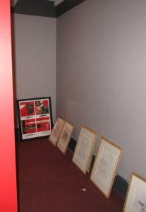
This is a corner of The Great British Graphic Novel from before the launch. This is what it looked like when we took down the paintings from the previous exhibition:

IMG_7667

First we painted the walls…

IMG_7670

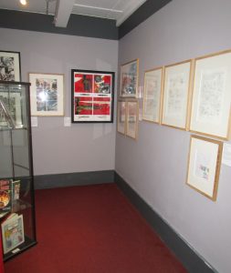
…then we decided where everything would go…

IMG_7671

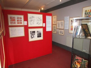
… and finally we hang. Voila!

IMG_7672

And if you want to see all this art, and SO much more, the exhibition is running at the Cartoon Museum until 24 July!

May 2016

Grand Openings

IMG_7673

You know this by now, but I’ll tell you anyway: last Wednesday the exhibition I have been curating with the Cartoon Museum opened to the public. It runs until 24 July 2016, so you have plenty time to visit. With over 125 pages of original art on display there should be something for everyone’s tastes. That’s been a major part of our thinking as we’ve organised the exhibition, to give visitors a little of what they know already and a little of what they’ve never seen before.

Where to begin, where to begin. How about what you’ll find in the exhibition? For starters, original art from a swathe of canonical British graphic novels. To throw a handful of titles out: Gemma Bovery, Tamara Drewe, Watchmen, V for Vendetta, The Sandman, Alice in Sunderland, From Hell, and Arkham Asylum.

You would expect nothing less from an exhibition with ‘Great British’ and ‘Graphic Novels’ in the name. But I am quietly confident that there will also be comics you didn’t expect to see. Lots of them.

Reflecting my own research, we’ve been excavating some prime texts from the 1970s and early 1980s. A few of these have been hidden in the public eye: when Posy Simmonds’s True Love and Ken Pyne’s The Relationship were released in 1981 they were published by major presses and reviewed in the national media. Still, most 1970s graphic novels were by underground creators, artists such as Bryan Talbot, Angus McKie, and Chris Welch who made their names in the feisty world of comix (with an ‘x’). Underground comix featured frank sexual material, left-wing politics, and psychedelic imagery. All of these characteristics made their way into the 1970s graphic novels and I’ve mentioned some of the books on display (Introduction to Chile, The Jewel in the Skull) in this blog before.

We’ve gone back even earlier in the opening section of the exhibition. This gallery, called ‘Roots and Traditions,’ thinks about how the contemporary graphic novel sits at a confluence of artistic currents. We’ve underlined this with a selection of relevant illustrators, painters, and cartoonists that have influenced the development of (i) long comics narratives, (ii) comics for adults, and (iii) publishing comics in book form (sometimes, but not always, all three at once). It’s hard to understate the importance of William Hogarth, who used sequences of engravings to narrate tales of immorality and instruction. As a print from the first of these sequences (1732’s A Harlot’s Progress) demonstrates, it may not be meaningful to say ‘Hogarth was the first British graphic novelist’ but he is historically important for appealing to a large adult audience with his sequential art.

‘Roots and Traditions’ not only shows significant signposts pointing to the contemporary graphic novel, it reveals the ongoing dialogue between past and present. Eddie Campbell’s Bacchus is a great example. In the 1980s and 1990s Campbell drew the present-day exploits of the Greek god Bacchus, who retold myths, got entangled with the mafia, and became the sovereign of a pub that seceded from the United Kingdom. Bacchus, the god of wine and revelry, was an ideal foil for Campbell to revisit the history of engraving and print-making because so many major illustrators over the years have depicted the dangers (and pleasures) of alcohol consumption. Bacchus’s arch-nemesis was Mr Dry, an advocate of abstinence based on a character from Prohibition-era political cartoons, and in one scene Mr Dry chases Bacchus through a series of classic prints, starting with Hogarth’s Beer Street (1751).

The hardest part of curating an exhibition like this is capturing what’s happening right now. With so many new titles coming out all the time, we’ve tried to show the sheer diversity of genres: autobiography, SF, history, Young Adult fiction, reportage, etc… Some 2010s graphic novels seem too important to leave out, like the award-winning The Motherless Oven by Rob Davis or the massively popular The Wicked + The Divine by Kieron Gillen and Jamie McKelvie. We also want to spotlight works still in progress but which are shaping up to be classics of the future; visitors can see art from as-yet unpublished projects by Kate Charlesworth and Asia Alfasi. The genre (if that’s the right word) of graphic medicine is so visible and influential it required a substantial presence and it’s represented by creators including Katie Green, Nicola Streeten, and Ian Williams (without ignoring earlier artists like Al Davison). Other varieties of the contemporary graphic novel compelled our attention too, so the exhibition has art from literary adaptations (like Paul Duffield’s Manga Shakespeare version of The Tempest) and documentary graphic novels (e.g. Darryl Cunningham’s Supercrash)

If you’re wondering about all those 1980s and 1990s graphic novels I haven’t mentioned, you’re right, there’s a lot more to the exhibition. For anyone (like myself) who thinks serious scholarly attention needs to be devoted to the UK’s small press / self-publishing scene, you’ll enjoy seeing art by Gary Spencer Millidge (Strangehaven), Nabiel Kanan (Exit) and Dave Hine (Strange Embrace). Some of the work on display comes from creators with roots in that milieu but who have gone on to write and draw graphic novels for book trade publishers, like 2013’s Montague Terrace by the Pleece brothers. Beginning in the late 1980s Deadline magazine offered a home to a group of lively creators plugged into trends in fashion, design, and popular music. The Great British Graphic Novel has several pieces of Jamie Hewlett art featuring the character Tank Girl as well as graphic novels that Deadline artists like Nick Abadzis, Rachael Ball, Ilya, and Philip Bond have worked on since the days of the magazine.

The idea here is not to list everything in the show, but to pique your interest. Let me pause there and return with some photos and a tube map.

The J.B. Rund Collection of Underground Comix at the British Library

The British Library’s collection of American comix is extraordinarily rich and anyone who researches the US underground will be interested in its holdings. What follows is a short explanation of where the collection comes from and what it contains. I’m sure many readers of this blog know and use the Alexander Street database for underground and alternative comics, but there are lots of good reasons to go to the original objects themselves (if you want to analyse page size or bindings, for example). There are some rare titles in the BL archives and a handful of the comics listed below have been inscribed by their creators.

The collection was donated by J.B. Rund, who runs Bélier Press, based in New York City. Bélier has an important place in underground comix history, publishing three deluxe book collections in the second half of the 1970s: R. Crumb’s Carload O’ Comics (1976), Art Spiegelman’s Breakdowns (1977), and Crumb’s The Complete Fritz the Cat (1978). Rund collected an extensive archive of underground comix, becoming friends with many creators in the process. I interviewed Rund in 2013 about his life, collecting activities, and the books and comix he published. You can listen to that fourteen-hour interview if you are visiting the British Library.

So how can you read the comix in the collection for yourself? First, you will need a Reading Room card for the British Library. The comix from the Rund collection available for public consultation are primarily deposited under the BL shelfmark General Reference Collection Cup.806.g.1. The comix at this shelfmark have to be consulted in the Rare Books and Music Reading Room at the BL. You can’t call up specific titles using the BL catalogue: talk to someone at the Inquiry Desk about which items you particularly want to see. There are a LOT of comics under this shelfmark and below is a list of the American underground comix you’ll discover there.

Before I sign off, this is just a sample of the material in the J.B. Rund Collection. The BL has many other items and the work of R. Crumb is well represented – if there is something you want to look at it is worth searching the BL’s online catalogue!


Cup806g1


1. GREY PRESERVATION BOX (SMALL), UNTITLED

Contains 9 minicomics:

  • Various creators, Zap 7 [?]
  • Leslie Cabarga, Buddy Baker “Crooner for hire”
  • “Jud” Green, Underground Cartooning Course
  • Griffy, Young and Lustless
  • [Leslie Cabarga?], Modern Medical Romances
  • Various creators, Self-Destruct
  • Trina Robbins, Sally Starr, Hollywood Gal Sleuth
  • Diane Noomin, Canarsie Creeps
  • [Leslie Cabarga?], A Plain Talk with Puerto Ricans


2. GREY PRESERVATION BOX (SMALL), UNTITLED

Contains 4 minicomics:

  • Art Spiegelman, Zip-a-Tunes and Moiré Melodies featuring Skeeter Grant’s Skinless Perkins
  • Art Spiegelman, Work and Turn
  • Crank Collingwood [S. Clay Wilson], The Saga of Yukon Pete
  • Art Spiegelman, Every Day Has Its Dog


3. BROWN BINDING, UNTITLED

Contains 6 comics:

  • Various creators, Bizarre Sex 1-4, 6-7


4. BLUE BINDING, ENTITLED “THE LOWBROW ART”

Williams, Robert. The Lowbrow Art of Robert Williams. San Francisco: Rip Off Press, 1982.


5. BLUE BINDING, ENTITLED “RIPOFF”

Contains 1 comic:

  • Various creators, Rip Off Comix 7


6. BLUE BINDING, ENTITLED “MISTER INFINITY”

Includes:

  • Art Spiegelman, The Compleat Mister Infinity [minicomic]


7. BLUE BINDING, ENTITLED “COMIX INTERNATIONAL”

Contains 3 comics:

  • Comix International 1-3


8. BLUE BINDING, ENTITLED “FUNNY WORLD”

Contains 11 items:

  • Funnyworld 12-22


9. BLUE BINDING, ENTITLED “BIJOU FUNNIES”

Contains 6 comics:

  • Bijou Funnies 2-7


10. BLUE BINDING, ENTITLED “BIJOU FUNNIES”

Contains 1 comic:

  • Bijou Funnies 1


11. BLUE BINDING, ENTITLED “COMIX BOOK”

Contains 5 comics:

  • Comix Book 1-5


12. BLUE BINDING, ENTITLED “THE YUM YUM BOOK”

Crumb, R. The Yum Yum Book. San Francisco: The Scrimshaw Press, 1975.


13. BLUE BINDING, ENTITLED “ALL KINDS COMICS” [it possibly reads “ALL KINES COMICS”]

Contains 5 comics:

  • Promethean Enterprises 1-5


14. BLUE BINDING, ENTITLED “SNARF”

Contains 9 comics:

  • Snarf 1-9


15. BLUE BINDING, ENTITLED “SONDERBAND”

Griffith, Bill. U-Comix Sonderbad 23. [Linden?]: Volksverlag, 1979.


16. BLUE BINDING, ENTITLED “RIP OFF COMIX AND PHOEBE AND THE PIGEON PEOPLE”

Contains 3 comics:

  • Various creators, Rip Off Comix 3, 12
  • Jay Lynch and Gary Whitney, Phoebe and the Pigeon People 3


17. BLUE BINDING, ENTITLED “SPACED”

Contains 3 comics:

  • James Pinoski, Spaced 1-2
  • S. Clay Wilson, The Checkered Demon 2


18. BLUE BINDING, ENTITLED “PORTFOLIO”

Contains 1 comic:

  • S. Clay Wilson, untitled [comic book version of his art portfolio]


19. BLUE BINDING, ENTITLED “GAY COMIX”

Contains 3 comics:

  • Various creators, Gay Comix 1-3


20. BLUE BINDING, ENTITLED “DOPE COMIX”

Contains 3 comics:

  • Various creators, Dope Comix 1-3


21. BLUE BINDING, ENTITLED “MOM’S HOMEMADE COMIX”

Contains 3 comics:

  • Various creators [esp. Denis Kitchen], Mom’s Homemade Comix 1-3


22. BLUE BINDING, ENTITLED “SUBVERT COMICS”

Contains 3 comics:

  • Spain Rodriguez, Subvert Comics 1-3


23. BLUE BINDING, ENTITLED “ANTHOLOGY OF SLOW DEATH”

Turner, Ron, ed. Anthology of Slow Death. [Berkeley]: Wingnut Press, 1975.


24. BLUE BINDING, ENTITLED “DR. ATOMIC”

Contains 3 comics:

  • Larry S. Todd, Dr. Atomic 1-3


25. BLUE BINDING, ENTITLED “INSECT FEAR”

Contains 3 comics:

  • Various creators, Insect Fear [1]-3


26. BLUE BINDING, ENTITLED “SPACED”

Contains 1 comic:

  • James Pinoski, Spaced 1


27. BLUE BINDING, ENTITLED “BIJOU”

Contains 1 comic:

  • Various creators, Bijou Funnies 8


28. BLUE BINDING, ENTITLED “MICKEY RAT COMIX”

Contains 3 comics:

  • Various creators [but mainly Robert Armstrong], Mickey Rat 1-3


29. BLUE BINDING, ENTITLED “TALES OF TOAD”

Contains 3 comics:

  • Bill Griffith, Tales of Toad and Other Stories 1-3


30. BLUE BINDING, ENTITLED “FREAK BROTHERS”

Contains 1 comic:

  • Gilbert Shelton, The Collected Adventures of the Fabulous Furry Freak Brothers


31. BLUE BINDING, ENTITLED “FANTAGOR”

Contains 1 comic:

  • Various creators, Fantagor 1


32. BLUE BINDING, ENTITLED “CHICAGO MIRROR”

Contains 3 items:

  • Jay Lynch, editor, Chicago Mirror 1-3


33. BLUE BINDING, ENTITLED “FANTAGOR”

Contains 4 comics:

  • Various creators, Fantagor 1-4


34. BROWN BOX, ENTITLED “YOUNG LUST” (IN PENCIL)

Contains 6 comics and one book collection:

  • Various creators, Young Lust 1-6
  • The Young Lust Reader


35. BROWN BOX, ENTITLED “ZIPPY” (IN PENCIL)

Contains 3 comics and two book collections:

  • Bill Griffith, Zippy Stories 1-3
  • Griffith, Bill. Zippy: Nation of Pinheads. Berkeley: And / Or Press, 1982.
  • Griffith, Bill. Zippy Stories. Berkeley: And / Or Press, 1981.


36. GREY PRESERVATION BOX, ENTITLED “14 PARTS SEE FRONT FOR CONTENTS”

Contains 14 items, not all comix, including:

  • Various creators, Short Order Comix 2
  • Various creators, Anomaly 3-4
  • Bill Griffith, Yow 1-2
  • Various creators, Voice of Comicdom 16-17


37. GREY PRESERVATION BOX, ENTITLED “17 PARTS SEE FRONT FOR CONTENTS”

Contains 17 comics:

  • Bill Griffith, Joe Schenkman, and Art Spiegelman, Short Order Comix 1
  • Various creators, Anarchy Comics 2
  • Various creators, Laugh in the Dark 1
  • Various creators, Lean Years
  • Bill Griffith, Griffith Observatory 1
  • Various creators, The Tortoise and the Hare 1
  • Various creators, Wet Satin 1
  • Various creators, Brain Fantasy 2
  • Various creators, Mondo Snarfo 1
  • Various creators, Air Pirates Funnies 2
  • S. Clay Wilson, 2 issues 1-2
  • Various creators, Grim Wit 1-2
  • Kim Deitch, Corn Fed Comics 2
  • Justin Green, Binky Brown meets The Holy Virgin Mary


38. GREY PRESERVATION BOX, ENTITLED “16 PARTS SEE FRONT FOR CONTENTS”

Contains 16 comics:

  • Various creators, Conspiracy Capers 1
  • Various creators, Weird Fantasies 1
  • Various creators, Up from the Deep 1
  • Justin Green, Show + Tell Comics
  • Various creators, Merton of the Movement 1
  • Various creators [esp. Kim Deitch], Eating Raoul
  • Various creators, 50’s [sic] Funnies
  • Various creators, Enigma 1
  • Various creators, Tales from the Berkeley-Con 2.2
  • Various creators, Bicentennial Gross-Outs 1
  • Various creators, Dopin’ Dan 1
  • Larry S. Todd, Tales of the Armorkins
  • Various creators, Paranoia
  • Aline Kominsky and Diane Noomin, Twisted Sisters
  • S. Clay Wilson, Bent
  • Various creators, Compost Comics


39. GREY PRESERVATION BOX, ENTITLED “7 PTS”

Contains 7 comics:

  • Various creators, Mickey Mouse Meets the Air Pirates Funnies 1
  • Bobby London, The Dirty Duck Book 1
  • Various creators, Weirdom Comix 15
  • Jay Lynch, Nard n’ Pat 1
  • Various creators, Barbarian Women 2
  • Various creators, Tales from the Plague 1
  • Richard Corben, Rowlf


40. GREY PRESERVATION BOX, ENTITLED “4 PTS”

Contains 4 comics:

  • Various creators, Turned On Cuties
  • Kim Deitch, Corn-Fed Comics
  • Trina Robbins, Fight Girl Comics 2
  • Various creators, Purple Cat 1


41. GREY PRESERVATION BOX, ENTITLED “16 PARTS SEE FRONT FOR CONTENTS”

Contains 16 comics:

  • Various creators [esp. Skip Williamson], Snappy Sammy Smoot
  • Various creators, Hungry Chuck Biscuits 1
  • Various creators, Left-Field Funnies 1
  • Various creators, Teen-age Horizons of… Shangri La 1
  • Robert Williams, Coochy Cooty Men’s Comics 1
  • Various creators, Roxy Funnies 1
  • Various creators, Consumer Comix
  • Spain and Algernon Backwash [?], Mean Bitch Thrills
  • RC, John Richardson, and Jan Strnad, Fever Dreams 1
  • Trina Robbins, Girl Fight Comics
  • Various creators, Corporate Crime Comics 1-2
  • Aline Kominsky-Crumb, The Bunch’s Power Pak Comics 1-2
  • Howard Cruse, Barefootz Funnies 1-2


42. GREY PRESERVATION BOX, ENTITLED “2 PTS”

Contains 2 comics:

  • Various creators, Berkeley Con Programme Book
  • Various creators, Douglas Comix


43. GREY PRESERVATION BOX, ENTITLED “3 PTS”

Contains 3 half-sized comics:

  • S. Clay Wilson, Pork
  • Various creators, Sleazy Scandals of the Silver Screen 1
  • Bill Griffith, Art Spiegelman, Spain Rodriguez, and Justin Green, Four Sketches and a Table of Useful Information


44. BLUE BINDING, ENTITLED “THE APEX TREASURY OF UNDERGROUND COMIX”

Donahue, Don, and Susan Goodrick, eds. The Apex Treasury of Underground Comics. New York: Links Books, 1974.


45. BLUE BINDING, ENTITLED “THE CHECKERED DEMON”

Contains 2 comics:

  • S. Clay Wilson, The Checkered Demon 1 and 3


46. BLUE BINDING, ENTITLED “PHOEBE AND THE PIGEON PEOPLE”

Contains 2 comics:

  • Jay Lynch and Gary Whitney, Phoebe and the Pigeon People 1-2


(I’ve numbered these boxes / bindings for this list – there is no numbering on the boxes or bindings themselves)


Thoughts on the Observer article “Framed! Meet the creators shaking up modern comics”

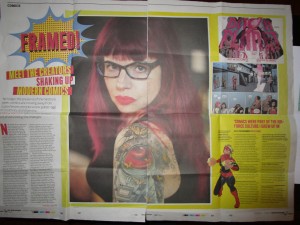
Did you see Andrew Harrison’s article “Framed! Meet the creators shaking up modern comics” in Sunday’s Observer (in The New Review section)? It was a big feature. I haven’t taken photographs for the blog this year, so here’s an idea of the space it received:

IMG_7652   IMG_7653

I don’t have an overall thesis so here are some random thoughts / responses:


Genres

I’m intrigued by the comics and creators grouped together here.  As far as categorisation goes, the article suggests the “most exciting comics” of today are characterised by “a broader, more accessible spread of themes than the super-books’ endless exploration of power and its consequences.” (14) A wide variety of genres is mooted, but the “Top Ten!!” for new readers to start with continues Harrison’s contention that the best new comics “are fuelled by the pulpy, pop-art immediacy and sense of wonder” (14) that made comics so popular earlier in the twentieth century. Broadly speaking, the recommendations in the Top Ten could be labelled as SF, horror, and – despite Harrison’s reservations about the genre’s relevance – superhero comics.

The Top Ten would make a fascinating syllabus for a module on contemporary comics, and it would prove a very popular course, I imagine. But what would be the module themes, what discussions would recur from week to week? Some essay questions spring to mind:

  1. How and why do these comics reconfigure heteronormative notions of the family?
  2. How is formal experimentation connected to gendered and/or racialized subject positions?
  3. What role does technology play in the construction of ‘the community’ and what are the political implications of this? (You may refer to urban, national, or planetary communities in your answer)

I suppose I’m thinking out loud because I really do think the Top Ten would be a successful module and because I can’t make up my mind about the following questions:

  • Are the texts and creators highlighted in Harrison’s article significant because they are popular or is something more going on?
  • Is there a movement or shared sensibility afoot in the 2010s comics mentioned?
  • How different is this from the 1990s – or the 1970s – or the 1940s?


Kapow

The URL for the article makes me wonder if it was entitled “Kapow!” at some stage.

I hope not, because that would make me sad.


Image

“Image was mostly known for conventional horror and superhero titles until around 2008, when it began publishing less easily categorised, creator-led comics to sudden acclaim.” (17) I accept – completely –  that a four-page Observer article is not the place to write the history of Image (although if someone isn’t doing that already, I’m there). But I want to add Image was always a more odd company that this suggests. Creators like Mike Grell and Jeff Smith were publishing comics that didn’t fit the early 1990s Image mould (bulging muscles, thinly clothed beautiful women, and large guns). Nabiel Kanan and Kyle Baker were doing significant work for them before 2008 too. My hunch is we’re not seeing a step change in the history of Image but something more gradual.

This was the main historical point on which I felt moved to comment, which says something about me, I know.


I was pleased to see The Observer looking at contemporary comics and impressed by the space it devoted to the subject. And I’m still thinking about the last lines:

“Comics people are depressive people,” says Kieron Gillen. “We always think the glass is half empty. But this is what winning feels like.” (17)


February 2016

The 1970s Graphic Novel Blog in 2016

In 2016 the blog is going to look a bit different; as well as postings on specific texts, I’m going to mix things up with some updates on the exhibition attached to the project. It’s taking place at the Cartoon Museum in London, from 20 April – 24 July, is called The Great British Graphic Novel, and it will have a lot of exciting original art on display! I’ll post photos as things develop, but if you want to help build up the anticipation, the hashtag is #GBGNovel

I won’t spoil the surprise by telling you exactly what will be exhibited just now.

OK, I can let you know one thing: the Cartoon Museum’s pages from Watchmen will be there in the flesh (you know what I mean). I hope you’ll come along!

PW, 8 Feb. 2016


The Wild & Woolley Comix Book: Australian Underground Comix

CREATOR/S: Various (see below); edited by Pat Woolley

YEAR: 1977

PLACE: Sydney

PUBLISHER: Wild & Woolley

ORIGINAL PRICE: Not known

PRINT RUN: Not known

WHERE CAN I READ IT FOR MYSELF? The British Library, The National Art Library (V&A), the National Library of Australia

* The comics discussed below contain racially offensive language *

Fig. 1. Cover of Wild & Woolley Comix Book © TBC. Source: amazon.com

I have almost no information on this book and I won’t pretend that it’s a comics narrative aspiring to be a novel. It is little known (although it is mentioned in this interesting essay by Kevin Patrick) so readers will, I hope, be happy to hear a bit more about it. The bare facts: it’s called The Wild & Woolley Comix Book: Australian Underground Comix (1977), it’s black and white, and it reprints 109 pages of Australian underground comix originally published between 1964 and 1976. It was edited by Pat Woolley, reported to own one of the biggest comics collections in Australia in the Sydney Morning Herald. The creators in it are:

Ian McCausland

Neil McLean

Martin Sharp

Phil Pinder

Laurel Olszewski & Piotr Olszekski

Gerald Carr

Ernie Althoff & Peter Andrew

Peter Lillie

Peter Dickie

David Pride & Jack Rozycki

Carol Porter

Jon Puckridge

Bon Daly

Greg and Grae

Dave Bromley

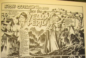
I’ll focus on the comix by Greg and Grae, which play heavily on the collection’s national context. These comix, featuring the characters Iron Outlaw and Steel Sheila, were originally published in the left-leaning independent newspaper Sunday Review. The first issue of Sunday Review came out on 11 October 1970 and it eventually merged with The Nation newspaper in 1972 to become the Nation Review (Carter 370 n.24). Unlike most of the other comix in Wild & Woolley Comix Book the adventures of Iron Outlaw and Steel Sheila form a brief (7 pages) but continuous narrative, the first page naming the story “Iron Outlaw and Steel Sheila Face the Yellow Peril!” [105] When the Sunday Review was launched it joined a cohort of other Australian newspapers that were celebrating “a new cosmopolitanism,” turning away from narrow definitions of Australian culture as white and British (Carter 370). “Iron Outlaw and Steel Sheila Face the Yellow Peril!” parodies the ‘Yellow Peril’ anxieties of late-nineteenth- and early-twentieth-century pulp fiction, which posed Asian hordes as threatening to swamp the bastions of white Euro-American civilization (see fig. 2). This danger was figured in individual villains like Dr Fu Manchu or (in thinly veiled form) Flash Gordon’s nemesis, the alien emperor Ming the Merciless. In Jack London’s short story “The Unparalleled Invasion” (written in 1907) the entire Chinese population represents a threat to the world and is represented as an insatiable, ever-expanding mass. The Yellow Peril was a menacing presence in fiction, film, comic strips and radio shows, often in the form of serial narratives. This rhythm of delivery is mimicked in Greg and Grae’s comic, apparently printed one page an issue: the first page ends “Tune in again, next week!” [105]

IMG_4412

Fig. 2. Page [105] of Wild & Woolley Comix Book © 1970 Greg and Grae

It is easy to list the racist stereotypes in “Iron Outlaw and Steel Sheila Face the Yellow Peril!” Madame Loo heralds the arrival of Warlord Nong with “Gleetings Nong” and their homeland is an “eternal” “Oriental mystery,” a place “hidden from the light of civilization, basking in the twilight of another time: another culture.” [105] Cruel, dictatorial and hyper-sexualized, the Edward Said of Orientalism (1978) would recognise many of the themes on display in the depiction of the Asian characters. The story reaches a paroxysm of dehumanization when Loo and Nong prostrate themselves in front of a giant, amphibious Chairman Mao.

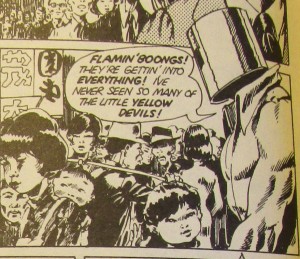
Loo’s plan to take over Australia and turn it into “Australoo” [105] is redolent of Yellow Peril anxiety about an inexorable invasion, potentially one from agents already inside white Western nations. Her forces have “infiltrated” Australia and “war shall begin from within!” From restaurants to factories and cinemas, Chinese immigration to Australia is shown to be nothing less than a conspiracy to wipe out the “poor, stupid round-eyes” [106] i.e. white Australians.

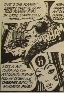
IMG_4413   IMG_4413

Fig. 3 and fig. 4. Page [106] of Wild & Woolley Comix Book © 1970 Greg and Grae

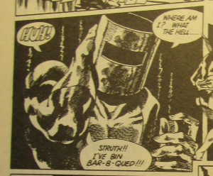
The heroes Iron Outlaw and Steel Sheila are avatars of an ethnically white Australia who resent the presence of Asian Australians (see fig. 2, fig. 3 and fig. 4) and their names hark back to white Anglo-Celtic settlement. The Iron Outlaw evokes folk hero Ned Kelly and Steel Sheila is named for the Australian slang term for a woman, one that probably derives from “the large number of Irish migrants to Australia.” (“Meanings”) The language of Iron Outlaw and Steel Sheila is marked by phrases such as “That’s the flamin’ limit!” [106], “corker!” [107], “Geez, I feel crook!” [108] and “whingin’” [109], and when Iron Outlaw is drugged, kidnapped, tortured and brainwashed, he is brought back to his senses by the flames of a dragon. In other words, he returns to the side of good after he is “bar-b-qued!!!” [110] (see fig. 5). What could be more Aussie than that?

IMG_4418

Fig. 5. Page [110] of Wild & Woolley Comix Book © 1970 Greg and Grae

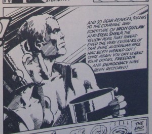
While the comic is open to the charge that in satirizing racist caricatures it nonetheless reproduces them, there can be no doubt Greg and Grae are attempting to put critical distance between their comic and the Yellow Peril tradition they are mocking. Through hyperbole and ridiculousness, the racist fears of the Yellow Peril genre are outlined and undermined. Readers are meant to laugh at the hysterical captioning of Madame Loo as “EVIL, EVIL, E-V-I-L!” [105] and at the idea of a secret undersea tunnel connecting Asia to Australia. At the end of the narrative Iron Outlaw and Steel Sheila get back to Canberra in time to warn the authorities: Madame Loo’s “mighty armada” is defeated at sea and the “fifth columnists [who] eagerly await” the arrival of the “invasion fleet” [110] are marched away. Madame Loo’s anguished cry of defeat refers to the Yellow Peril genre’s investment in white superiority and Oriental dissimulation. “Our fiendish Asian cunning and inscrutability were no match for British ignorance and stupidity!” [111] Loo’s conspiracy confirms that racist white Australians’ worst fears are correct: there is an elaborate conspiracy to transform the country’s racial order, and Asian immigrants and their children are working from within to erase white settler culture. But, also like many Yellow Peril texts, the plot assuages white supremacist fears by staging the downfall of Asian invasion. The idea that the genre flatters a precarious sense of white racial selfhood is underlined by a caption stating Madame Loo’s plot is “more than the Caucasian mind can comprehend” [105], which implies how Yellow Peril texts drew narrator and reader together as shared members of the “Caucasian” race, both horrified by Loo’s plans.

IMG_4419

Fig. 6. Page [111] of Wild & Woolley Comix Book © 1970 Greg and Grae

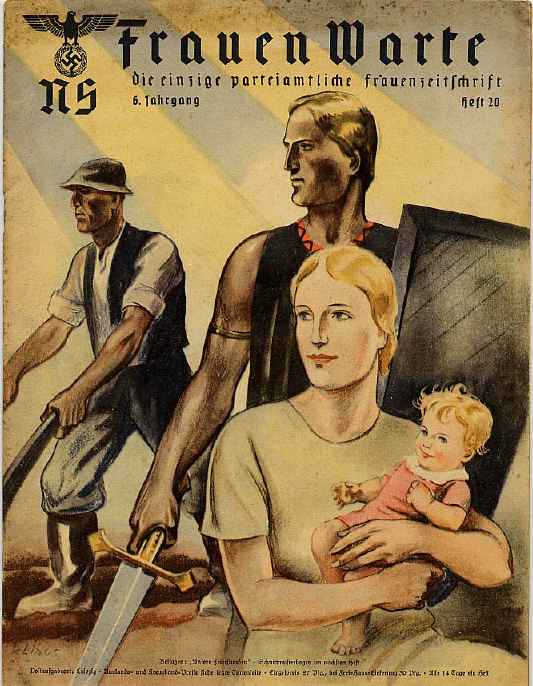
Fig. 7. Nazi propaganda poster (c) 2011 United States Holocaust Memorial Museum

Fig. 8. Magazine cover with no copyright information provided. Source: http://alphahistory.com/nazigermany/women-in-nazi-germany/

“Iron Outlaw and Steel Sheila Face the Yellow Peril!” may be warning that the racist stereotypes and plots of Yellow Peril popular fictions inform white Australian anxiety about being swamped by non-white immigration. Greg and Grae stridently criticise anti-immigration sentiment by linking the protagonists’ racism to German Nazism. The initials on Steel Sheila’s helmet (see fig. 4) look like the insignia of the SS, and the penultimate panel of this story thanks the heroes for preserving “our pure Australian race.” Iron Outlaw and Steel Sheila stare out of the panel towards an unseen point in the distance (see fig. 6), adopting the stylized posture of Nazi propaganda, the heterosexual Aryan couple resolutely fixed on a better future off-frame (see fig. 7-8). As Greg and Grae indicate, those racial fantasies can go clothed in the language of “freedom and democracy” as well as fascism and totalitarianism.

December 2015


Bibliography

Carter, David. “Publishing, Patronage and Cultural Politics: Institutional Changes in the Field of Australian Literature from 1950.” The Cambridge History of Australian Literature. Ed. Peter Pierce. Melbourne: Cambridge UP, 2009. 360-90. Print.

“Meanings and Origins of Australian Words and Idioms.” Australian National Dictionary Centre. Canberra, The Australian National University. 31 Dec. 2015. Web. 30 Dec. 2015. *

Patrick, Kevin. “The Invisible Medium: Comics Studies in Australia.” Refractory: A Journal of Entertainment Media 17 (2010). Web. 30 Dec. 2015. 

* Pleasingly, due to the time difference between the UK and Australia, the date this page was last updated really is after the day I consulted it. My research travels forward in time now.

Mrs Weber’s Diary

CREATOR/S: Posy Simmonds

YEAR: 1979

PLACE: London

PUBLISHER: Jonathan Cape

ORIGINAL PRICE: £3.95

PRINT RUN: Not known

WHERE CAN I READ IT FOR MYSELF? British Library

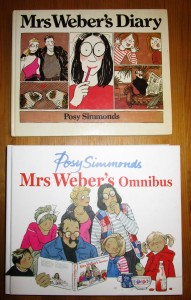
IMG_7646 IMG_7647

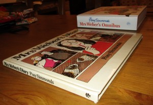
Fig. 1 and fig. 2. Cover and spine of Mrs Weber’s Diary © 1979 Posy Simmonds and Mrs Weber’s Omnibus © 1979, 1981,1982, 1985, 1987, 1993 and 2012 Posy Simmonds

I’m going to take a break from my recent Conan musings to discuss the 1979 book Mrs Weber’s Diary by Posy Simmonds. Simmonds is a comic creator best known for the graphic novels Gemma Bovery and Tamara Drewe. Simmonds’s weekly comic strip in the British Guardian newspaper featured the major themes of those books: contemporary manners, the legacy of the 1960s on middle-class attitudes, and taste and consumption practices as identity-constituting acts. Those strips, which began in May 1977, were reprinted as collected editions (Mrs Weber’s Diary was the first), and the compendious Mrs Weber’s Omnibus (2012) brought them all together under one cover.

Mrs Weber’s Diary works as an integral unit of 58 pages, running from January to December 1978 and from a New Year’s walk to the school Nativity play. It follows the year of Wendy Weber, her husband George, their large family and their friends the Heeps and the Wrights. As the title indicates, the comics are interrupted and framed by Wendy’s diary entries. Simmonds’s eye for the detail of middle-class mores and rituals includes the brief note in December’s diary:

TV Times

Radio “

The piles of Radio Times and TV Times in newsagents and supermarkets, even in today’s age of the internet, is a reminder of the habit of buying TV guides over Christmas to allow one to plan one’s viewing over the festive season. UK readers of a certain age will remember the time when, to get complete coverage of the schedules, one had to buy the Radio Times and the TV Times to cover independent broadcasters and the BBC respectively. Details like this in Wendy Weber’s diary show her fidelity to this annual ritual.

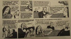
For me the star of the book is George. A Senior Lecturer in Liberal Studies, George is able to transform everyday life into the subject of academic discourse, and if his books The Meta-Megalith: A Structuralist Interpretation of the Career of Buckminster Fuller and Weimar, Chicago, & the Cultural Squash Ball do not currently exist, it is only a matter of time. George’s passion for his own research rises to heroic heights when rebuffed; when McGill turns down his collection of essays on the grounds of length (600 pages) the enraged George tears his manuscript in half (see fig. 3).

IMG_7649

Fig. 3. Detail from Mrs Weber’s Diary © 1979 Posy Simmonds

Wendy, hoping to wind him up, replaces the flower-pattern blind in the kitchen with a Toile de Jouy print full of bucolic scenes. George does not recoil from the kitsch; he is inspired to launch into a rhapsodic celebration of the pattern as a “TRANSPLANAR cultural model… the mediator between NATURE outside & CULTURE inside!” Even the characters in the pattern protest at having to listen to George’s intellectualizing – but it’s the source of amusement to the reader. Simmonds’s depiction of George, a former radical maintaining a semblance of his 1960s politics while fulfilling the demands of work and family, was influenced by her time as a student at art school in the 1960s (see Sabin). Simmonds’s careful delineation of her characters’ peccadilloes is well judged: because there are so many references to George’s interest in structuralism, readers familiar with this body of thought can see why he would be so enthused. The old New Leftist is not shocked by the pattern, he loves it: he sees in it confirmation of his structuralist model of a world divided into nature and culture, whereby the liminal state of the window over the sink (dividing private and public space) is acknowledged as a porous membrane with images of premodern agrarian life passing into modern Enlightenment. Haberdashery recapitulates phylogeny.

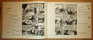
The figure of the lecherous, predatory professor, an enduring stereotype in popular culture, casts a shadow over Mrs Weber’s Diary, although Simmonds doesn’t reduce George to this stereotype. In the month of April in the book the diaries of Stanhope Wright (an advertising director) and George are juxtaposed (see fig. 4) on facing pages.

 IMG_7648

Fig. 4. Pages from Mrs Weber’s Diary © 1979 Posy Simmonds

Set within the pages of each diary is a comic detailing a similar encounter: an older man spends an evening with a younger woman over whom he has authority in the workplace, an encounter taking place because the man has lied to his wife that he needs to stay late at work. Stanhope is dining with his secretary Carol at an expensive restaurant, but his seduction is rebuffed; she needs to get back to her mother, and Stanhope thinks “Excuses Excuses!” George is out drinking with one of his students, who plies him with drink, but at the end of the night George declines to leave with her. This does not appear to be because of a moral opposition to infidelity, since George tells her that the Webers have an open marriage. He can’t afford to spare the time. He needs to get home because the boiler is faulty and if nothing is done the guinea pigs could be “overcome with fumes”! George is positioned as the frustrating party, and the student thinks “Excuses Excuses!” George is the butt of the joke, but not because he is a failed lothario; these paired scenes construct him as a verbose buffoon in the same position as Carol the secretary (not least where composition of the final panels of each page is concerned), protesting that familial, domestic demands compel him to return at once. Here George is a deflated, homely version of the far more sinister, promiscuous academic Howard Kirk in Malcolm Bradbury’s 1975 novel The History Man.

Whether he is analysing his friend’s ponytail, or a painting used to promote whisky, or his own status as a father on a bus, George continually brings sociological and semiological interpretations to his everyday life. He is a Cultural Studies pioneer in that respect. Yet George gets partly lost in his reveries, and in this he may represent a warning that obsessive academic interests are solipsistic and narcissistic. Unable to stop himself slotting phenomena into the methodologies and theories of his research, one could potentially read George as a marker of the slow slide in which doing work has infiltrated the unpaid leisure time of workers in academia. George is so alienated he holds his personal life at one remove while he analyses it, turning his own experiences and lifeworld into material on which his skills can be practiced.

While that reading chimes with the jaded lecturer in me, there’s a joy in George’s compulsive need to analyse the occurrences and objects that populate his life. He manages to even amuse himself through the incongruity of his high theorizing and unlikely subject matter. In an underwear shop he muses “the SYNTAGMATIC ORDER of bra, suspender belt & knickers, could be understood as the FOUNDATIONS OF STRUCTURALISM…Ha Ha!” He knows the ridiculousness of his thought experiments and enjoys them, he is able to play with intellectual possibilities, and in doing so he can endure what, certainly in the underwear shop, are the demoralising effects of consumer culture. George’s intellectualizing is a way of putting up with and understanding his life and not an escape into some passive interiority. Because of it, the world of family and work and shopping is continually fascinating, endlessly rewarding.

November 2015


Bibliography

Sabin, Roger. “Some ‘Contemptible’ British Students.” The Education of a Comics Artist: Visual Narrative in Cartoons, Graphic Novels, and Beyond. Ed. Michael Dooley and Steven Heller. New York: Allworth, 2005. 214-20. Print.

The Complete Marvel Conan the Barbarian (vol. 1)

CREATOR/S: Roy Thomas (writer), Barry Smith (artist), featuring the hero created by Robert E. Howard

YEAR: 1978

PLACE: New York

PUBLISHER: Tempo Star-Grosset & Dunlap (distributed by Ace Books)

ORIGINAL PRICE: $1.95

PRINT RUN: Not known

WHERE CAN I READ IT FOR MYSELF? Ohio State University

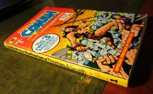
       IMG_7573    IMG_7574

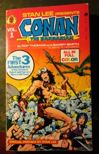
Fig. 1 and fig. 2. Cover and spine of The Complete Marvel Conan the Barbarian, volume 1 © 1978 Conan Properties, Inc.

Last month I talked about the importance of the Conan franchise for 1970s discussions about the metamorphosis of comics into novels, and I’m going to continue along the same vein here. In 1978 and 1979 Grosset & Dunlap issued six paperback volumes through their Tempo imprint entitled The Complete Marvel Conan the Barbarian. These books reprinted stories from Marvel’s comic Conan the Barbarian, starting with the early issues by the prized pairing of writer Roy Thomas and artist Barry Smith. Grosset & Dunlap also put out Marvel puzzle and activity books, Incredible Hulk paperbacks (reprinting newspaper strips featuring the green superhero), and a two-volume Battlestar Galactica adapted from the SF television show.

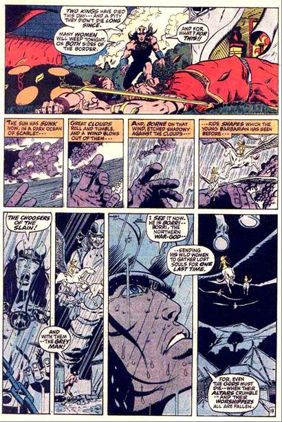
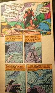
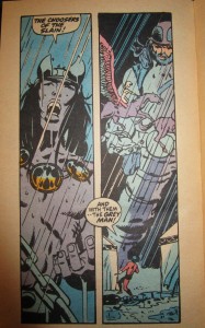
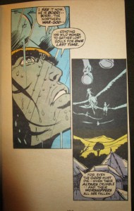
As Roy Thomas’s introduction conceded, “since the comics stories were designed visually for a different format than paperbacks, we’ve had to cut panels and copy to fit – an imperfect process, but one which was inevitable.” (4) Let me give an example of the editing process by comparing page 19 of issue 3 of Conan the Barbarian (fig. 3) with the same panels  on pages 155-57 in the first Tempo volume (fig. 4). I’m not doing this to denigrate what has been lost on the cutting room floor. The panels in the paperback edition fall differently from those in the comic book but some of the book’s page layouts have intriguing effects unavailable in the original version.

Conan

Fig. 3. Page 19 of Conan the Barbarian #3 © 1971 Marvel Comics Group

 IMG_7576  IMG_7579   IMG_7581

Fig. 4. Pages 155-57 of The Complete Marvel Conan the Barbarian, volume 1 © 1978 Conan Properties, Inc.

I won’t list every obvious change (e.g. the colouring). Just one or two obvious ones: the first panel no longer enjoys a whole row to itself at the top of the page. It has been cropped on either side so that the billowing tent flap on the right can no longer be seen. Because in the paperback volume Conan’s figure occupies a larger space relative to the other elements inside the frame, one might argue that the fallen warriors and the pointlessness of their struggle seems less poignant and less significant in the later version, less caught in a timeless moment as the canvas turns in the air. The purpose of this panel now seems to be more about bringing Conan quickly back into the narrative to pass judgment on the two dead kings before he sees the flying women of Borri, the Northern War-God, whisking off the souls of the fallen.

A second obvious point: in the original, the gutters dividing the four panels on the middle row don’t quite match the vertical gutters on the bottom row, but the shared colour scheme invites one to see (want?) those gutters all lined up. They almost do, but don’t.

I find this extremely irritating.

But I understand (I think) why it has been constructed this way: the panels on the middle and bottom rows don’t line up because the one focusing on Conan’s face is larger than the others. This slightly larger panel (the third panel on the bottom row) not only shows off the star of the comic’s title but, combined with the images of Borri’s hand on the middle tier, it almost looks as if Borri’s hand is Conan’s, raised to feel the coming rain and to send the women on their winged steeds. Well, Conan is a kind of Northern War-God.

This reading the page as a gestalt isn’t possible with the paperback, since all the panels from the top and middle row are on p.156, and we have to turn the page to see the four panels from the bottom tier. Given that Conan and Borri occupy two adjacent panels blown up to larger size, the comparison still stands. Throughout this paperback volume the editing process creates a lot more negative space surrounding the panels than the comic book version, and when Conan says that Borri is “sending his wild women to gather lost souls for one last time” (157), rather than the speech balloon protruding into the next panel and leading on to Conan’s next comment, that “one last time” seems to dangle on the edge of nothingness. Time has been called on Borri the Northern War-God and he is passing into non-existence, into the nothingness that hovers around the panels. As the sequence appears in this paperback edit, the slight increase in time it takes to move from the penultimate panel to the last one adds a pause, a moment of contemplation about the void that awaits. And because now Conan’s speech balloon doesn’t intrude into the last panel, the sight of the winged steeds is able to be admired as a tableau, before the reader’s eyes descend to the last speech balloon. Given that the theme of Conan’s soliloquy is the death of gods, the crumbling of altars and the fall of worshippers, the edited version uses Conan’s speech balloon to poise the reader in the blankness over the last panel, so that the reader’s descent down the page seems to be more vertical and plunging than negotiating these panels in the comic book.

As this example suggests, the revised page layout of The Complete Marvel Conan the Barbarian loses some of the rhythms of the original – but the new arrangement of panels offers new, noteworthy spaces and beats.

More Conan to come!

October 2015

CREATOR/S: Script by Roy Thomas, Art by John Buscema and the Tribe, adapted from the story by Robert E. Howard

YEAR: 1975

PLACE: New York

PUBLISHER: Marvel Comics Group

ORIGINAL PRICE: $1

PRINT RUN: Not known

WHERE CAN I READ IT FOR MYSELF? Michigan State University


 IMG_7554    IMG_7555

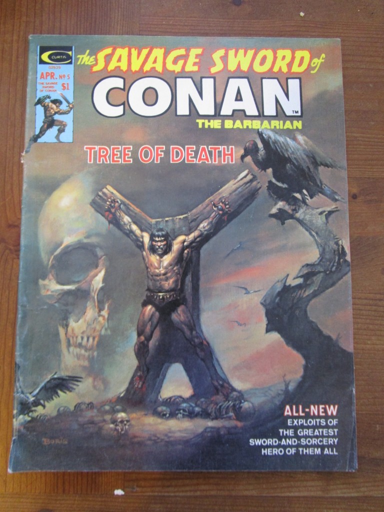
Figs. 1 and 2. Cover and spine of Savage Sword of Conan #5 © 1975 Marvel Comics Group

The fifth issue of Marvel’s Savage Sword of Conan, cover-dated April 1975, featured the “longest, mightiest Conan epic yet” (3), the 55-page story “A Witch Shall Be Born.” The length of the story permitted division into chapters, the breaks between which provided opportune sections for the placement of advertisements, somewhat reminiscent of Bart Beaty’s suggestion that Archie Comics “conceptualized its advertising material as akin to ads on the television and radio” (115).

“A Witch Shall Be Born” was not only notable for its length. The original Robert E. Howard story it was adapted from contained, according to the “Swords and Scrolls” letters page, “the single most famous episode in all of Conaniana: the barbarian’s crucifixion” (80). This is the central motif of the narrative, and given its iconic richness, it is appropriate that Boris Vallejo’s painting of this scene provides the cover to this issue (see fig. 1).

“A Witch Shall Be Born” was not marketed as a novel, but perhaps the comic writer Steve Gerber read it as such. In an interview with Gary Groth in August 1978, Gerber reflected on whether the world of comics could produce work “on the same level as a novel”:

the term ‘novel’ is rather all-encompassing. Robert E. Howard wrote novels. Unquestionably, to me, what Roy Thomas, John Buscema and Barry Smith have done with Conan is so far superior to the stuff that Howard turned out… so I suppose a certain kind of novel very definitely can be done in comics (37).

The Conan stories were frequently woven into debates in the long 1970s about the viability of graphic novels. Some fans loudly believed that Marvel’s careful exploitation of this literary property would usher in the long-length, book-published narratives the comics world had been anticipating. Some, it had to be said, scoffed at the idea that Marvel’s Conan tales would one day be stacked against the classic novels of American literature. Nonetheless, the commercial and critical success of the early Marvel adaptations by Roy Thomas and Barry Windsor Smith catalysed a cycle of sword-and-sorcery fantasy comics. Even The Comics Journal in April 1980 had praise for their collaboration, Kim Thompson writing that Thomas and Smith (as well as other creators) had set “particularly high standards” for the medium (7). The Comics Journal, it may be remembered, luxuriated in these “high standards” that the editors demanded, blazoning across the cover of the October 1980 issue the promise of “Yet Another Elitist Interview” within.

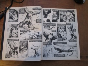
As with Marvel’s other black-and-white magazines, The Savage Sword of Conan was not sanctioned by the Comics Code Authority and was aimed at a slightly older readership. In terms of taking advantage of going without Code approval this was primarily manifested in scenes of implied sexual assault and more visceral violence (Conan up to his thighs in massacred enemies, severed hands etc.). Chapter three of the narrative, entitled “The Tree of Death,” is a wince-inducing episode that takes advantage of this license to show more bloody scenes than a newsstand comic book. This chapter narrates Conan’s crucifixion and eventual escape; it comes from Howard’s original material but there is something distinctively Marvel about it, evoking Stan Lee and Steve Ditko’s famous sequence from The Amazing Spider-Man 33 (Feb. 1966), when the web-slinging protagonist slowly and painfully lifts himself out from under heavy machinery. Conan’s release also comes slowly, an excruciating, drawn-out, dangerous disentanglement. By my count, Conan is left alone on the crucifix for 26 panels (see fig. 3), but once he is discovered it still takes 24 panels for the final nail to be removed.

IMG_7560

Fig. 3. Pages 18-19 of Savage Sword of Conan #5 © 1975 Marvel Comics Group

On one level the crucifixion scene aligns Conan with the suffering Christ and is part of an overall tendency in “A Witch Shall Be Born” to re-use characters and iconography from the New Testament. The title refers to “Salome, the witch,” a manifestation of an eternal female character who recurs through history (and is always called Salome) to do evil work. Even when “a new world has risen on the ashes and dust– even then, there shall be Salomes to walk the earth — to trap men’s hearts with their sorcery— –to dance before kings— –and to see the heads of the wise fall at their pleasure!” (8) The latter speech aligns this Salome with the daughter of Herodias in the Gospels, who danced in front of King Herod; Herod was so pleased with the performance he granted the girl one wish, and she asked for the head of John the Baptist (Mark 6.21-29; Matt. 14.3-12). By the twentieth century the daughter of Herodias was commonly known as ‘Salome.’

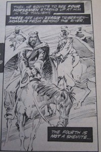
However, there is another Salome in the gospels, a disciple who witnesses Christ’s crucifixion (Mark 15.40). Where does she fit into this allusion? Furthermore, another Biblical reference, the bandits whom Conan sees as “four horsemen staring up at him in the twilight” (21), seems to work ironically, in that this equestrian quartet brings not the apocalypse but Conan’s salvation (see fig. 4). A reversal like this makes me think very carefully about Conan being bound to the cross. Perhaps it is wrong to see in this character’s crucifixion an allusion to Christ? At the very least, it seems worthwhile to burrow a little deeper in the image’s complex relation to that tradition.

IMG_7567

Fig. 4. Page 21 of Savage Sword of Conan #5 © 1975 Marvel Comics Group

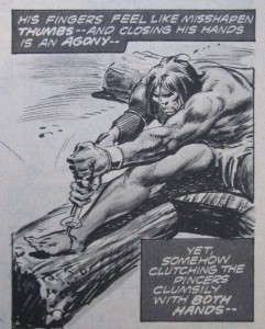
To begin with, the cross to which Conan is affixed is not shaped like the central motif of Christianity. This wooden structure looks more like an X, which gives Conan the appearance of being about to drop on his prey. Conan looks as menacing as ever on his crucifix; he has the aspect, not of humility, but of a tense energy wound tight and ready to spring. In fact, when a vulture flies in to peck out Conan’s eyes, the barbarian draws his head back in order to lunge forward when the bird is close. He catches it by surprise and breaks its neck with his bite. When the bandits release his hands, Conan finishes the job, pulling out the nails in his feet by himself (see fig. 5). Not even crucifixion can steal his strength away altogether.

IMG_7566

Fig. 5. Page 23 of Savage Sword of Conan #5 © 1975 Marvel Comics Group

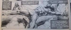
As the cover and the title of the chapter suggests, this is a “tree of death,” which seems an odd thing to say. The depiction of the crucifix makes it look bolted together from discrete parts and not carved out of a tree. There are trees of death in some religious traditions, so I wouldn’t rule that out as a reference point, but what if the tree of death doesn’t refer to the cross but the character? When the bandits consider how they will free the barbarian, they are concerned that in felling the wood they will kill the man in the fall. In order not to sustain injuries, when they chop through the base of the cross Conan makes “his whole body into a solid knot” and “holds his head rigid against the wood.” (22; see fig. 6) He avoids whiplash by making himself flush with the timber, and by tensing his body into a “solid knot” Conan turns himself into a rigid lump of tied of rope – or indeed, a piece of tough wood.

IMG_7562

Fig. 6. Pages 22 of Savage Sword of Conan #5 © 1975 Marvel Comics Group

The crucifixion of Conan in the comic affirms his power and not his vulnerability. He does not suffer for our sins; suffering confirms that he is the man of wood, a living entity but a hardened one, able to remove the nails from his feet as if he were pulling them from a chunk of lumber. As thirsty as he is, he continues to go without water and rides ten miles in the desert. On the last page of the story, Conan has nailed Constantius to a cross, and rides off to leave him to die. It is a reversal of the earlier scene and indicates that the barbarian, the tree of death himself, has bested another enemy.

I’ve been re-reading the Roland Barthes of Mythologies (1957) recently, which may account for the speculative reading of signs in this post. Barthes might well have asked ‘what kind of ideological work is this image doing?’ The vultures and the skulls on the cover could have functioned as memento mori at an earlier point in the history of art, but here they are emptied out of their power, because we are in no doubt that Conan will survive this ordeal. This image does not valorize suffering or find sources of redemption, in this life or the next: it hymns the male figure as somehow unkillable, as a timber-hard figure resistant to the ordeals of thirst, hunger, heat, predation, exposure. The 1970s was the decade when environmentalism became the coherent, visible and militant movement it had never been before, when ecological concerns like overpopulation and over-foresting were the source of best-selling books and blockbuster films. In 1970 the Environmental Protection Agency was created in the USA and at the decade’s end President Carter called for a limit on American consumption in his “Crisis of Confidence” speech. The crucifixion of Conan can be read as a retort back to environmental anxieties, figuring the male human warrior as too powerful to be destroyed by anything as pathetic as being nailed to a wooden structure in a barren, hostile environment. When man (that seems the appropriate word here) takes on nature’s raw, unreflective hardness, the regenerative ability of vegetation and its pulsing urge to push out of the soil, then man can usurp nature’s power and triumph over it. Conan has managed this: even when nailed to a cross he is capable of posing a threat to nature, warning it away, and eventually (symbolically) unbinding himself.

Before I go, let me show you figure 7:

IMG_7557

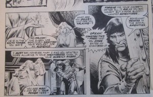
Fig. 7. Page 10 of Savage Sword of Conan #5 © 1975 Marvel Comics Group

I would say that the Anglophone eye (sorry, awkward, but you know what I mean) wouldn’t automatically go top left panel, right-hand panel, bottom left panel, but top left, bottom left, right. So the placement of the speech balloons is key if the panels are to be read in order, and how adeptly they’ve been placed to this end. Taramis’s jagged speech balloon takes us out of the first panel in this sequence and into the right-hand one, and placing Constantius’s face adjacent to Taramis’s balloon ensures that the reader is likely to contemplate his visage and words next. Well-crafted stuff indeed.


September 2015


Bibliography

Barthes, Roland. Mythologies. 1957. Trans. Annette Lavers. London: Vintage, 1993. Print.

Beaty, Bart. Twelve-Cent Archie. New Brunswick, NJ: Rutgers UP, 2015. Print.

Gerber, Steve. Interview by Gary Groth. The Comics Journal 41 (Aug. 1978): 28-44. Alexander Street Press Underground and Independent Comics. Web. 2 Oct. 2014.

Thompson, Kim. “Another Relentlessly Elitist Editorial.” The Comics Journal 55 (Apr. 1980): 6-7. Alexander Street Press Underground and Independent Comics. Web. 4 Dec. 2014.