Our chosen clip is a pivotal scene within the film. The scene in which Count Orlok stalks Ellen and attempts to feed off her.
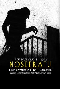
Immediately within this scene we have a classic shot of Count Orlok’s shadow creeping up the stairs, his long claws outstretched. This use of lighting to create such a vivid shadow of the character is remarkable and is repeated several times during this sequence. The acting and the mise-en-scene blend the character to the set and especially the elongated fingers provide the distortion and exaggeration characteristic of the style.
This scene is one of the most famous of the film. The use of shadow to portray Nosferatu walking up the stairs and opening the door is so emblematic of its expressionist qualities that it is even a poster for the film.
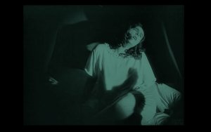
Further on in the sequence we see this shot another excellent use of shadows as Count Orlok’s hand grabs at Ellen’s heart. The way Ellen is frames centrally with her being the only visible being in the room draws all attention to her as she seems to be literally gripped by Orlok’s hand.
Nosferatu uses tempo and pitch in order to show meanings and representations within the film. In regards to tempo, this musical feature represents the pace of certain aspects within the narrative, whether that be someone in a rush to get somewhere or to show a build up to a climatic moment within the storyline. The pitch carries out a similar usage by reflecting types of imagery we see on the screen. For example, when we see Jonathan and Ellen ‘peacefully’ living their lives at the beginning of the film, we hear uplifting and ‘peaceful’ music. Whereas when we see images of the castle or Count Olok, there is a sinister approach to the musical motifs using minor tonalities and climatic approaches such as ascending chromatic runs and clashing notes to emphasise Count Olok’s evil traits. This combined with the cinematography and lighting create the atmosphere desired by director F. W. Murnau.
 In this clip there are many examples of the unrealistic performances typical of the Expressionist movement. Starting off with the Vampire creeping up the stairwell, his shadow perfectly displayed on the wall showing the full extent of his elongated and grotesque body. This is followed by Ellen jumping in fear when she finally see’s the vampire’s shadow at her door. Further examples are the performances between Ellen and his shadow. Ellen reacting as if the shadow was truly hurting her. Her movement and emotion during this scene is close to a theatrical performance during the scene. This scene ends with the Vampire’s shadow of his fist suddenly closing over her heart with Ellen reacting as if he had truly just squeezed the life out of her.
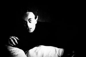
Costume and makeup design in Nosferatu is arguable one of the leading features that pushed the film to be the classic horror masterpiece its regarded as today. In the clip both makeup and costume design are extremely important for this specific part in the narrative, Ellen’s makeup is designed to make her face look gaunt and worn out with dark contours and circles under her eyes, this is to reflect the torment from Nosferatu that’s built up over the film. Her bright white nightgown directly contrasts her ghoulish makeup and pushes the idea that she is pure and untarnished by  sin. Also, by juxtaposing the virgin white of her nightgown and Nosferatu’s blacker than black ensemble, Albin Grau (costume designer) creates this yin- yang imagery that really hammers home how fighting and disturbing Nosferatu is as a character and how though extremely different, Ellen and Nosferatu have a balance that ultimately draws them to each other.
This is a very impressive and detailed post that makes solid use of images to bolster your central argument.
The writing is generally of a high standard, but it is a little uneven in places and so, as a group you might want to devote a little more time to making sure your posts are more cohesive. This is a minor criticism, however, and I would stress that you are very much on the right track.
The reading of Murnau’s use of shadow is highly persuasive, as is your analysis of mise-en-scene, music, acting, make-up and costumes (very thorough stuff here overall!). I might quibble that the acting is a little more naturalistic than Caligari for instance, but to our eyes it still can appear theatrical of course.
I particularly like how you have isolated the various formal features that make up the film and demonstrated how they come together to form the terrifying final product. Filmic analysis, in other words, and impressive filmic analysis at that.