
Apologies it has been so long since blogging, the ExDx team has now largely disbanded and Ginny has been working on her latest book The Rise of Autism: Risk and Resistance in the Age of Diagnosis to be published later this month.
This two-part blog series will share with you some of the graphics that will feature in the book.
Figure 1: This figure outlines the possible links between older parenthood and autism in offspring.

Figure 2: This data shows plotted ONS data on UK average age of motherhood over last twenty years.
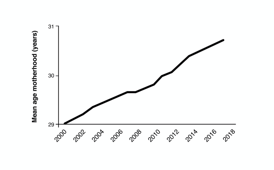
Figure 3: The below graph shows the rise in pre-term birth rates in high income regions.
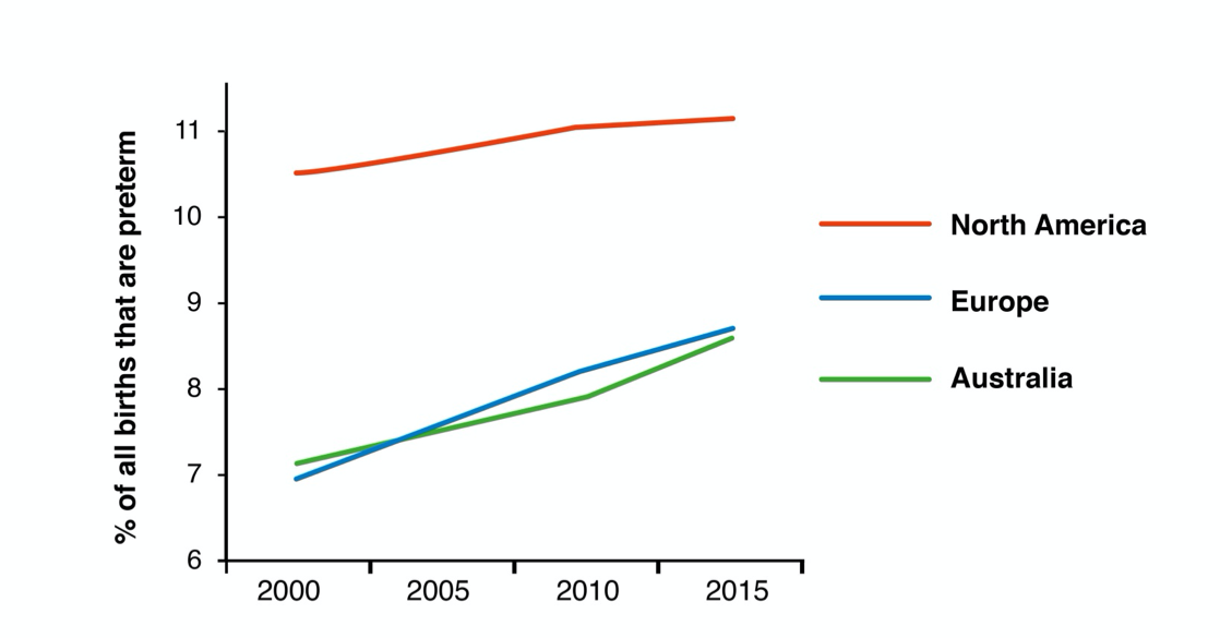
Figure 4: This graph shows the rise in “medically indicated” pre-term births, meaning those decided by doctors, versus spontaneous pre-term births in the US.
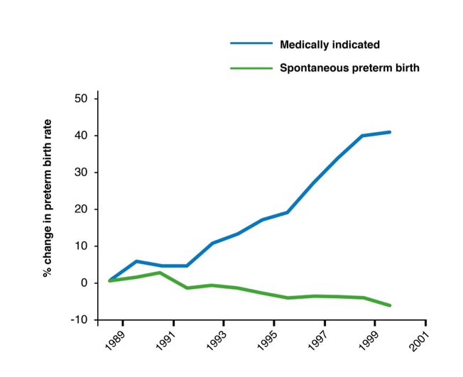
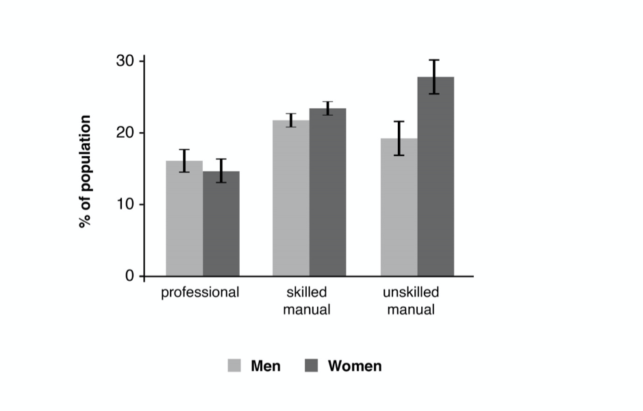
Figure 5: This graph shows interaction of obesity, wealth and gender. A thought-provoking picture of social interactions.